Playing With Parchment

I agree.

This last one I tried to do more to the edging - scruffing it up a bit, scratching it some, and fading it in places, but I agree it looks superimposed.

The real reason?

Because it is -too- perfectly straight. Problem with using knotwork fonts instead of taking the time to do my own knotwork (I'm really good at knotwork, but very slow at it).
 

log in or register to remove this ad

HellHound said:
Well, with the inspiration provided by Fargoth, combined with the fact that my wife was too ill to game yesterday, the gelflings (my daughters) and I decided to try a craft, and we aged paper int he classic tea-bag style.

Of the four sheets we did, two came out very well, and two less so.

But from them, I started making new parchment designs, and here is the first:

Those used coffee grounds add the best touch. Don't remove them after the paper soaks in the solution. Blow the paper dry with a hair dryer and the coffee grounds will make things look even better. Some course fireplace ash or fine charcoal from the same fireplace can add to things as well.
 

I have been working with Photoshop for the past few days on some parchments, I was really inspired by the stuff posted here :) Just a few questions. How did you make the designs in the first three images posted? In the Necromancer's Legacy pic, what font did you use for the text and how did you get the knotwork around the borders? Thanks for the help in advance. I really enjoy this kinda stuff, even was able to figure out how to make my own seal. Can't wait to use this in the Campaign that I am running :)

Cheers,
-E
 

The first ones use the technique explained later in the thread, with some variations in colour.

The font is (I think) Deutch Gothic.

I'm really good at drawing knotwork, but in this case it is from another font.
 

HellHound said:
I agree.

This last one I tried to do more to the edging - scruffing it up a bit, scratching it some, and fading it in places, but I agree it looks superimposed.

The real reason?

Because it is -too- perfectly straight. Problem with using knotwork fonts instead of taking the time to do my own knotwork (I'm really good at knotwork, but very slow at it).

Have you tried some of the Distort filters on the font borders? Set to very subtle distortion values of course. Or, if you are really ambitious, you could use those rendered Clouds as the Distort > Glass texture (I think you need to save textures as greyscale PSD, but my memory is hazy on that one).

Just a sudden thought from six+ weeks down the road.
 

Hey HH,

Beautiful work. I really admire well-done parchment. I might try making my own with my copy of PSP 8.

Question, though: you ever do parchment that has the hand-ruled lines faintly overlaid on them, a la the 3.5 Core Books? I've been looking for something like that to use as a background for my digital doodles.

-SJ
 

Those are great, Hound. Let me tell you, you put out a clip-art set of these parchments, I'm all over it. And if you make one with hand-drawn knotwork, even more so! These would be great for my Bardic Lore line. :)
 

I really liked the parchment you've done. And i thank you for the work you've done on the background for the E.N. Guilds line.

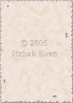
I've wanted to showcase the new background for the E.N. Guilds line. And if anyone has comments, you're welcome to express them. Though after seeing this thread I know about some changes I'd like to make for the next E.N. Guild, as this background is already incorporated in the Guild book about to be released.
 

Attachments

  • back.jpg
    back.jpg
    193.1 KB · Views: 112

Remove ads

Top