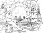
I will try to critiqe only the coloring since that's the only thing you want.
Honestly I think what you should try is this: Start over with your coloring. If you really like the shading and linework that's there, don't bother covering it up to make it look more "painterly." Instead, go into Photoshop (I assume that's what you have, am I wrong?), and convert it into CMYK. From there, go into channels and only select C, M, and Y channels. That way when you color with brush or whatever, the blacK channel won't be altered at all. I use this technique for my own stuff.
Other than that, I recommend not using such bright colors on so much of the piece. Decide what your focus is (the figures and their faces), and use the most saturated colors there. Have their shirts or colors be the brightest colors.