D&D 5E D&D Next weekly art column!

Status
Not open for further replies.
It's reminiscent of the Classic Traveller covers, which had great graphic design imo.
Oh yeah! And the words on the box:
This is Free Trader Beowulf,
calling anyone...
please help...
Mayday...

Silence.

Just an everyday moment of genius to not actually depict the ship making this call, but just pure black and red, no cover art.
 

log in or register to remove this ad

Oh yeah! And the words on the box:
This is Free Trader Beowulf,
calling anyone...
please help...
Mayday...

Silence.

Just an everyday moment of genius to not actually depict the ship making this call, but just pure black and red, no cover art.

Traveller has a nice clean graphic design, I agree. OTOH I think that meshed well with the genre.

I keep coming back to the 1e PHB/DMG cover designs though. In a sense there's a rather similar thing going on there. They're rather understated, suggesting a deep and interesting world and story, much like the 'mayday message'. I just think they need to be less minimalistic than a practically blank field. The Skyrim box cover art for instance doesn't say ANYTHING to me. It doesn't suggest a world of adventure, or much of anything really beyond "some sort of fantasy content."

I think "exploring a world of imagination and adventure" is the note that needs to be hit right now by D&D. It needs to invite you in, tease you, give you a taste of what is really interesting and cool about D&D. What is that? Limitless possibilities for adventure, and an ongoing story in a deep self-created world.

It should be understated but loaded with the suggestion of action to come and mysteries to be explored. I think it should also avoid being gimmicky. That was what annoyed me about the 3.x covers, they weren't all that good looking, didn't tell me much, and I wasn't really buying the whole "ancient book of lore" vibe. I don't want a lore book, I want an ADVENTURE. IMHO the 2e and 4e cover designs are not BAD, but they're a bit too overstated. Leave more to the imagination of the viewer. That 1e PHB cover was a work of genius. Nothing much exciting is happening right that instant, but you just know there's a big story back there and plenty of action and excitement to come. That idol is going to do something any second, or some bad guys are going to attack, or SOMETHING. Why are the adventurers there? What is that place? What are those creatures and that idol? It BEGS you to dive in and find out and invent a story. It is the pure essence of D&D boiled down into a single scene, just like the Traveller cover is the pure essence of adventure in space boiled down to a distant SoS.
 

dmg_redsky.jpg


This is understated? Really? While it might not be as full as it could be, I don't think it's understated. I do agree with showing the whole Worlds of Adventure vibe though. I really love the old Otis Basic/Expert covers, which is what the 4e covers are trying to emulate.
 

This is understated? Really? While it might not be as full as it could be, I don't think it's understated. I do agree with showing the whole Worlds of Adventure vibe though. I really love the old Otis Basic/Expert covers, which is what the 4e covers are trying to emulate.

Oh, not so much as the PHB cover, certainly, but still, more so than the 'close in shot' sort of stuff that the 4e covers have on them. I don't know when they went from "show me the adventure" to spotlighting on a hero (or a monster as the case may be), but that whole City of Brass vista is still very open-ended and the focus is at least as much on "what can I find here?" as it is on the fight going on on the front.

I liked some of the other styles of cover art now and then, but those 2 pieces really were something else. It could be nostalgia I guess, but even some of the earlier stuff has the same vibe. The cover of "Eldritch Wizardry" with its sacrifice scene and the outline of the castle on the Blackmoor cover have a similar vibe too. I miss that artistic sensibility that seemed to depart somewhere between 1e and 2e.
 

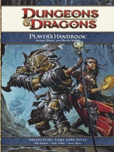
I can see that. I look at the 4e PHB cover:

dnd4e_phb_cover_v2.jpg


and see the similarities to the Basic D&D cover:

dd-box.jpg


And, yeah, nostalgia probably plays a big role here, because that Basic set is where I got my start. :D
 

dmg_redsky.jpg


This is understated? Really? While it might not be as full as it could be, I don't think it's understated. I do agree with showing the whole Worlds of Adventure vibe though. I really love the old Otis Basic/Expert covers, which is what the 4e covers are trying to emulate.

Are you talking about the reused art or something else?

4E covers look like adventurer's Facebook postings where they pose and look like they are doing something interesting....but they're not.

No posing. Please.

Also as to the earlier posts about gender. The art must be good. Beyond that I don't care.

Reused art? I actually didn't realize that the 4e cover was reused art. How are they posing any more than in the Otis Basic D&D cover? You've got a dude and a chick in a dungeon. Granted, the 4e cover needs a dragon, but, it's not like there's nothing going on there.

Could it be better? Oh sure. Like I said, it needs an antagonist (preferably a bloody dragon, after all it's the name of the game) on the cover. But, it's suitably dynamic, even if I'm also not a huge fan of WAR.
 

Reused art? I actually didn't realize that the 4e cover was reused art. How are they posing any more than in the Otis Basic D&D cover? You've got a dude and a chick in a dungeon. Granted, the 4e cover needs a dragon, but, it's not like there's nothing going on there.
The male in the image isn't, but the female is. But this is typical of Wayne Reynold's art. See the "Dragon's Eye View" thread for my many posts on the subject of why Wizards should stop hiring him.

[MENTION=42437]Wiseblood[/MENTION]; if you think the posing on the 4e PHB is bad, check out the alt cover:
4e_alt_phb.jpg

The lady's verging on being an Escher Girl.

Can we fire Wayne now?

Could it be better? Oh sure. Like I said, it needs an antagonist (preferably a bloody dragon, after all it's the name of the game) on the cover. But, it's suitably dynamic, even if I'm also not a huge fan of WAR.
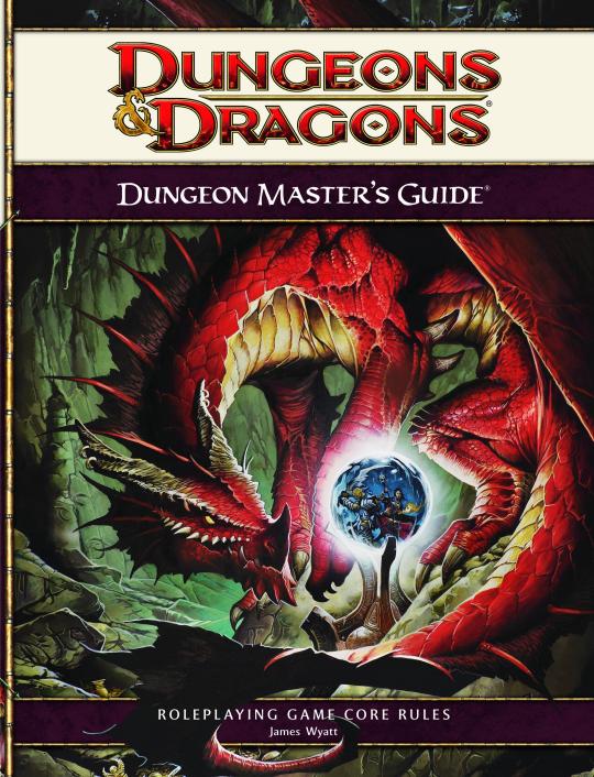
Technically, the antagonist is on the cover of the DMG. There's a red dragon in it's lair viewing the two PC's through a small scrying orb-type thing.
Dungeon_Masters_Guide_540x706.jpg
 

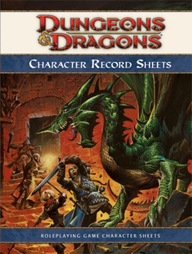
I think the worthy successor of the Basic/1e covers actually ended up being used in the Character Record Sheets. IMHO, it would've hit it out of the park as the cover for the 4e PHB:

51FR1GTxO3L.jpg
 

Reused art? I actually didn't realize that the 4e cover was reused art. How are they posing any more than in the Otis Basic D&D cover? You've got a dude and a chick in a dungeon. Granted, the 4e cover needs a dragon, but, it's not like there's nothing going on there.

Could it be better? Oh sure. Like I said, it needs an antagonist (preferably a bloody dragon, after all it's the name of the game) on the cover. But, it's suitably dynamic, even if I'm also not a huge fan of WAR.

I was actually talking about the red box and how they reused Elmore's work. I did not get the impression that they were emulating the classics.

On a side note It seems that many of the works on covers are from the dragon's sidekick point of view. I want to see what the PC's see. I do not want to see what the antagonists see. Goes the same for monster movies.
 
Last edited:

Status
Not open for further replies.
Remove ads

Top