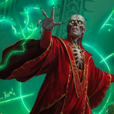
• The VOIDRUNNER'S CODEX is coming! Explore new worlds, fight oppressive empires, fend off fearsome aliens, and wield deadly psionics with this comprehensive boxed set expansion for 5E and A5E!

D&D 5E D&D Next weekly art column!

Status
Not open for further replies.

GX.Sigma

Adventurer
My general view is that I don't see why the logo and cover of a D&D gamebook has to concern itself with "capturing attention" at all, really. Why would it need to do that? Whose attention does it need to capture?

How do newbies come to D&D? Is anybody actually strolling down the aisle of a brick&mortar store when the cover of a D&D book grabs their attention, so they pick it up and read the back, then buy it and play it and get into D&D like that?

No way.

...

Skyrim knows it's huge. It's not trying to grab your attention with an image like "you can be this!" (although I am aware that it has an iconic character used elsewhere) or even "you can explore this!".

It's all like: if you're looking at this, you already know what this is.

That's what I want the D&D logo/cover to say.
I think that's a dangerous attitude to have. We definitely don't want it to appear intimidating to new players, like "if you don't already play D&D, this isn't for you." It should be as accessible as possible.

In my opinion, it's gotta be red. Red is like, objectively the best color. It's bright, powerful, and eye-grabbing.

A white and blue logo sucks from a product design standpoint (which WotC learned pretty early on with Magic: the Gathering).
I like purple and green, but those feel more like special colors you use for a reason, rather than the main color of the product.
Brown is nice, but as a main color it sucks (3.x book covers were just plain '90s-ugly).
Beige is nice, but it's very boring (4e essentials books, web interfaces, etc. are so bland).
Yellow is fine, and it's the second-best to red.
Orange I guess would work.
 
Last edited:

log in or register to remove this ad

Stormonu

Legend
I believe one of the biggest mistakes of D&D's art department recently was the design of the Red Box. It looks like some retro re-print of the original red box. It has the old logo, and the old painting (which has not aged well).

Then you open the box and, what's this on the cover of the booklet? It's a redesign of the original red box, with the same general graphic design but with the current edition logo and a new painting (which looks good by modern standards) of the same subject matter and composition as the original painting. It looks classic but modern. That's what they should have put on the front of the box.

Sorry, but I vehemently disagree with this view. I love the old Elmore painting they use and despised the image they used on the books inside. I would go so far to say if they had not used the Elmore cover, I would not have bought it. I don't know how many else may hold that same opinion.

However, I do agree that reusing old artwork is a dangerous proposition likely to cause confusion with buyers. If they want to be alude to iconic, older images (such as "paladin in hell"), I'd rather see an interpretation. Agian, however, the one in the new red box wasn't to my liking, so like all art it's a subjective thing and some folks are going to like it, and some aren't.
 
Last edited:

Hussar

Legend
The illustration (by Richard Whitters) accompanying the article shows caricatures of six members of their art department portrayed as D&D characters: Mari "Mistress of Monsters," Kate "Keenblade," Dan "DooMhMhamer," Emi "Evil," Jon "Machete" Schindehette, and "Nique Necromantique." (Except Emi is listed as "Emil" in the text below the illustration.)

All of them are LEFT-wielding their weapons or leashes. (Alright, "Nique" holds his reins in his right hand, but he has a left-wielded sword pointing upward across his right shoulder.)
I have to suppose that the left-wielding was part of the original idea for this piece; otherwise, why have it? (Are all of those people actually left-handed? Or is this a mirror-image sort of thing, wherein we are supposed to see ourselves as those people, as though in a mirror?)

I never even noticed that until you said it. huh. :D

Logo's are important. Remember, that logo isn't just going on a book. Look to the left of your screen, and you'll see the En World logos for it's adventure paths. D&D's logo will be appearing all over the place, from books to T-shirts, coffee cups, web sites, possibly TV or billboard ads. That sort of thing.

You want something that's going to leap out at you for recognition.
 

Libramarian

Adventurer
I think that's a dangerous attitude to have. We definitely don't want it to appear intimidating to new players, like "if you don't already play D&D, this isn't for you." It should be as accessible as possible.
No, but I wouldn't mind the cover saying, "if you don't already want to play D&D, this isn't for you."
 

No, but I wouldn't mind the cover saying, "if you don't already want to play D&D, this isn't for you."

The only thing the cover should say to people is "WOW, you WANT to play THIS!". Who exactly is it that D&D "isn't for?" Not everyone is going to love it or keep playing it, but there aren't that many people that couldn't profitably give it a try.
 

Dausuul

Legend
It would not surprise me to find out Kate and Jon are left handed. It's harder for me to tell the handedness of the others (even Dan's depiction is somewhat questionable). But these are artists right? Left-handedness is a lot more common in artists, compared to the general population.

That's because left-handed people are better. :)
 

Klaus

First Post
The illustration (by Richard Whitters) accompanying the article shows caricatures of six members of their art department portrayed as D&D characters: Mari "Mistress of Monsters," Kate "Keenblade," Dan "DooMhMhamer," Emi "Evil," Jon "Machete" Schindehette, and "Nique Necromantique." (Except Emi is listed as "Emil" in the text below the illustration.)

All of them are LEFT-wielding their weapons or leashes. (Alright, "Nique" holds his reins in his right hand, but he has a left-wielded sword pointing upward across his right shoulder.)
I have to suppose that the left-wielding was part of the original idea for this piece; otherwise, why have it? (Are all of those people actually left-handed? Or is this a mirror-image sort of thing, wherein we are supposed to see ourselves as those people, as though in a mirror?)
I asked Jon, and he said "No, we're a mix".
 

Hussar

Legend
No, but I wouldn't mind the cover saying, "if you don't already want to play D&D, this isn't for you."

Could you expand on this? I have a knee-jerk reaction to what I think you mean, but, I'm trying to turn over a new leaf and give people the benefit of the doubt. :p
 

Libramarian

Adventurer
The only thing the cover should say to people is "WOW, you WANT to play THIS!". Who exactly is it that D&D "isn't for?" Not everyone is going to love it or keep playing it, but there aren't that many people that couldn't profitably give it a try.
Oh no way. Completely disagree.

I suspect this idea that the cover needs to create a desire to play is a big factor in why the 4e books have such a "toy" look to them (imo).

Compare Skyrim vs. the 4e PHB:

iTxG6.png
vs.
CayGa.jpg


Skyrim doesn't try so much to create a desire to play. This is why it looks cooler.

I think being coy and a little bit inaccessible would be a good thing. Basically, think of how a limited edition cover would look. That should be the cover on release!

Like "Roleplaying Game Core Rules" -- you don't need that on the cover. Who is going to be looking at it without already knowing that? You don't need that on the cover anymore than Skyrim needs "Roleplaying Video Game" on the cover.

Do we even need the name Dungeons & Dragons on the cover? What about just a solid fantasy painting (wraparound front to back! and a SCENE with a narrative to unravel, rather than just some PCs modelling themselves), with Dungeons & Dragons on the inside page.

I know that sounds wild, but this is the presumably the point of extending the conversation to random internet people like me, let's shake up the assumptions.
 

Libramarian

Adventurer
Could you expand on this? I have a knee-jerk reaction to what I think you mean, but, I'm trying to turn over a new leaf and give people the benefit of the doubt. :p
Well I appreciate that. Basically I think you have two different art styles for two different priorities, capturing attention and creating a desire to play vs. rewarding attention that's already there.

I think D&D should do the latter, both because it would be more appealing to existing players AND potential new players.

Because even new players are really interested in D&D before they actually play. I recall reading at some point during the Next announcement that "D&D" is one of the the most popular internet search terms among teenage boys. The interest is already there. So I think don't overmarket to them, don't try to grab attention that is already there, would be a good general rule of thumb.
 

Status
Not open for further replies.
Remove ads

Top