• NOW LIVE! Into the Woods--new character species, eerie monsters, and haunting villains to populate the woodlands of your D&D games.

Where do you like to see your art dollars in a ttrpg book?

I think there is a point of sale and marketing aspect to this assuming you're asking for business reasons. Sort of a "what matters BEFORE the book is sold VS what matters after the book is sold." Not necessarily the same answer?

When you're talking about selling a physical book, you can watch people flip through. They seldom stop on text or rules and often stop flipping at the art. If, as a publisher, you're selling physical copies at cons or in brick and mortar stores, I think you kind of HAVE to have a good amount of art. Paizo once noted you need a graphical element every 4th page at minimum. The idea is that anyone flipping through will see something other than text. Now this could be a chart or sidebar, but it's usually art. Art is also vital to selling online. If you're going to engage people on social media and the other 'markets' where RPG folks have to sell today, I think you need a pool of art to sell with.
 

log in or register to remove this ad

Paizo once noted you need a graphical element every 4th page at minimum.
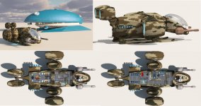
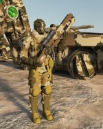
Yup, that's standard. Sometimes I let 5 pages slip by, when it's tables of feats or items, and sometimes there's an illustration with only 2 pages separating - when you have an illustration that corresponds to a specific paragraph of text, it's best to keep the art as close to the text as possible. On my Rules of Engagement supplement for Starfinder, I got inspired by "colonial marines" so I created about 15 illustrations before I even started writing the supplement - Colonial Marines was a major part of it, though the rules focused on allowing starships and planetary fortifications to attack each other which doesn't work in RAW. (Don't worry, I'm not plugging my art - I only create maps for others, nothing else)
 

Attachments

  • hermes-marathon-composite.jpg
    hermes-marathon-composite.jpg
    822.2 KB · Views: 81
  • marine-standard-kit.jpg
    marine-standard-kit.jpg
    1.4 MB · Views: 82
Last edited:

I'll ditto maps. If they're going to be there in a RPG book, they should be highly legible and capture the theme of the setting. If a map is low quality I'll sometimes recreate in Campaign Cartographer, but I'd rather not have to bother with that time sink. Other than that, the bestiary would be my next category of art where I like good quality.
 

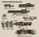
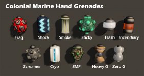
I often don't really notice when art is put at the right place, but I notice when it is lacking. One thing that irritates me is when a TTRPG book has a list of equipment (especially weapons) and only has art for a portion of them. This is even more frustrating when it's not your usual Broadsword but a Spinning Multi-Phase Rifle. I want to see what it looks like.
 

I often don't really notice when art is put at the right place, but I notice when it is lacking. One thing that irritates me is when a TTRPG book has a list of equipment (especially weapons) and only has art for a portion of them. This is even more frustrating when it's not your usual Broadsword but a Spinning Multi-Phase Rifle. I want to see what it looks like.
Like this? ;)
 

Attachments

  • marine-weapons.jpg
    marine-weapons.jpg
    510.4 KB · Views: 95
  • grenades.jpg
    grenades.jpg
    246.7 KB · Views: 92


Like this? ;)
Hopefully better. Those look like the gear in the first XCOM game.

Which brings up a point: if there are going to be depictions of weapons, use an artist who has actually seen a firearm. I've seen far too many examples that look like pastel-colored DeWalt tools or paintball markers. Ergonomics is critical to weapon design, and weapons should not have glowing panels or bright colors.
 

So if you have a budget for art and you want to split up between
  • cover
  • character classes
  • character races
  • monsters
  • miscellaneous throughout the book
  • etc

Of course the cover is the most important, but apart from that where would you put Color vs Black & White vs not necessary?

Does every class and every race need a color drawing? Can you get away with just black and white drawings for monsters?

How would you split it up?
Maps, character archetypes, and illustrations of rules.
Preferably with unity of style.
 

So if you have a budget for art and you want to split up between
  • cover
  • character classes
  • character races
  • monsters
  • miscellaneous throughout the book
  • etc

Of course the cover is the most important, but apart from that where would you put Color vs Black & White vs not necessary?

Does every class and every race need a color drawing? Can you get away with just black and white drawings for monsters?

How would you split it up?
Spaceships, but you didn't give me an option for those!

(I guess you pretty specifically mean a D&D book?)
 

Hopefully better. Those look like the gear in the first XCOM game.

Which brings up a point: if there are going to be depictions of weapons, use an artist who has actually seen a firearm. I've seen far too many examples that look like pastel-colored DeWalt tools or paintball markers. Ergonomics is critical to weapon design, and weapons should not have glowing panels or bright colors.
I was in the US Army, I think I think I've seen weapons before. And I don't pay for art, so if you can find somebody to do this better for me, for free, send them over, otherwise, I'm just happy that include content that other designers always forget to include!
 

Into the Woods

Remove ads

Top