D&D (2024) More Dragon Redesign Clues

I don't like them all, but I also don't think the are distinctly inferior. Here are my thoughts on the dragon we have seen vs the 3e+ versions of them.

Red: not much difference, but I think the new concept art is a slight improvement or perhaps equal but different. But the 3e+ design was the best D&D dragon design of that era IMO. I like to move to make it more "dragon-like" and less horse-like. I also prefer the longer tail, it was to short in the 3e+ design for me.
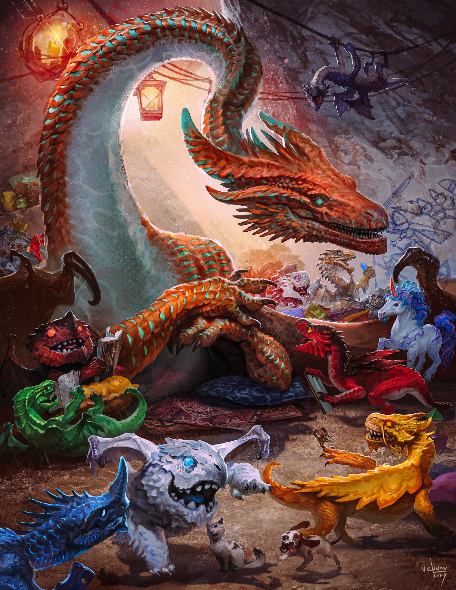
The red is the only chromatic I'm (very, very slightly) more positive than negative on. I preferred the overall look of the old one, but I recognize that there are elements that are an improvement. The wing silhouette and the longer tail both do it a service. I agree with your stated criticism elsewhere, that the new one is really weirdly chonky in several places, while being sleek in others--it's like they couldn't decide whether to make it hefty or svelte and ended up making it kind of both.

Blue: new art, though I am not sure I like it, is an improvement IMO. the 3e era blue strayed to much from the original IMO and I never liked the stocky proportions (for a blue) or semi-skeletal head of the 3e+ designs. I prefer the less body-builder design, but it I will wait until we get full look at it.
I definitively dislike it. In fairness, I wasn't exactly fond of the 3e/etc. art. I just think this is worse.

Green: I am undecided if I like it, I would love to see the concept art on this one, but I always felt the green design (3e and before) was somewhat lacking. This new version seems to be distinct and leaning into its poisonous roots (with the cobra-like design). So I think it is an improvement over 3e+, but I am not sure I like it yet.
The weird...under-chin-horns and flat head just don't work for me. Maybe it's the perspective, I dunno, but I just do not like how either of these images look.

Black: Barely changed. However, I think all the subtle changes over the last few years have been improvements to the 3e+ design. I do wish the head would be a little less skull-like, but I prefer the current look to the 3e+ smashed skull design. I like the evolution of the black and think the minor revisions are almost all improvements over the 3e version. I like the more distinct dorsal spines to the traditional frill
I STRONGLY dislike the stupid double-swept horns. The skull-face is an improvement, I'll cop to that, but everything else doesn't do it for me. Especially the xenomorph-style knobs along the spine/tail and the creepy as feck spider-leg-like protrusions on the wings. I have moderate to severe arachnophobia. No spiders please. No spiders ever.

White: Need to see more. I think the 3e+ design was one of the worse changes to the original 1e design. However, I am not sure if the new design is an improvement. It appears to have last the classic mono-fin on the head which I liked. I will wait and see.
I guess I'm kind of the same, since (as you say) we haven't seen much. But it looks...furred? And I'm not about that.

Gold: I am from 1e so I do appreciate a return to a more classic design. However, I thought the 3e+ gold design was a nice synthesis of the 1e version while bringing it up to modern design standards. For me, this is a wash I think. PS - the 3e+ design of the gold was often shown with a tail 2x the length of the body - so that is not new to the 2024 version.
The art you showed has a tail approximately equal to the dragon's body length. Especially since both the neck and the spine are arched in the shown image.

I hate, hate hate hate, the new gold. I cannot stand it. I think it looks horrible. It is, by far, the worst "official" dragon design I've ever seen.

Silver: Appears to be virtually unchanged to me. I feel the 3e+ design of the silver and red were very similar and the best of the chromatic and metallic "traditional" dragon designs. They seem to have kept them both mostly the same, which was a good idea IMO. I think the the 2024 silver is = to the 3e+ design.
I'm genuinely not sure how you can't see the changes, especially given your complaints about the red. It's obviously WAY chonkier, to the point that it has an outright barrel chest; the face is weirdly flattened and widened, and the legs are now squat and wide rather than long and graceful. It looks like a hippopotamus with wings, not a refined and elegant dragon.

Bronze: I think 2024 design is an improvement over the 3e design. It is just more interesting and distinctive to me.
As noted above, this is probably the one I'll have to concede--though this should have been the copper, not the bronze, so I've no idea how they're going to do the copper. Also, this is a tail length that's actually reasonable; the gold's is WELL over 2x the body length, pushing 3x. (Having just checked myself, the tail is almost exactly 2.5x the length of the gold dragon's chin-to-hamstring length when stretched straight.)
 

log in or register to remove this ad

It's hard for me to articulate. I guess with the red: I don't like the changes to the snout, the horns, the scales, the tail, the weird chonkiness it has in some places. The previous version is much sleeker.

There are some in Fizban's that I didn't particularly like (the deep dragon is goofily ugly and the topaz dragon has those weird backwards wings that just look nonsensical), but overall I am happy with the OG 5e dragons.

This red dragon looks so much better to me than either the new one or the original 3e one.

1718888170990.png
I do think this one is better than the original 3e, but it is really not a design change IMO, just a artist style change. You already see some of that in the 2024 designs too (artists with slightly different looks).

So this art may be my favorite red red (though I hate the chin horns), but I like the more animalistic / reptile design of the new reference / concept red.
 

I'm genuinely not sure how you can't see the changes, especially given your complaints about the red. It's obviously WAY chonkier, to the point that it has an outright barrel chest; the face is weirdly flattened and widened, and the legs are now squat and wide rather than long and graceful. It looks like a hippopotamus with wings, not a refined and elegant dragon.
We have only seen this one image of the silver. As of right now it could be artist stylistic differences IMO.

Using the red as an example: the concept art differs quite a bit from the red head on the Tiamat image. They are both the 2024 design, but they differ quite a bit. That is each artist interpretation.

What I see right from the silver now looks basically the same and until I see more references I can't determine what is a reference change and what is an artist's style.

Also, I wouldn't call the 3e silver refined and elegant - it looks really top heavy and unbalanced in the image I provided.
We'll just have to agree to disagree on the silver then.

How about the issue with bronze vs copper? Because that "bronze" dragon clearly has copper patina on it.
 

We'll just have to agree to disagree on the silver then.
What are we disagreeing on? I have stated that I am unsure if the image in the PHB is indicative of the new style guide or artist preference. Do you feel you have a definitive answer to that questions?

Personally I am reserving judgment until I see the new core MM.
How about the issue with bronze vs copper? Because that "bronze" dragon clearly has copper patina on it.
It breathes lightning, its a bronze. If the color is wrong in the concept art I assume it will be corrected for the MM. It is not a design issue as far as I'm concerned.
 

How about the issue with bronze vs copper? Because that "bronze" dragon clearly has copper patina on it.
Bronze will also form that same type of patina as it tarnishes, which makes sense as bronze is a copper alloy. Heck, I’d expect the Bronze Dragon to have more patina then the Copper Dragon due to the Bronze Dragon’s exposure to rough water and storms in its natural environment.
 

What are we disagreeing on? I have stated that I am unsure if the image in the PHB is indicative of the new style guide or artist preference. Do you feel you have a definitive answer to that questions?

Personally I am reserving judgment until I see the new core MM.
The old one. I find it quite elegant.

It breathes lightning, its a bronze. If the color is wrong in the concept art I assume it will be corrected for the MM. It is not a design issue as far as I'm concerned.
Yes, I'm aware that it IS a bronze. But its patina, as shown in the concept art, is very specifically copper patina. Bronze statues patina differently. The patina on that one looks identical to the patina on the Statue of Liberty, which was clad in copper (and was, originally, extremely shiny.)

The patina of bronze is almost always either a dull brown or a dark brownish green. It is essentially never that bright turquoise-blue color shown in the image.

Bronze will also form that same type of patina as it tarnishes, which makes sense as bronze is a copper alloy. Heck, I’d expect the Bronze Dragon to have more patina then the Copper Dragon due to the Bronze Dragon’s exposure to rough water and storms in its natural environment.
See above. The distinctly blue-green hue is copper. Bronze, because of its alloy materials (tin, in the case of bronze), darkens more heavily and has much more brown in its patina. It still forms a patina, no question, but the most you'll get out of it is a very dark green, such as seen here. The "verdigris" color, like that seen on the Statue of Liberty, is definitely not bronze. Furthermore, bronze in its natural state is supposed to look like gold. The dragon shown there is VERY clearly copper-colored, with a distinctly red hue. That's part of what makes it pop so much; the orangey-red of copper is nearly exactly opposite the cyan color of the verdigris patina that copper develops.
 

The old one. I find it quite elegant.
The 3e silver is one of my favorite D&D dragons, but I wouldn't call it elegant. On the other hand, I would call the new 2024 gold design elegant. Different people, different ideas of "elegance!"
Yes, I'm aware that it IS a bronze. But its patina, as shown in the concept art, is very specifically copper patina. Bronze statues patina differently. The patina on that one looks identical to the patina on the Statue of Liberty, which was clad in copper (and was, originally, extremely shiny.)
I am an architect and quite familiar with how bronze and copper patina differently.

My point was that I can look past that mistake when I am considering the design. It is a color issue, not a design issue IMO. I assume they will get it correct in the MM.


Remove ads

Top