So I wonder what colors I'm missing.
In the right paint program, you can see all the combinations of the RGB color code (3 integer values ranging from 0-255 each in any combination).
It certainly LOOKS like all the colors.
Whats missing from it (aside from variant colors like a lighter than off-blue in my crayon case because I needed to have blue=12.5, etc). Anything specific (like brown?)
Unfortunately it's a bit tricky to describe, and as you can imagine, effectively impossible to show you since your monitor has the limits.
This Wikipedia bit explains the basics.
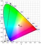
The image that Cor Azer posted is one way of showing it. The colors outside the triangle all look like the colors inside it, which is the point: they'd look different if they could.
---
The human eye is the other limitation. The short, medium, and long cones in our eyes respond best to certain colors and not well to others. We're told in junior high school (or so) that the short ones respond to blue, the medium to green, and the long to red, but it's more like this (the peaks are where those S, M, and L cones are most sensitive):
As you can imagine, it's very difficult to discern subtle differences between colors outside of those areas, though it's further complicated by both the clever tricks and limitations of our brains' processing.
That, and that light levels have a big effect on what the eye perceives; when there's lots of light and we're looking directly at something we mostly use signals from our cones, but when it's dark or your brain is processing peripheral images it derives most of its information from our rods (of which there's basically one kind). I mocked up an image showing the colors our rods perceive using the pervious Wikimedia image as a base:
When it's dark our cones hardly fire at all, so we can only reasonably discern colors inside that zone. Our brains, though, fill in details for us, making us think we can see things we really can't. For example, if you saw a stop sign at night with very little light it would look red to you, but mostly because you know that stop signs are red; if I made one that was of the appropriate luminance (brightness) but was instead a green outside of your rods' detection zone you'd still think it was red.
My favorite image of all time that shows how your brain tricks you is this one:
The squares labeled A and B
are the exact same color and shade. I had to test it in my image editor before believing it. You can see the same brain trick in action in this amazing YouTube video:
[ame=http://www.youtube.com/watch?v=z9Sen1HTu5o]Incredible Shade Illusion! - YouTube[/ame]
To sum, our eyes and brains combine to do amazing things that do not accurately reflect reality, though mostly to our benefit.
")