• NOW LIVE! Into the Woods--new character species, eerie monsters, and haunting villains to populate the woodlands of your D&D games.

A Different Kind of Map

The Green Adam

First Post
I love maps. Always have and always will. It's not just the facsination of how maps are created and how they convey information but moreover, what they look like. Maps as art if you will.

Now I've created dozens if not hundreds of maps for my games over the years and looked at twice as many made by others. My frustration has been that while some of my designs have looked fairly good, they've never looked quite the way I have wanted.

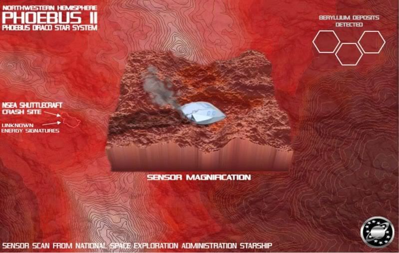
So...I have recently been trying to create a different kind of map. One that conveys the looks of a place to my players but reveals nothing they wouldn't immediately know. The map as art as prop! The image should say 'map' but really be more of a catalyst to make them want to go to the place and do stuff.

So...the first of these is a map from my upcoming Galaxy Quest adventure (a sequel to a very popular one-off game I did a few years ago). I have used a strange hybrid of Fractal Mapper, Campaign Cartographer 2, World Machine and Photoshop. Let me know what you think. If it works I may go pro with it (which would be a nice addition to my freelance art and writing jobs which have been very light of late :\ ).

Here goes...Never Give Up, Never Surrender!


GalaxyQuestSensorScanMap1.jpg


The Green Adam
 

log in or register to remove this ad

Sixty four views and no responses lends me to make me think that either people hate this style of map or have no opinion on it, which I find far more disturbing then having them not like it. So, to this end I will post up one more tonight which is more traditional mixed with a little experimentation. Unless of course someone would like to give me some feedback...

:\

The Green Adam


The Green Adam said:
Sixty four views and no responses lends me to make me think that either people hate this style of map or have no opinion on it, which I find far more disturbing then having them not like it. So, to this end I will post up one more tonight which is more traditional mixed with a little experimentation. Unless of course someone would like to give me some feedback...

:\

The Green Adam


The map is very nice, but I am not sure what I should be looking at. I am sure that at the game table with a firm (or even mild) grip of the game at hand I would better understand it.

Is there a way to give a little more data on what we are looking at?
 

Absolutely Wysten! And thanks for the kind words Raven.

This is crash site of a shuttle in service of the NSEA (the Galaxy Quest version of Starfleet). The vessel had gone missing and the PC starship has finally located it on the surface of the planet Phoebus II.

Looking at the area where the shuttle landed, one can see discoloration on the ground (the shallow, orange, circular craters near the little craft). As noted to the left, this area is giving off mysterious energy readings.

The upper left hand corner of the map shows deposits of Beryllium, a material used to power the PC starship and all other NSEA vessels.

The planet itself is a Mars-like, barren wasteland that is very hot during the daylight hours. The paler pink-to-white areas are the polar ice caps, which as you can see are much smaller then those on Mars.

Why did the shuttle crash? What are those energy readings? Was the shuttle searching for the Beryllium? These are the various factors that went into the map design.
 

I must say I don't like it. I like it as far as art goes, but not as a map. Apart from the contour lines there is nothing 'mappy' about it. What I don't like most is the 'magnified image' taking up the middle of it. Apart from a handout that'd get looked at for all of 2 minutes, it's pointless. How could you use it in-game?...


The Green Adam said:
Let me know what you think.

I like the idea, but the layout as is doesn't quite work. Knowing nothing about anything this all the map tells me... A shuttle crashed. There are odd energy readings. Beryllium deposits have been detected nearby, but I don't know where. Nothing that couldn't be said, and nothing that is really enhanced by the map.

My suggestions...

  1. Reduce the size of the "sensor magnification" slightly, and move it off to a corner of the map.
  2. Highlight the orange spots using "false color energy readings". As is, I couldn't even tell that the those orange spots were something out of the ordinary. Label them as anomalies here, in the inset, rather than on the main map. Perhaps place little random numbers at various spots to indicate the intensity of the energy reading results.
  3. Move the crash site (on the map) to the middle of the map. Indicate the crashed shuttle using some sort of icon (even a hollow circle would be fine), and use a box to delimit the boundaries of the "sensor magnification". Label the crashed shuttle icon as "Automated Transponder Signal Detected: NSEA Shuttlecraft THX-1138" (or whatever serial number you wish to use for the shuttle).
  4. Consider using circles, instead of hexes, to indicate the beryllium deposits, and make certain they aren't in a regular pattern (I thought the hexes were just a pretty design, and ignored them). Like the energy readings, place tiny random numbers next to each circle to indicate the size of each deposit. Maybe connect the "Beryllium Deposits Detected" level to the circles with lines.
 
Last edited:

Ah! There we go...any feedback is good feedback in my opinion. :p

So I can see what your all saying about it not being useful enough as a map as opposed to an artwork handout. Certain elements are there to preserve a look (the hexes and not circles for instance) but I agree it needs to be redesigned to serve as a functional reference.

As for the idea of 'looking at it for a whole two minutes' thing - my players are very visually oriented. They need lots of pictures to help them get the 'feel' of the adventure. Most of them could care less about the distance in inches from the door to the treasure chest, the encumbrance of x amount of gems or the range of one weapon over another. If it sounds reasonable and looks cool they get much more excited. Hence my attempts to make maps you want to keep looking at. I'll try a revision and post a more traditional one later today.

Thanks gang,

The Green Adam
 

My suggestions....

The 'magnified' part of the map looks the coolest, right. It's in the middle - thus the focus.
The magnified part shows the ground terrain in 3D, opposed to the rest which is 2D. I would suggest creating 2 maps of the same scale, one overhead - showing the crash site, anomolies, Bell-whatch'ma'call'it, and what not. This one will clearly show your areas of interest and be used to calc distances and work out travel times etc.

The second map you should do, like I said, to the same scale, but this one in 3D. This is more of asthestics than anything, but could also be used as a more 'tactical map' if the PC's get into any combat situations, allowing them to utilise their surroundings to their advantage.
 

Into the Woods

Remove ads

Top