
Left-handed Hummingbird
First Post
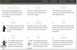
I've made two design suggestions for a new button set matching the boards general color scheme; a button with yellow text and a button with orange text. Please pick the one you prefer so I can proceed.
Thanks.
/LHH
Thanks.
/LHH
Last edited:


")