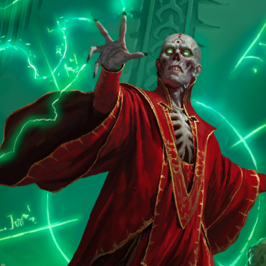
D&D artwork which captures something for you

Henry said:


...and your point is? :) Nostalgia can be a valid part for something that captures the "feel" of something for a person.

Well, as mouseferatu said:

I could name a bunch of examples, but I find it telling that they're almost all from Basic or 1st Edition products.

And I'm basically saying that no, it really isn't that telling because there hasn't been enough time for 3E's style to sink into the gaming subconscious the way Elmore, Easley, Otus et al have. Give it another decade, and then we'll see.

I still remember 1E's artwork, and I remember that on the whole, it was crap. Which is fine, because the artwork wasn't a selling point for the product anyway, but artists like Dave Sutherland III were just laughable. It looked like stuff I might do, and I'm terrible at visual art.

I'll grant that Otus and Dave Trampier had their own distinctive style, but then so do Foglio and that d00d who draws Nodwick. Which makes the comment that the 3E style is too cartoonish rather ironic.

For me, the art that captured D&D was most artwork from Larry Elmore back in the 80's. That feel of "camera snapshot" was very powerful to me. Larry Elmore can draw like a ****** ****er.

The best Elmore pic IMO, and one of the best pieces of D&D art around, is his portrayal of Laurana in "The Death of Sturm". The epitome of the heroic female warrior, without a hint of cheesecake. He pretty much went downhill in the 90s, though.
 

log in or register to remove this ad


One of the first 3e Dragon covers.. the one with undead theme. The picture is just somehow menacing. Something is about to happen...

Also of the newer art; The Gloom in ELHB. Why is it smiling at me? ;)
 

In general, I prefer D&D art that gives a sense of wonder of adventure. That means landscapes, or cityscapes, or other art with lots of potential. I dislike simple portraits.

Good:
2nd Ed DMF: Dungeon. A troll winds up the spool of twine laid down by an adventuring bearded human fighter.

3E Song and Silence: Lidda and Dervis open a treasure chest, but an assassin lurks in the shadows.

Cover of some novel, plus interior art in other books: A city street. A male and female adventurer pass by an alley. A man dressed in shabby noble's clothes entices the female with a pretty necklace. His gnoll partner, armed with two wicked daggers, lurks out of sight just inside the alley entrance.

Cover of Unearthed Arcana.

Any Raistlin painting by Elmore. This violates my general rule of "no simple portraits".

The cover for "Keep on the Borderlands" So simple, so fun.

The cover of the Basic set, and the cover of the Expert set.

Any of the Dark Sun covers.

Most anything by Elmore, especially the Dragonlance calenders. So crisp, so detailed, so lifelike. With realistic arms and armour.

Most anything by DiTerlizzi, especially the character portraits. Very medieval, very personable, kind of like Dirk the Daring.
http://www.diterlizzi.com/whats_new/downloads/pc_portraits/index.html

Bad:
Interior art for sword and fist. What, is this a manga comic book?

3e's buckle and spike fetish.


Ugly:
"Armor" section of PHB. The sorriest, ugliest, most innacurate depiction of armour ever committed to papar in the history of mankind. Compare "half plate" to "full plate" to "breastplate". Notice a difference? Neither do I! And what's with that chainmail? Ugh! Has this artist ever seen or worn a suit of armor? Apparently not.

The cover and interior art for the original monster manual. Looks like it was drawn by somebody's kid brother.
 

there must be something wrong with me -- i'm an "old-guard" D&D gamer, have played just about every incarnation going back 20 years, and i just love the 3e look for D&D. i can't stand anything done by Elmore or Otus. there's no disputing matters of taste.
 

The artwork that Tony Scuzzdo (sp) did for the Birthright setting. Most of the work on that setting was his. The painting for the main box (and DM's screen) was just amazing. It captured the grit of the campaign and the sense of scale within it.

The painting in question detialed a battle between humans and goblins with a castle and high mountains as the backdrop. It's a very busy painting with great detail in the foreground and background. Lots of surprising details. I can still pour over that painting and find new and interesting things happening. It's telling a story, especially in the foreground. Lots of characters visible and active with clear motivations and goals within the moment of combat that they were captured in. Great stuff.
 

And I'm basically saying that no, it really isn't that telling because there hasn't been enough time for 3E's style to sink into the gaming subconscious the way Elmore, Easley, Otus et al have. Give it another decade, and then we'll see.
Although it's more or less psychological artifact that the memory lends a silver lining to the past (if it didn't, I think we'd go insane because if we remember that the past was awful as well, what is there to look forward to :) ), I think there's a difference between artwork that hits you on the head from the get-go, and that which has to "sink in". For instance, out of my list, I'm near certain that the greedy adventurers and the chest from near the treasure tables of the 1E DMG had to "sink in" in order for me to like them. The cover of FR2 Moonshae, on the other hand, I loved from the moment I saw it.

Recently, I've liked the 3E Monster Manual II and the artwork of the brothers Fraim for Hackmaster from word go, even moreso than their older counterparts. This may be nostalgia based on a certain style of monster book and artwork, but done better than the first time around, or it may simply be personal preference for these styles that is being written off as nostalgia.

I think the photoshopped blur around the edges of much of the DMG's interior art, for instance, seems to sap the life out of some of the pictures, which is sad, because the penciled 3E concept artwork looked fantastic, and had a life to it the finished products seem to lack. I think it's like bands who can't recapture the spirit of their demo tape when they end up in the studio. Resultingly, much of that art didn't evoke a "cool" reaction on first sight (although I could see that it was good art)...but the strong black and white contrast in the work of the brothers Fraim certainly did.

Perhaps Fraim artwork and the 3E Monster Manual II represent affirmations or updates of old tastes, and are thus nostalgia from that perspective. It has, however, been over a decade since 2E came out, and not much of that artwork seems to have gained extra cred with age. Most of the 2E Monstrous Compendium artwork still looks functional, but pretty average to me. The splatbooks saw a tonne of use, and I still don't like that interior art. It remains to be seen what 3E art ages gracefully; I'll be betting I still like the bogun picture in the MMII, but still won't like the smokestick-charred Lidda in the PHB...but I can see myself growing nostalgic for the PHB Regdar picture. We will see...
 
Last edited:


Jeff Dee's artwork from the early D&D expert set and some of his AD&D work (in rogues gallery and some modules)

rk post's artwork in planescape and the Dragon.

Andy Brase's work for FFG, especially the female warrior in Path of the Sword

Various of Stephie Law's fantasy pics.

Much of Wayne Reynold's work in 3e. Sorry guys, you guys panning the 3e are smokin somethin' unless you are talking about the books with lots of Cramer and Roach.
 
Last edited:

i guess the main reason why i prefer the older art to the newer art is proportion, and not nostalgia as hong would have us believe.

i like the 3e artwork that maintains human (or demi-human to use the old term) proportions. many of the iconics are good art mostly because they have believable proportions. unfortunately there is a lot of 3e art (especially the art concerning the fighter type classes) that just mocks proportion and is comic book art. A mans forearm is never going to be bigger than his head. ever. Just go a head and give him some bad japanimation hair and a sword thats 8 feet long and two feet wide way dont ya... :)

i know alot of the old art didnt have the best proportions, but i tend to few that from more of a lack of skill than a deliberate choice. :)

I also dont really feel the need for gritty (what i would term more as comic-y art ala Spawn etc.) artwork. I like art that looks like people or crazy monsters. not artwork that looks like a bad dream of some fashion-clothes designer who took to many drugs while watching Alien.

but then again, i really, really like Albrect Durer. :)

joe b.
 

Remove ads

Top