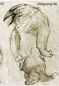
D&D 5E D&D Next Art Column: June! And July!


log in or register to remove this ad


Hussar

Legend
Oh, I'm such a map geek. I LOVE maps.

One thing I don't think I've ever heard anyone bitch about is pretty maps in D&D. Sure, this or that map might not be up to snuff, but, damn, throughout D&D's history there have been some FANTASTIC maps. The Darleen maps of Greyhawk, Forgotten Realms, and all sorts of others just get the juices going. Even the old blue screen of death maps in the old modules were enough to make the 12 year old me sit up and beg for more.

I can't think of any real general issues with D&D cartography. Sometimes this or that map have had issues, but, nothing really jumps to my mind as being a problem.
 

Kaodi

Hero
Maps are teh awesome.

I agree that D&D has had a tonne of great maps over the years. Though I think that if we were to judge them in a slugmatch to the death, it would be harder to tell which style are the best.

For instance, if you take the 3e and 4E versions of the Eberron map, well, I have to say I draw on both (Christ, I just realized the 4E map is actually tilted compared to the 3e one!). I think the 3e one is a little better at drawing you in, while the 4E one is probably better as a description of Khorvaire.

Pathfinder also has awesome maps.

Not sure what to say about maps for 5e. One side of me wants the old school, Tolkien style depictions. Another side is kind of itching for a real Google Khorvaire (or google Faerun) level of detail.
 

Yora

Legend
"Why don't we have both?"

I think this is a case where you can really make use of digitial technology in a useful way.
Inside the printed books, you have limited amount of space on a page and the damand to give the right impression of the world. Since there is only so much information you can get on a given space, would not force it and instead go for "artistic optimation". At the same time, you can have digital maps with variable scale through the use of zoom, which you can combine with different amounts of information at different scales. Since delivering the right artistic impression with the print map, it can also be much more utilitarian, without things that look great but impede the readability of the information.
Either make it a 6000x4000 pixel map or even make a whole digital atlas programm with all kinds of gadgets to enable or disable what kind of information should be displayed.

I love maps and I like statistics, and the most common candidate for the "greatest graph ever made" is also a map. Adding overlays with climate zones, population density, vegetation types, natural resources, and anything else you can imagine would be really terrific. ^^
And maybe even add animations Indiana Jones travel transition shot style, which follow historic events from the setting.
 

Mercutio01

First Post
There was a vector-based pdf map for Eberron put together by someone (I think I found it on the old Jhonen Olain something-or-other website) that was awesome.

Maps are something I've never had a problem with in D&D. I think there are some absolutely awesome cartographers that have work published by WotC.

That said, I think I would very much love to see published digital maps that can be used in VTTs or for tabletop printing on a 1 to 1 scale. I like making my own maps as much as any other amateur cartographer, but sometimes I'd like to not have to do that.
 

Stormonu

Legend
Maps. I love maps.

And that is the one thing that bothers me about the Caves of Chaos maps.

They are accurate, but bland. I think that one reason that former 4E's are crying out that the playtest is so bland are the actual maps of the caves. There's lots of stuff in them, but the maps ... they look like architecture floor plans before someone moves in.

Surely, even the cave's humanoids have furniture and other bits lying around the caves, but we don't get any sense of that in the maps. And it makes it that much harder for the DM to incorporate the interesting terrain into encounters, or sometimes get a sense of what the area really looks like.

Compare those old blue maps to various 4E maps, and you'll see quite a difference - not just in the fancy colors, but the placement of terrain and other features to make the maps interesting.

It's like the difference between the fold-out Rand McNally maps and Google Maps w/ satellite view. The McNally maps will get you where you're going, but the Google maps will give you a sense of what it's like to be there.
 

grimslade

Krampus ate my d20s
The old AD&D module maps have a certain nostalgic flair to them, but they are certainly minimalist. The play test map is the original blue map for KotB, so it gives old skool cred and is art already to go. A new map is more expense than WotC wants for an open play test.
New mods should have updated style detailed maps.

Since WotC loves to sell map tiles, why don't they have a map planner using the map tile art in DDI? There is a subscription I would pay for. Even better if you could print your layout as a dungeon map. Multi-use for cartography art and a tie-in to sell more dungeon tiles for those that want them. World Works Games sells a TerrainLinX planner that shows what is needed to print and build paper terrain. WWG is a small operation I am sure WotC could whip up something similar for their 2D offerings. Plus, I got to mention WWG whose offerings are gorgeous.
 

Stormonu

Legend
Since WotC loves to sell map tiles, why don't they have a map planner using the map tile art in DDI? There is a subscription I would pay for. Even better if you could print your layout as a dungeon map. Multi-use for cartography art and a tie-in to sell more dungeon tiles for those that want them. World Works Games sells a TerrainLinX planner that shows what is needed to print and build paper terrain. WWG is a small operation I am sure WotC could whip up something similar for their 2D offerings. Plus, I got to mention WWG whose offerings are gorgeous.

Actually, buried somewhere on the WotC site IS a map planner that you can build dungeon maps with using map tiles - it could be run in a browser or downloaded. It stopped being officially supported after about the 3rd or 4th map pack was released (back during 3E), but there was a site that had added map packs images for later packs, up until about 4E came out. I lost track of the former web site when my computer crashed recently.

ahh - here's WotC's mapper: Dungeon Tile Mapper v1.2.0
 

Libramarian

Adventurer
My favorite maps are from Karen Wynn Fonstad's The Forgotten Realms Atlas. Nothing makes me want to run a FR game like those maps.

I generally prefer maps that look like they could exist in the game-world. Drawn by hand if possible.

I don't have any particular fondness for the old school blue grid maps or the new school computer generated tile maps. Neither is very evocative, they're just functional. I have never and will never purchase packs of dungeon tiles. Doesn't really add anything, imo.
 

Klaus

First Post
My favorite maps are from Karen Wynn Fonstad's The Forgotten Realms Atlas. Nothing makes me want to run a FR game like those maps.

I generally prefer maps that look like they could exist in the game-world. Drawn by hand if possible.

I don't have any particular fondness for the old school blue grid maps or the new school computer generated tile maps. Neither is very evocative, they're just functional. I have never and will never purchase packs of dungeon tiles. Doesn't really add anything, imo.
Dungeon tiles add a lot, IMHO. Seeing details like ledges or alcoves, the players get immersed in the battlefield. Whenever I use a more detailed physical battlemap (tiles or poster), there is more roleplaying during combat, as the characters begin to react to their surroundings.
 

Hussar

Legend
As someone who plays via virtual tabletop all the time, I can honestly say that pretty maps make or break a session. Sure, I could throw together some very basic skeleton outline - black lines on grid sort of thing - but, having a map that is full of detail and is pretty is such a huge bonus.


GX.Sigma

Adventurer
Great to hear a tiny hint that they're going to be publishing ebooks again.

Very very depressing to think that it'll be a "DRM"-mired abomination of iPad, Kindle, or whatever terrible choice they end up making.

Anyway, I think they should definitely not sacrifice the book cover's quality for the sake of the digital thumbnail. Definitely separate images if necessary. The book's cover needs to be inviting, captivating, dramatic, etc. The digital version doesn't even need a cover.
 

Stormonu

Legend

  • Should the cover design have different versions for brick-and-mortar stores and for digital presentation?


I don't think so, I believe that would only cause confusion over what the customer is getting.


  • Should the use of art change depending upon the sales channel?
Definitely not. I don't want to be trying to figure out if this is the "Walmart collectible cover #3 " or any of those sort of shenanigans. Nor do I want to wondering if version X is an "updated with errata" version or "with bonus content (even if it's alternate art) only available through channel X". I want it clear that what I'm getting is the PHB, DMG or whatever. When my group sits down at a table, all the front covers of the PHB better damn well look the same so I know we've all got the right book.


  • Does a change of cover treatment cause confusion with the buyers?
It can. Covers should be consistent in a given version. D&D has had a history of changing the covers in a given version over time, but I think it'd be a buyers hell if there were many different cover versions available at the same time.


  • Do they notice or care about the differences in a cover from one version of the book to the next?
I'd look back at the sales difference between the PHB's of the original 1E/recovered 1E version, the original 2E/black cover 2E, the 3.0/3.5 version and the 4E/Essentials version. Personally I don't care if the cover changes, as long as it looks "good". In fact, personally I didn't buy the original 1E DMG because the cover made me uncomfortable. I liked the recovered 1E version better (the one with the "DM" opening the doors).


  • Does the role of the cover have a different purpose to the consumer in the different mediums, or it simply a business issue?
To me, it's a business issue - a lavish cover doesn't make me drool and increase my desire to have a book, but a simple cover (say a title on a faux leather background) for a digital book screams to me "I'm trying to be cheap!"


  • Should a digital cover try to look like a book cover on the virtual bookshelf, or is that an antiquated concept
3E tried to make it's cover look like reference books - and they were actually just god-awful ugly. I imagine the same is true of a digital cover trying to emulate a book cover. What is needed is something that is clear and legible, not necessarily an attempt to replicate what it is not. If the artwork is going to be so tiny as to be a pixelated mess, simplify it where possible.


Hussar

Legend
Gonna go point by point as well.

Should the cover design have different versions for brick-and-mortar stores and for digital presentation?[/quote

Yes, of course. You cannot have the same cover, it simply doesn't work. For one, again, you're looking a much smaller thing to read on - Iphone for example. So, if you look at a, say, 3.5 PHB, or, even worse, a 4e PHB, that's not going to work in a titchy little image. Different mediums require different presentations.

Should the use of art change depending upon the sales channel?

Abso-freaking-lutely. Tables don't work on a smaller e-reader like a smart phone. They just don't. I don't want big honking pictures in my ebook - I don't want any pictures at all. They serve little to no purpose and make reading very difficult. Also, the layout of the book MUST be different. Three columns DON'T WORK on e-readers.

Does a change of cover treatment cause confusion with the buyers?

Possibly, but, we're talking about different venues here. If I'm looking for, say, a Monster Manual, I'm probably not going to buy the books cold. I'm already going to know what a Monster Manual is. And, if the e-retailer site is up to snuff, it should explain exactly what I'm buying anyway. I mean, look at novels. How many covers are there for, say, Harry Potter novels? I know of at least half a dozen for each novel - all targetted at different audiences. And the e-versions are also different as well.

Do they notice or care about the differences in a cover from one version of the book to the next?
I'm not sure what this means honestly? You mean, like Monster Manual 1 or 2, or do you mean an electronic vs print version?

Does the role of the cover have a different purpose to the consumer in the different mediums, or it simply a business issue?

Again, absolutely. A print book's cover is there to attract your eye. You're looking at that wall of books, and a cool cover brings people over to look at it. Plus, having a last name begin with H or thereabouts usually puts your book at eye level in most book stores. :D But, an Ebook buyer probably already has some idea about what he or she is looking for. Sure, people "browse" e-retailers, but, I think it's much more likely that you get people who are hitting certain author's or related works. That sort of thing.

Should a digital cover try to look like a book cover on the virtual bookshelf, or is that an antiquated concept?

I have tried pretty much every e-reader program for the Iphone/Ipad. The I-reader app blows chunks. The absolute best one is Stanza. Which doesn't have a "virtual bookshelf" per se. It shows the little cover images down the left with the book titles in big letters in the right. Works great. My opinion would be no, but, then again, Kindle and Apple would disagree with me, so, hey, they probably know better than me.
 

Klaus

First Post
Should the cover design have different versions for brick-and-mortar stores and for digital presentation?

Yes. Take, for instance, the 1e PHB (ruby-in-the-eye idol cover). The physical book can use the whole image, etc, but a digital copy would be better off as a close-up of the idol's head, with the thieves trying to pry out the eye, and a shortened version of the title.

Should the use of art change depending upon the sales channel?

To an extent, yes. While you want the digital version to load quick, you also want both versions of the book to equally navigable. Art, in this context, is used as "bookmarks" that help break the wall of text.

Does a change of cover treatment cause confusion with the buyers?

Only if the treatments are radically different. Otherwise, small variations to mark "digital version", "print version", etc, are okay.

Do they notice or care about the differences in a cover from one version of the book to the next?

Some will notice, some will not.

Does the role of the cover have a different purpose to the consumer in the different mediums, or it simply a business issue?

An e-book's cover will never match a print cover in the "details that drag you in" department. Compare LP and CD covers, which went through a similar process.

Should a digital cover try to look like a book cover on the virtual bookshelf, or is that an antiquated concept?

Since I never experienced a virtual bookshelf, I'll refrain from answering this.
 

Mercutio01

First Post
Will the virtual bookcase use larger images? Will animated images come into play? (Egad, I hope not! Can you imagine a browser page full of animated covers?)
Not to mention e-readers like the Nook and the Kindle can't really do animated anyway.

In the world of print, the cover plays a major part in the buying process
This is my major beef with shopping digitally. I consume most of my books digitally now, but I tend to shop physically at the bookstore, figure out what I want, and then go home and purchase it on my Nook or Kindle. I hate shopping at Amazon.com. I frequently pick books up in the book store, read the back text, look at the cover, and thumb through the inside skimming a few pages here and there before I make a decision.

Should the cover design have different versions for brick-and-mortar stores and for digital presentation?
No. I think that feels gimmicky and sort of shady. Even if it's not done just to trick people into buying the same book twice or to nail completists, it will have that effect. Although I haven't yet bought one myself, I have several times received books I've already owned because covers changed.

Does a change of cover treatment cause confusion with the buyers?
It has in the past for some people.

Do they notice or care about the differences in a cover from one version of the book to the next?
I tend to notice. I even make comments like "They changed the covers of X title again." Has happened frequently with Redwall books, for instance.

Should a digital cover try to look like a book cover on the virtual bookshelf, or is that an antiquated concept?
On my virtual bookshelf is a different concept than on Amazon's digital bookstore. I don't really care for the cover once I've purchased a book, to be honest.
 

I'm A Banana

Potassium-Rich
Things should be designed for their medium. What this means about e-books I'm not so sure, since iPads and suchlike are luxuries for me, but I do know that those design requirements will be different than what you can do on paper. It's not a direct 1-to-1 translation. Just using PDF files, things like bookmarking and OCRing makes the world a much better place. Cover-design wise, I think the cover should be recognizable and iconic across media, so that if someone sees the cover for THE PLAYER'S HANDBOOK or whatever they can recognize it. But the design is probably subtly different.


Epic Threats

An Advertisement

Advertisement4

Top