Do you like Wayne "WAR" Reynolds?

What do you think of Wayne Reynolds's D&D artwork


Hey all! :)

Wayne Reynolds is arguably the most iconic artist of this era.

Hes also pretty much my favourite D&D artist ever. I'm still waiting to see an illustration by him that I dislike.
 

log in or register to remove this ad

When he is great he is one of the very best.
But when he misses it is a major whiff.

Kinda a Babe Ruth of D&D Art.

In particular I find that he is a poor choice for "standard" humanoids. But the more bizzare or extreme the subject the more it clicks with his style.
 

mhacdebhandia said:
There really needs to be some sort of button I can press to make knives sprout from the keyboards of people who make ridiculous comparisons like this.

You cannot find me a single anime or manga image that actually looks anything like Wayne Reynolds's work, because there are no points of comparison.

His use of colour is completely different. His anatomy, while exaggerated (no point denying it!) is exaggerated in completely different ways. His use of shadows and highlights is completely different. Reynolds's work is extremely stylised, but the way in which it is stylised is worlds apart from any anime or manga artist.

The only real comparison is that both often depict very physical, over-the-top action, but that's a matter of subject not style.

Again, knives from the keyboard. It's just so infuriating to see someone say such silly things!

Wow, sensitive much? The proof is in the pudding- I point to the most recent and blatant offender, Seoni:


That illustration looks almost exactly like many characters in anime- as do many of his other illustrations to me. The exaggerated anatomy, rodent-like faces, overlarge eyes, oversized armor and weapons, and EXTREME action poses, spiky hair, and general style strike me very much as anime. You're free to your own opinion of course, but at least respect my opinion as well rather than having a fit of geek-rage.
 

Attachments

  • Pathfinder2_Sorceress03.jpg
    Pathfinder2_Sorceress03.jpg
    188 KB · Views: 182

Like I said, actually nothing like anime. Wayne Reynolds uses a different style of exaggerated anatomy, different shading - soft blending from light to dark as opposed to the typical hard delineation of darkened colour found in colour anime and manga artwork - et cetera, et cetera. Wayne's style of drawing faces is not realistic - he obviously doesn't work from life models like Clyde Caldwell and Larry Elmore, for instance - but it's also distinctively different from the typical exaggerations and stylisations of Japanese comic art.

Wayne Reynolds' real artistic heritage is in British comic book art, and everything about his exaggerated anatomy and physicalised, over-the-top action suggests his actual working history on comics like Slaine and Judge Dredd in the 2000 AD line, as well as Games Workshop's Warhammer and Warhammer 40,000 wargame illustrations - as far as I know, he hadn't worked for Games Workshop before Black Industries put out Warhammer Fantasy Roleplay Second Edition, but I personally see some similarities.

If you want to draw a comparison between Wayne's work and over-the-top comic-book action, you're looking to the wrong island when you look to Japan. I really advise you to learn something about the broader field of art than your kneejerk assumptions based on the current grognard "talking points".

Half of your complaints are about subject, not style or technique, and thus mean nothing - there's crazy over-the-top Dragonball Z-style action in anime and manga, but there's also completely different subjects like those found in Spirited Away or Grave of the Fireflies. Likewise, there's Wayne Reynolds-style over-the-top action to be found in Western comic book and fantasy art alongside more painterly, classical work from the likes of Elmore or Alex Ross.

"Anime" does not mean "exaggerated", or "oversized", or "extreme". The actual techniques and stylistic elements of anime and manga - you know, the things which actually define the common, underlying artistic STYLE of Japanese comics and animation - are absent from Wayne Reynolds' work.

Don't mistake subject for style. Don't mistake superficial resemblances based on ignorant opinions for meaningful similarities.


Well, I didn't actually vote because there wasn't a choice for me (I've not seen enough of his stuff to determine if I like his work or not).


All artists attract criticism and praise. Generally, more talented artists and illustrators with a more distinctive style attract greater volumes of both. A good example of this is Tony DiTerlizzi, an artist who many regard as brilliant, and who has forged a successful career for himself outside of gaming with The Spiderwick Chronicles, demonstrating that his art clearly has a broad appeal. However, when he worked on the Planescape books and other TSR products (I first remember his art in the '93 Monstrous Manual - it totally blew me away), he attracted a large amount of criticism and people saying things like "I wish they'd gotten [fill in typical late-'80s TSR artist] to do this!". Some of my first "debates" on the internet were over DiTerlizzi's work (which I defended with the vigour of youth, I can assure you).

WAR gives me a bit of a taste of what it's like to be on the other side.

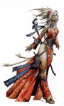
I don't like WAR's work. It's not that I hate it, either. I just don't enjoy it, and almost every time I see a piece I think "I wish [insert Brom/DiTerlizzi/Lockwood/"Sam Wood"] had done that instead...", especially covers. I just find it doesn't suit my general aesthetic sense. His limbs are too curved, heads too pointy, the mouths he draws look wierd to me, and so on.

Yet, I understand, now, at least, after artistic training myself (which I hadn't had a lot of back in '93-94), and from being on the exact other side of this, that none of this makes him a bad artist, and in the end, I managed to put up with Easley's art in 2E for a decade, so I'm pretty sure I can deal with WAR's for another few years.

Hey, maybe it's just familiarity, but I'm even beginning to like some of his pieces. The new Monstrous Manual cover looks fantastic, as does the DMG cover (though ironically I hear they're the ones not finalised, so there's still time to make them so ugly I sigh every time I see them WotC! Again, I dealt with than in 2E and 2E Revised so...). The PHB looks 'orrible, but then again, I hate "sexplate" with a burning passion, so I'm biased.
 

His Games Workshop/Warhammer roots show through too much sometimes, especially in his rendering of Dwarves, 'Stubby Swords' and other exaggerated proportions with regards to weaponry. Some of his stuff is really good and some of it is just 'blergh'. That said, I like that Wizards are moving towards a grittier Warhammer style of art, I just wish they would use more sensible proportions and steer clear of the "Waaagggh da Orcs!" mentality.

[Edit]
Wait a sec, I'm getting confused with Wayne England, oh well...
 
Last edited:

Remove ads

Top