I just don't I am ever going to get used to that style of art for D&D, because I find this a lot more evocative, despite (if not because of) its primitivism:
Nostalgia coud be part of it I guess, but mostly it is because the cover I attached before has something happening. There is a story before it and a story after that you can imagine. Sneaking in. . . the harrowing escape. . . I can imagine what the place is and what the adventure might be like. . . Thus what I mean by evocative.
These new covers are very static to me. What is happening there? Where is the sense of adventure that should attractst the mind's eye as much as the physical eye?
Personally, I think all the covers look great. This is a new and different edition of D&D. So, I guess the artwork should be somewhat new and different, right?
Art for all of the covers has a kind of murkiness to it that makes it seem dark to me. The color palette is very cool (yes, even the reds), and seems to lack saturation. Perhaps it was done to convey a feeling of being underground in a cavern.
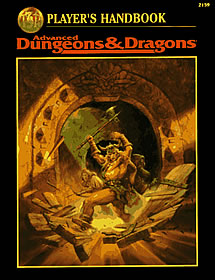
I feel the proportions are off on the dragonborn from the PHB cover. His forearm is longer than his lower leg, and his legs in general look too short. His eyes are too small, which is part of why it's hard to read any expression on his face. And he needs a tail. The wizard is typical, but not inspired (her fire spell looks good). She's wearing the usual cleavage and midriff revealing clothes that look totally unsuitable for dungeon crawling.
Perhaps there's an invisible "Force Shield of Décolletage" that goes along with her armor. It's the D&D version of safe sex. Want to attract the eye of every man (and some women) in town with your daring cleavage and bared belly while still maintaining a modicum of protection from orc crossbow bolts? Our new Force Shield offers that and more! It will also prevent you from bouncing right out of your bustier whether you're slinging spells, climbing a wall, or tactically shifting past your enemies. For a modest additional fee, a simple cantrip can be added to keep you warm in those dank caverns you'll be exploring. No more being forced to choose between a warm woolen shirt, and tempting the paladin to forsake his vow of chastity –now with the Force Shield of Décolletage you can have it all!
As I started playing RPGs around 1999/2000, I know D&D since 3E, not before that. So there is no nostalgia in me in that picture.
I like the idea of the picture. I like that there are several adventures, and seeing them looting is funny, in a way. But art-wise, I don't like the picture. It's a little to plain and simple for my taste.
Personally, I am fine with the art for the 4E books, though I think there could have been more compelling motives - a full band of adventures should be in focus, not just two of them. But art-wise, they look very good to me.


") now with the Force Shield of Décolletage you can have it all!
now with the Force Shield of Décolletage you can have it all!