You are using an out of date browser. It may not display this or other websites correctly.
You should upgrade or use an alternative browser.
You should upgrade or use an alternative browser.
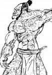
I decided to start drawing again.....
- Thread starter LGodamus
- Start date
ThoughtBubble
First Post
On the initial and final images, you may want to consider removing a few of the lines, some of them seem out of place. The overall result looks a bit cluttered. I'm reverencing some of the lines in the Ogre's neck, and the wizard's cape.
I'd also suggest a litle more time/attention on defining some of the underlying shapes, ie: the shape of the face, shoulder and bicep.
And really, they would look better if you cleaned them up a little.
I'd also suggest a litle more time/attention on defining some of the underlying shapes, ie: the shape of the face, shoulder and bicep.
And really, they would look better if you cleaned them up a little.
Similar Threads
- Replies
- 13
- Views
- 3K
- Replies
- 13
- Views
- 3K
- Replies
- 0
- Views
- 7K
- Replies
- 520
- Views
- 42K
Recent & Upcoming Releases
-
June 16 2026 -
June 16 2026 -
September 16 2026 
Arcana Unleashed(Dungeons & Dragons)
Rulebook featuring "high magic" options, including a host of new spells.
Replies (250) -
September 16 2026 -
October 1 2026 -
October 6 2026 -
January 1 2027 -
January 1 2027


