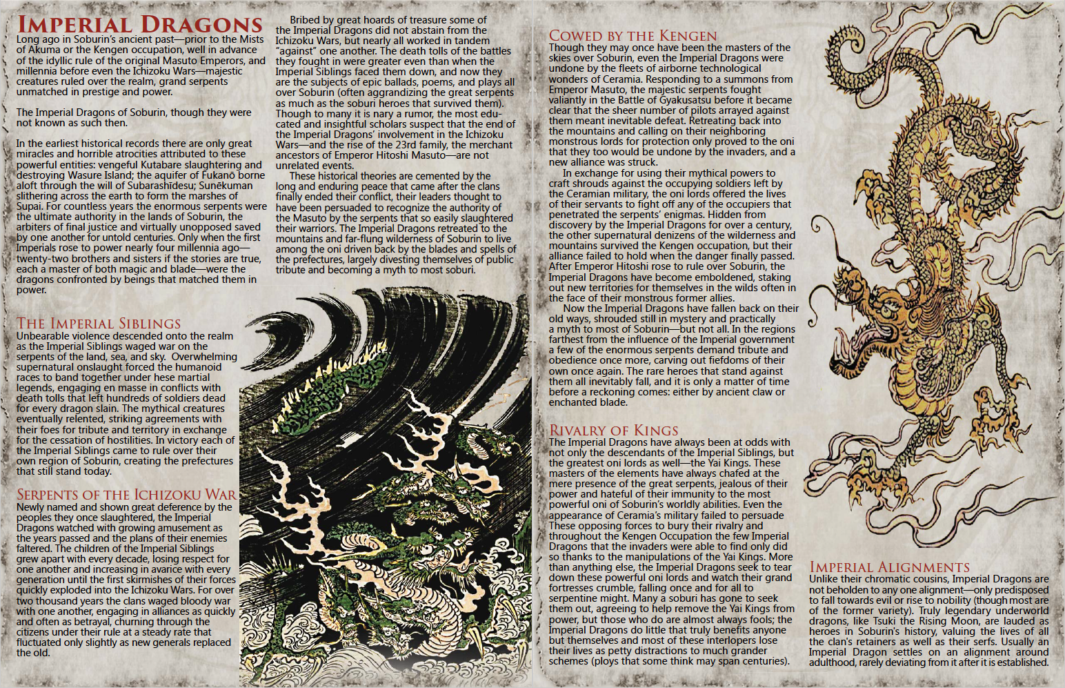
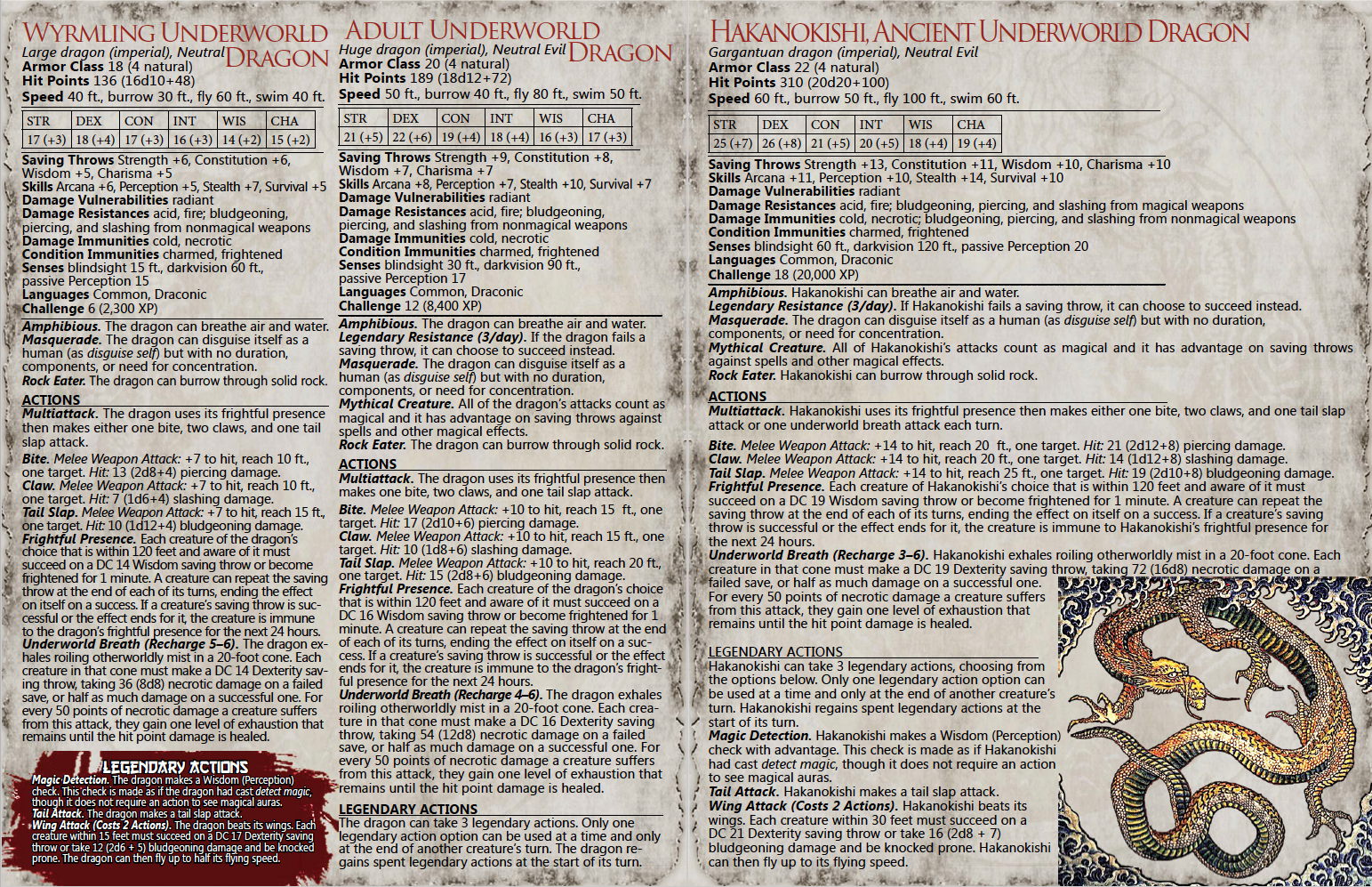
A couple of weeks ago, I shared a preview of Mists of Akuma, the Eastern Fantasy Noir Steampunk setting for D&D 5th Edition coming soon from Storm Bunny Studios. That preview showcased a bunch of feats from the setting. The preview I have today is all about dragons - giant snakelike Imperial eastern style dragons! We have the Hakanokishi (man, autocorrect does not like that word!), and underworld dragon, in its wyrmling, adult, and ancient forms. The Kickstarter for this 5E setting is coming soon, so be sure to check out the previous preview. I have a couple more to share between now and then!


You are using an out of date browser. It may not display this or other websites correctly.
You should upgrade or use an alternative browser.
You should upgrade or use an alternative browser.
Imperial Dragons of Eastern Fantasy; 5E's Mists of Akuma Setting Preview
- Thread starter Morrus
- Start date
A couple of weeks ago, I shared a preview of Mists of Akuma, the Eastern Fantasy Noir Steampunk setting for D&D 5th Edition coming soon from Storm Bunny Studios. That preview showcased a bunch of feats from the setting. The preview I have today is all about dragons - giant snakelike Imperial eastern style dragons! We have the Hakanokishi (man, autocorrect does not like that word!), and underworld dragon, in its wyrmling, adult, and ancient forms. The Kickstarter for this 5E setting is coming soon, so be sure to check out the previous preview. I have a couple more to share between now and then!

Morrus is the owner of EN World and EN Publishing, creator of the ENnies, creator of the What's OLD is NEW (WOIN), Simply6, and Awfully Cheerful Engine game systems, publisher of Level Up: Advanced 5th Edition, and co-host of the weekly Morrus' Unofficial Tabletop RPG Talk podcast. He has been a game publisher and RPG community administrator for over 20 years, and has been reporting on TTRPG and D&D news for over two decades. He is also on the socials.
Grimjack99
First Post
Ditto!
turkeygiant
First Post
Im really intrigued by this setting but man these layouts are dark and dense. I find myself getting really picky with layouts these days when I see more and more small publishers investing in that element of the project. When the layouts seem thrown together or clumsy thats a big turn off because I know it can be done better even on small projects.
Mike Myler
Grand Vizier of the Googly Mooglies
Fergurg said:The more I see of this setting, the better it looks.
^_^ There's a ton of awesome still on the way so keep checking in on EN World to see what's coming down the line.Grimjack99 said:Ditto!
The Kickstarter launches Friday April 29th!
Im really intrigued by this setting but man these layouts are dark and dense. I find myself getting really picky with layouts these days when I see more and more small publishers investing in that element of the project. When the layouts seem thrown together or clumsy thats a big turn off because I know it can be done better even on small projects.
Thank you! I think Mists of Akuma might be my most intriguing setting yet!
The layouts in the free, promotional PDFs are limited by two things:
1) How many viable pieces of artwork I can dig up and use.
2) The amount of time I can devote to free work.
One of the main things we're gathering funds for is to pay for layout (IE: give me realistic amounts of time to lay out the book as opposed to what I can squeeze into my schedule) so the final Mists of Akuma campaign setting will look much more elegant and have more negative space. Not only because I'll have a proper amount of time to finesse it, but also because we'll have a proper art schedule with custom art orders! Eeeee!
I hear you though but no worries -- we are looking at that aspect of the project with a keen eye, there just aren't enough resources at our disposal now to make it what we want it to be. That's why we're Kickstarting it!
View attachment 76167
turkeygiant
First Post
Oh I didnt realize these were draft pages, I thought they were just excerpts.
Mike Myler
Grand Vizier of the Googly Mooglies
Oh I didnt realize these were draft pages, I thought they were just excerpts.
No worries! Your point was valid either way and I imagine that you weren't the only person thinking it.
If things go as well as I'm hoping they will we'll have a very, very big book with custom artwork (all the images you see here are literally from ancient Japan but my goal is to get enough funds for original illustrations by modern artists so we can maintain a visual theme throughout) and I'll have more than ten minutes to put together each page.
turkeygiant
First Post
No worries! Your point was valid either way and I imagine that you weren't the only person thinking it.
If things go as well as I'm hoping they will we'll have a very, very big book with custom artwork (all the images you see here are literally from ancient Japan but my goal is to get enough funds for original illustrations by modern artists so we can maintain a visual theme throughout) and I'll have more than ten minutes to put together each page.
That is fantastic! The whole concept of "maintaining a visual theme" is something a lot of publishers don't give enough weight to, the one thing that really stands out to me from big publishers like WotC, Fantasy Flight, and Paizo isn't so much the quality of their art but rather the commitment to having a consistent aesthetic style. But smaller publishers can do the same thing, games like Symbaroum, Numenara, and The One Ring all have this consistency that speaks towards a real care for for the property.
One of my most recent disappointments was the third edition of Exalted, the book has a great deal of art and even funded extra art with stretch goals, but more art doesn't necessarily mean more GOOD or APPROPRIATE art. They really lost out on the opportunity of setting up a real aesthetic for the game line going forward in this new edition. Far to much of the art was either vague and generic, detached from the flavour of the text, or in odd 3D poser art or cartoonish styles that stuck out like a sore thumb in contrast to the rest of the book. This was actually a step backwards from the previous edition core book, whose art may have been more modest overall, but struck a much more definitive aesthetic.
Mike Myler
Grand Vizier of the Googly Mooglies
That is fantastic! The whole concept of "maintaining a visual theme" is something a lot of publishers don't give enough weight to, the one thing that really stands out to me from big publishers like WotC, Fantasy Flight, and Paizo isn't so much the quality of their art but rather the commitment to having a consistent aesthetic style. But smaller publishers can do the same thing, games like Symbaroum, Numenara, and The One Ring all have this consistency that speaks towards a real care for for the property.
One of my most recent disappointments was the third edition of Exalted, the book has a great deal of art and even funded extra art with stretch goals, but more art doesn't necessarily mean more GOOD or APPROPRIATE art. They really lost out on the opportunity of setting up a real aesthetic for the game line going forward in this new edition. Far to much of the art was either vague and generic, detached from the flavour of the text, or in odd 3D poser art or cartoonish styles that stuck out like a sore thumb in contrast to the rest of the book. This was actually a step backwards from the previous edition core book, whose art may have been more modest overall, but struck a much more definitive aesthetic.
If you can afford the Lord of the Ring license or have half a million dollars to do it, it's a crying shame not to see a strong art theme in your RPG book. If I can get the sort of funding Symbaroum got, there will definitely be totally killer artwork throughout all of Mists of Akuma!
The whole model of tabletop publishing has transformed considerably over the past decade and while the industry has become far more accessible (which is a good thing) thanks to the internet (read: publishing tools, resources marketplaces (stock art, page templates, etc.), and crowdfunding), it also ends up sending production values way topsy-turvy. Before a publisher looking for artwork to put in a book pretty much had to have some serious capital around to pay for that right out -- now they can go to a website and drop a fraction of that to get (sometimes very good) stock illustrations. That cuts down production costs but it also cuts down prices; when prices get hit across the board, that comes back around to knock down capital for projects.
I think that's why you're seeing those sorts of things happen, though I didn't even get that far with Exalted (recent doings on their part put them right out of my reading bin -- I wouldn't be surprised if somebody in their art department decided to look for greener pastures around then).
Morrus and Green Ronin use art studios (collections of artists that band together as opposed to a team of freelancers) and that definitely works like a charm -- but they had considerable capital to do that. If you don't have the funds to budget original artwork for an entire book, you're in a rough spot indeed!
In Veranthea Codex we had different artists for different continents and the library of stock art available to RGG was enormous, but the whole concept there was a radical mixup of settings (and reports so far are that we nailed it
That said, I really want to have a strong, consistent theme to the artwork in Mists of Akuma.
We did a two hour discussion and blind art corral between the designers to figure out which of the applying artists were up to snuff, and in the commission e-mails I made it clear to all the prospective illustrators that they'll be working to emulate a Lead Artist specifically so I can get a solid visual theme throughout the final book.
The cover artist is confirmed though and I know he'll knock it out of the park and set the stage just right (I'll let Morrus reveal who that is
Herobizkit
Adventurer
Is... is this setting basically 'The Legend of Korra' with the serial number filed off? 
Because that would be amazing.
Because that would be amazing.
Similar Threads
- Replies
- 4
- Views
- 5K
- Replies
- 6
- Views
- 2K
- Replies
- 9
- Views
- 4K
- Replies
- 127
- Views
- 39K
- Replies
- 9
- Views
- 10K
Related Articles
-
Mike Myler Talks About The Mists of Akuma Bonanza (5E+)
- Started by Egg Embry
- Replies: 4
-
Kickstarter Mists of Akuma Returns to Kickstarter (live with free PDFs and ENDING SOON)!
- Started by Mike Myler
- Replies: 6
-
-
