Making your own power cards

Alphastream

Adventurer
Dennis -

Unless I'm very much mistaken, that's Mercutio's and Black Plauge's card format.

Yep, it is theirs. The cards have their own thread on the Dragon Avenue set. They work really well, though the auto-fill can result in differences from the Monster Manual (probably because the MM is in error). I have used them and find them pretty useful, though not indispensable. The MM format itself is pretty easy to use and most LFR mods come with all monsters on a single page, making it ok to just use an initiative card and refer to the page. The real benefit is in using the attack powers off of the initiative card, and in the retyping you can easily organize what you want to make bold, italics, etc. so the card is more useful than the MM block.

DennisB, what changes have you introduced, if any?

Thanks,

Teos
 

log in or register to remove this ad

DennisB

First Post
I have not made no changes, I dont know about this program enough to make changes. For the most part i like it the way it is with the exceptions i noted before, And i dont know how to do it. (Wish I did)


erf_beto

First Post
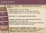
Hey, what do you think of these?

EDIT:
sorry, I hit "post" before attaching the .jpg :blush:

I edited what I believe to be knight_otu's template, wich borrowed from the DDM RPG stat cards. I've been working on it reaaaal slow, but it works for both monsters and PCs (I have a BIG style, wich prints 4 "cards" per page).
 

Attachments

  • SKAMOS REDMOON.jpg
    SKAMOS REDMOON.jpg
    45.7 KB · Views: 532
Last edited:

eloquentaction

First Post
Hey, what do you think of these?

EDIT:
sorry, I hit "post" before attaching the .jpg :blush:

I edited what I believe to be knight_otu's template, wich borrowed from the DDM RPG stat cards. I've been working on it reaaaal slow, but it works for both monsters and PCs (I have a BIG style, wich prints 4 "cards" per page).

Those look good.


turk128

First Post
Sample card image from the UCS version 1.

Hope you guys enjoy. This is just from *ONE* designer in a beta project.

So far we've got at least two card styles in works with a lot more in the future if more card designers will step forward.

NOTE: Yes, the icons are a bit off, the styling isn't perfect. It's a BETA, people! ;-)
Any chance the UCS will enable horizontal oriented cards (like Ander's for instance)?
 

Remove ads

Top