I have to disagree on the artwork in the MM, I really feel it missed the boat. This was an edition to get everyone back on board, and rather than get "classic" renditions of the monsters, it feels like they tried to push the art direction towards edgier designs that'd be easier to slap IP/trademarks on.
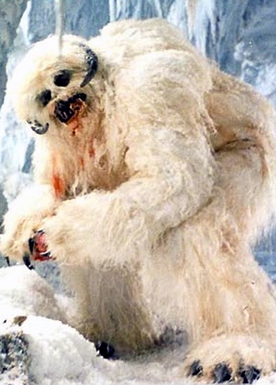
Some of the ones that really stood out: The kobold muscleman (they're Str 7!), the kraken (WTF - doesn't even resemble the old ubersquid or titan from Clash), the sheepdog pegasus, the mialee-dog gynosphinx, fishy merfolk, the cloverfield baskilisk and most of the demon/devils (worst offender: Barlgura - it used to be an orangutang, not an orange gorilla). Anyone notice that the mephits ARE IN THE SAME POSE IN EACH PICTURE (except the Mud)? Why do the yeti have ram's horns? Why does every snake-like creature have a cobra's hood? In some places, the line drawings would have been better than the completed pictures (see the Griffon). And the worst two offenders? The owlbear and the behir - I just hate them both.
Now, there were some I did like - the angels, cockatrice, merrow, centaur & chimera, quasit and the picture of Castle Ravenloft are great. The displacer beast looks sleek and fearsome. Most of the dragons are well done (exception is the red & shadow). I'm glad to see a woman-like Dryad back instead of the tree abomination. What makes me shake my head is how awesome the androsphinx looks, and how much the gynosphinx sucks. The DiTerlizzi-like modrons harken back to Planescape, but seem out of place (BTW, they were the first page I opened up to when I got the MM - made me smile).
Unfortunately, most of the rest of the art falls into the meh or blech range for me. Overall, on my first glance through it, I hated the art. I had to sit back down and go picture by picture to start finding art I did like. I'm just not fond of it and while it works for the stats, the art is just - meh.