
Silverblade The Ench
First Post
Ok, I am not bashing the artists ") But I have serious problems with the lack of "inpsiration" 4th ed artistic layout in the books :/
But I have serious problems with the lack of "inpsiration" 4th ed artistic layout in the books :/
Let me explain:
go pick up some old 2nd ed adventures and add ons, for Dark Sun, and Spelljammer, other settings too, but those pair in particular.
What do you notice?
A coherent internal and external layout that screams at you "THIS IS D&D! THIS IS DARK SUN! THIS IS SPELLJAMMER!"
This is absolutely vital, and IMHO, lacking terribly in 4th ed, it is failing to build an "atmosphere".
[sblock="Dark Sun and Spelljammer covers"]

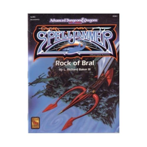
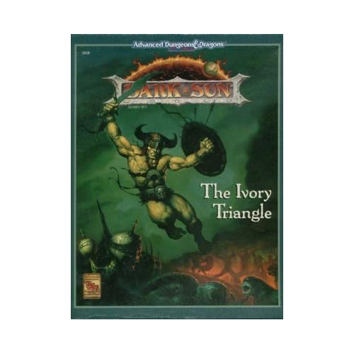

[/sblock]
you see? What I cannot show you of course, is the internal work, fonts , layout, background page colours (Dark Sun stuff for instance has an evocative fading organge gradient on it's pages)
By use of fonts, page colours, specific little bits of recurring artwork, like borders (see Ravenloft for all the little macabre items of minor artwork) it helped draw you into the atmosphere of the setting.
4th ed is well laid out, it's extremely practical. But it sucks for atmosphere, it has none, none at all!!
Now, I really hope they add some in for the Eberron books for 4th ed, 'cause the Realms books were dull as dishwater to me.
Go look at the very first Forgotten Realms boxed set...absolutely stunning page layout and artwork inside, draws you right into what the Realms "is", you know?
But then look at the last Realms boxed set under 2nd ed, ugh, it looks cheap! I was appalled
And the 4th ed one...meh...boring!!
Again, not fault of the artists who contributed, I'm talking about lack of page borders or colouring, fonts etc etc.
For crunch, stick to set crisp fonts and lyout, but for fluff, oh please for pity's sake, add evocative design!!!
I'm also not a fan of much of the artwork used now, it's very "wuxia" or "faded pastels", I know many of them are great artists, and lots of bits are good, but I like art that really kicks you in the gonads and says THIS IS D&D!!!
Compare Larry Elmore's amazing pic inside the 2nd ed Player's Handbook:

to the 4th ed work. ELmore screams out at you the essence and styl eof D&D.
See what I mean? I know WOTC cannot find lots of new ELmore's, Parkinson's and Caldwell's, but...I miss their style of work.
Those guys scream at you "THIS IS D&D!", not "This is anime/wuxia influenced fantasy". I knwo it's a different era and all, but...to paraphrase a song:
"It's still D&D to me!"")
So, 4th ed, coherent, neat layout: good
Lack of beautiful, evocative page layout (especially for fluff) and not enough bold, crisp art: bad!
But I have serious problems with the lack of "inpsiration" 4th ed artistic layout in the books :/Let me explain:
go pick up some old 2nd ed adventures and add ons, for Dark Sun, and Spelljammer, other settings too, but those pair in particular.
What do you notice?
A coherent internal and external layout that screams at you "THIS IS D&D! THIS IS DARK SUN! THIS IS SPELLJAMMER!"
This is absolutely vital, and IMHO, lacking terribly in 4th ed, it is failing to build an "atmosphere".
[sblock="Dark Sun and Spelljammer covers"]
[/sblock]
you see? What I cannot show you of course, is the internal work, fonts , layout, background page colours (Dark Sun stuff for instance has an evocative fading organge gradient on it's pages)
By use of fonts, page colours, specific little bits of recurring artwork, like borders (see Ravenloft for all the little macabre items of minor artwork) it helped draw you into the atmosphere of the setting.
4th ed is well laid out, it's extremely practical. But it sucks for atmosphere, it has none, none at all!!
Now, I really hope they add some in for the Eberron books for 4th ed, 'cause the Realms books were dull as dishwater to me.
Go look at the very first Forgotten Realms boxed set...absolutely stunning page layout and artwork inside, draws you right into what the Realms "is", you know?
But then look at the last Realms boxed set under 2nd ed, ugh, it looks cheap! I was appalled
And the 4th ed one...meh...boring!!
Again, not fault of the artists who contributed, I'm talking about lack of page borders or colouring, fonts etc etc.
For crunch, stick to set crisp fonts and lyout, but for fluff, oh please for pity's sake, add evocative design!!!
I'm also not a fan of much of the artwork used now, it's very "wuxia" or "faded pastels", I know many of them are great artists, and lots of bits are good, but I like art that really kicks you in the gonads and says THIS IS D&D!!!
Compare Larry Elmore's amazing pic inside the 2nd ed Player's Handbook:
to the 4th ed work. ELmore screams out at you the essence and styl eof D&D.
See what I mean? I know WOTC cannot find lots of new ELmore's, Parkinson's and Caldwell's, but...I miss their style of work.
Those guys scream at you "THIS IS D&D!", not "This is anime/wuxia influenced fantasy". I knwo it's a different era and all, but...to paraphrase a song:
"It's still D&D to me!"
So, 4th ed, coherent, neat layout: good
Lack of beautiful, evocative page layout (especially for fluff) and not enough bold, crisp art: bad!


