RPG Advertisement Help!

Dan Bell

First Post
Hi all,
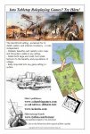
Help! I could use a second opinion. I have been asked to help design a magazine print advertisement for Harn. Here is what I and two others have come up with so far. With rpg print advertising an almost certain money losser, I would appreciate your honest opinion on how to make the below really stand out:


Thanks!
 

log in or register to remove this ad

I like it -- it would catch my attention because it looks both serious and "old school": the line art, the maps, et cetera. I think it probably would stand out compared to most modern RPG advertisements, because of the difference in style.


Honestly, it reads like an eBay listing. Instead of making words entirely capitalized, try using bold print instead. The line "It is acclaimed for realism..." is kinda tangential. Acclaimed by whom? If you really want to keep that statement, I'd drop it down a paragraph. Make the first line something like "The HarnWorld Setting - acclaimed for its realism, detail, and internal consistency - is rules independent."

Personally, I'm not too fond of the old school look of the poster, but then again your target demographic aren't the same type of gamer I am.

I've attached my personal revisions below. Just an opinion, feel free to disregard it entirely.

-TRRW
 

Attachments

  • harn.JPG
    harn.JPG
    91.4 KB · Views: 92

Dan Bell said:
People have told me that 'old school' was bad.
I guess that depends on your target market. Harn, itself, seems old school to me, so an old school ad strikes me as appropriate. However, if you're looking to attract a big chunk of the 3E (and 4E) crowd, old school might not be a good draw.
 

Two things:
1) Sell the sizzle, not the steak. How exactly am I going to have more fun with your product than another one?
2) Why is there an accent in the name?

-blarg
 

I think something along the lines of, "Grimly real, and internally consistent." is more important than the free downloads. I'm not going to look at the setting primarily because it has free downloads. What, in your view, is the most important selling point for those who aren't already using it?

I'd tier the sellings points in this order, and phrased more or less as follows:

Looking for a new setting, but not a new rules system?

Try Harn!

Grimly real, and internally consistent (Bold) - maybe use the word realistic instead of real. Or grim realisim and internal consistency.
(Optional subtype)
Consider adding a few highlights - such as monster ecologies that make sense
Packed with campaign themes that ring with authenticity - adventures in Harn could be history if they weren't fiction!

Acclaimed by fans and designers alike (Bold)
(Subtype)
See if you can insert a quote by a someone people will recognize, specifically, people who aren't already Harn fans.

Rules independent. (Bold)
(Subtype)
Don't be bogged down learning new rules. Take the setting and enjoy dynamic, detailed play experiences using the rules you already know and like!

Contents include
Make the notes about color maps, big details, small details, etc.

My $.02
 

I agree that there is probably no real value in mentioning the free downloads - not in this kind of ad, anyway.

Also, I would suggest not overusing the word "realistic". Yes, even twice is once too many, in my opinion. Especially given that some of the subheading-type text has the word "realism" in it. I might feel a bit bludgeoned, with those three instances of (essentially) the same claim, in quick succession.

But then, I don't tend to see a lot of ads, whether on- or offline. My lifestyle is just like that. So yeah, I mightn't be particularly representative, in some quite relevant ways. :\


Anyway, the maps and art look good. The overall style looks fine too, I think.
 
Last edited:

"Into Tabletop Roleplaying Games?" isn't exactly right.
It should be "In To Tabletop Roleplaying Games?" "In" and "To" should be two different words.
Also, I agree, it does look a little strange with all those words capitalized. Perhaps you could small-cap all the letters in the words.
 

theredrobedwizard said:
I've attached my personal revisions below. Just an opinion, feel free to disregard it entirely.
When I look at the original ad, there is a visual problem that bothers me. The large heading above and below the full-width color image at the top divides the eye too much. It doesn't flow well and detracts from the ad overall.

TheRedRobedWizard has solved this in the supplied revision. You have the single heading above the image and then a much nicer flow beneath it. Visually, it is a superior layout.


I believe that noting the free downloads is important. As a gaming consumer, there is a greater chance that I am going to go to the website and see what's there then the chance I'm going to read through a setting at the local store just because of an ad. If I like what I see on the website, then I am more likely to look for the book at my FLGS and see what it has to offer.
 

Remove ads

Top