D&D 5E Starter set cover art meh?

I like it as art, but I do agree that it makes some blunders advertising itself. Product looks like "Starter Set" not "Dungeons and Dragons." Production issues are also at play - the physical covers do look murkier than the online samples.

When the site owner pulls out the bandwagon approach to get you to shut up though... well, you're not going to get helpful critiques of D&D from D&D fans.
 

log in or register to remove this ad

I'm really not seeing the 'drab' in this image. The greens of the upper parts of the dragon that are directly lit are bright and vibrant, and the orange tinge to the lower parts of its body are an evocative touch, informing the viewer's subconscious that there's some serious fire or lava in the area without directly showing it.

The dark, shadowed look of the fighter in the foreground allows it to be detailed and yet not defined, letting the viewer project their own self-image onto that heroic protagonist.

The background colours are muted, but that only serves to bring the main subject into sharper relief. And the entire colour-scheme complements the reds of the title logos rather than clashing or blending with them.

Overall, an excellent image, well-chosen and well implemented.

EDIT: For clarity, I'm only going by the cover art I've seen online. I'll have to wait and see next Wednesday whether the physical product matches up.
 
Last edited:

Im going to join the crowd of non-sophisticated art connoisseurs and say I like it. It has a dragon, it has a warrior, its scary, kind of realistic (as far as giant man eating dragons go) and **SPOILER ALERT**relates well to the material its printed on. So in conclusion I like it.


SPOILER ABOUT ADVENTURE WITHIN

That is an excellent point about being related to the scenario material. That itself probably justifies this selection more than anything else. That it is being treated as "artwork for the module" is standard practice, although I think they could have added a bit more umph' to the art on their 'recruitment' boxed set. The fact that you might actually be facing that creature puts it ahead of example 1, 2 covers from previous sets. Those aren't the iconic characters on the front are there? Do we have iconic characters yet?

Btw, I don't necessarily "like" or "not like" the art as a whole. Its more fun to break it down into pieces to examine it.

Glad you guys are passionate about the art! It ought to be memorable and draw you in.

jh
 
Last edited:


IMO, the Starter Set cover art is okay. Not great, but okay.

Of course, it loses in comparison with the 4e/BECMI Red Box art. But then, anything would lose in comparison with that, for nostalgia reason. (Although, actually, even setting nostalgia aside, as far as is possible, I do consider the Red Box cover art to be the better piece.)

That said...

SPOILER ABOUT ADVENTURE WITHIN

That is an excellent point about being related to the scenario material. That itself probably justifies this selection more than anything else.

Yep, that's true.
 

I think the Starter Set dragon looks awesome and is totally reminiscent of early 80's art. The fighter on the other hand just doesn't seem that heroic or "cool" to me. Its hard to put my finger on why but I remember looking at the fighter with the massive enchanted sword and wicked armor facing the green dragon on the cover of the Companion set in 1984 and thinking he was just the coolest.

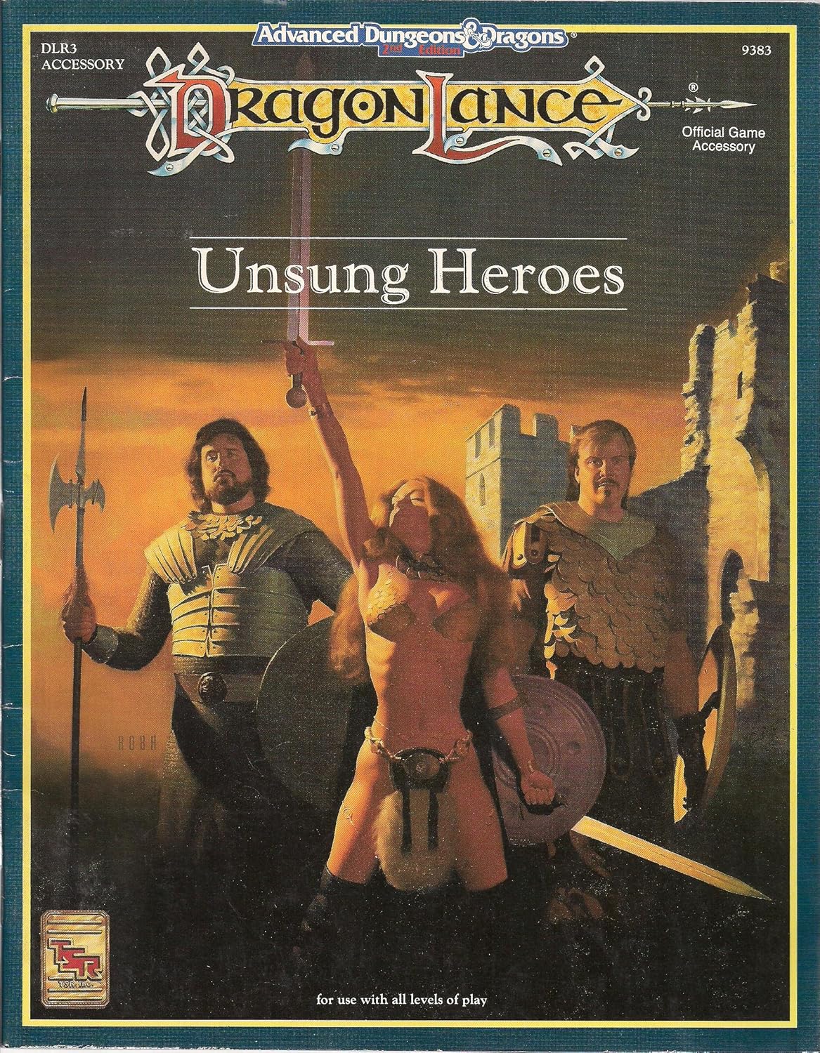
The warrior on the Starter Set box reminds me of some of TSR's mid-90's art that appeared to feature people from accounting or marketing dressed up in medieval armor like the two dudes on the cover of Unsung Heroes:

A18YaRin9YL._SL1500_.jpg
 
Last edited:

Ugh! I remember those days. They'd pull crap like that and name their encounters after pop music lyrics and other really tacky things. It's one thing to have some fun with it. It's another thing to make the whole hobby a joke and trivialize it like Lorraine Williams truly wanted it to be. It demonstrated what crud the industry people really thought of the fans.

Nothing makes me think heroic like a face like those you describe above:

original.jpg
 

Remove ads

Top