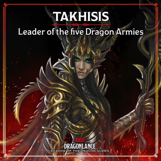
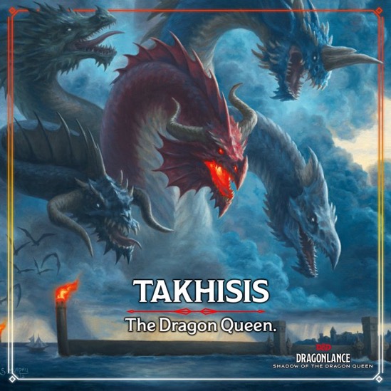
WotC has shared some new art of Takhisis, Dragonlance’s 5-headed dragon queen.
You are using an out of date browser. It may not display this or other websites correctly.
You should upgrade or use an alternative browser.
You should upgrade or use an alternative browser.
Dragonlance Takhisis Revealed In New Dragonlance Preview Art
- Thread starter darjr
- Start date
WotC has shared some new art of Takhisis, Dragonlance’s 5-headed dragon queen.
dave2008
Legend
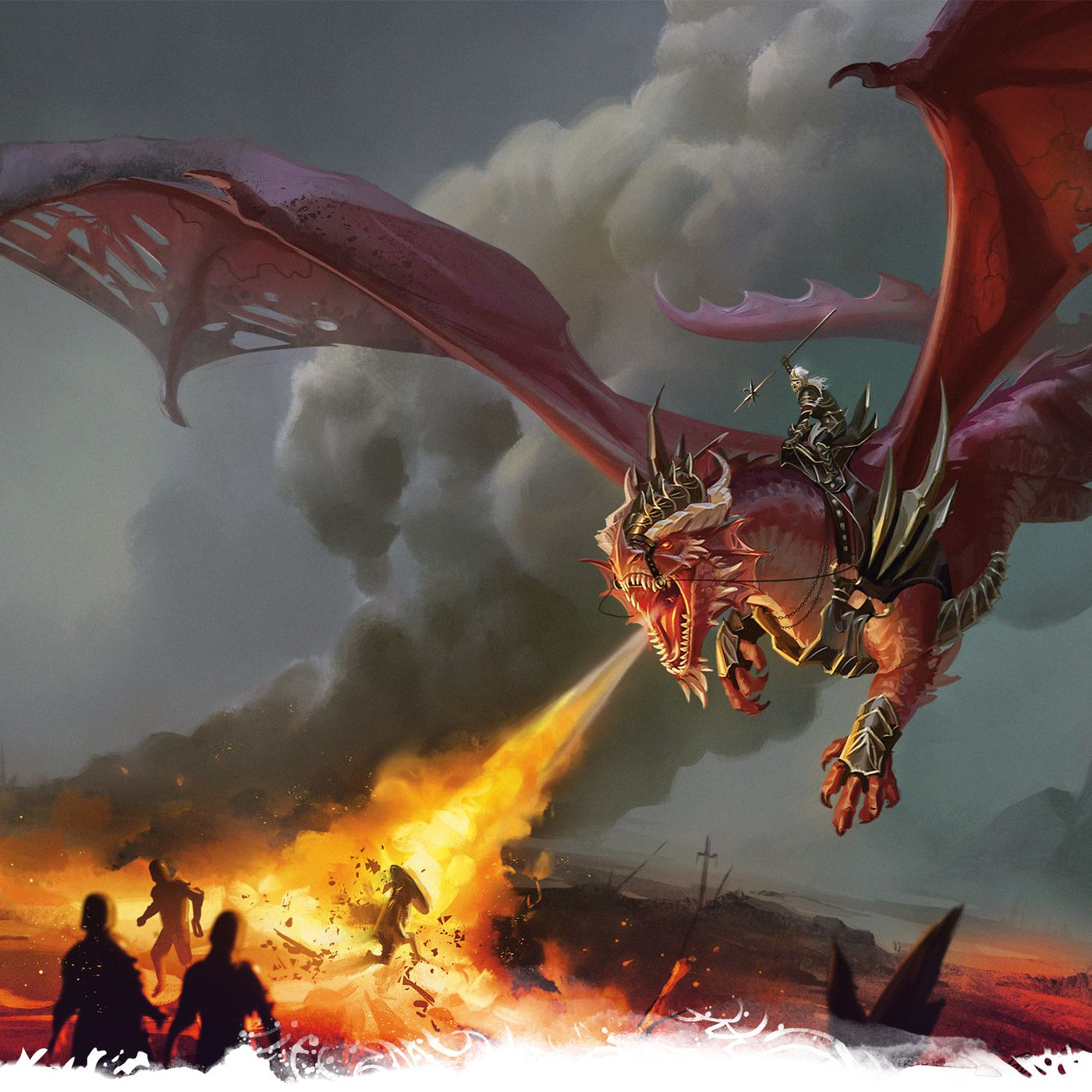
I definitely get your point. However, there has been some more creative freedom, in 5e at least. In particular red dragons. Just look at the new Dragonlance art:
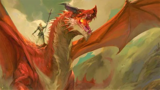
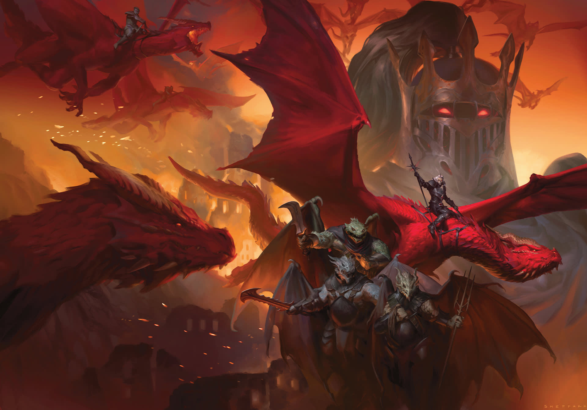
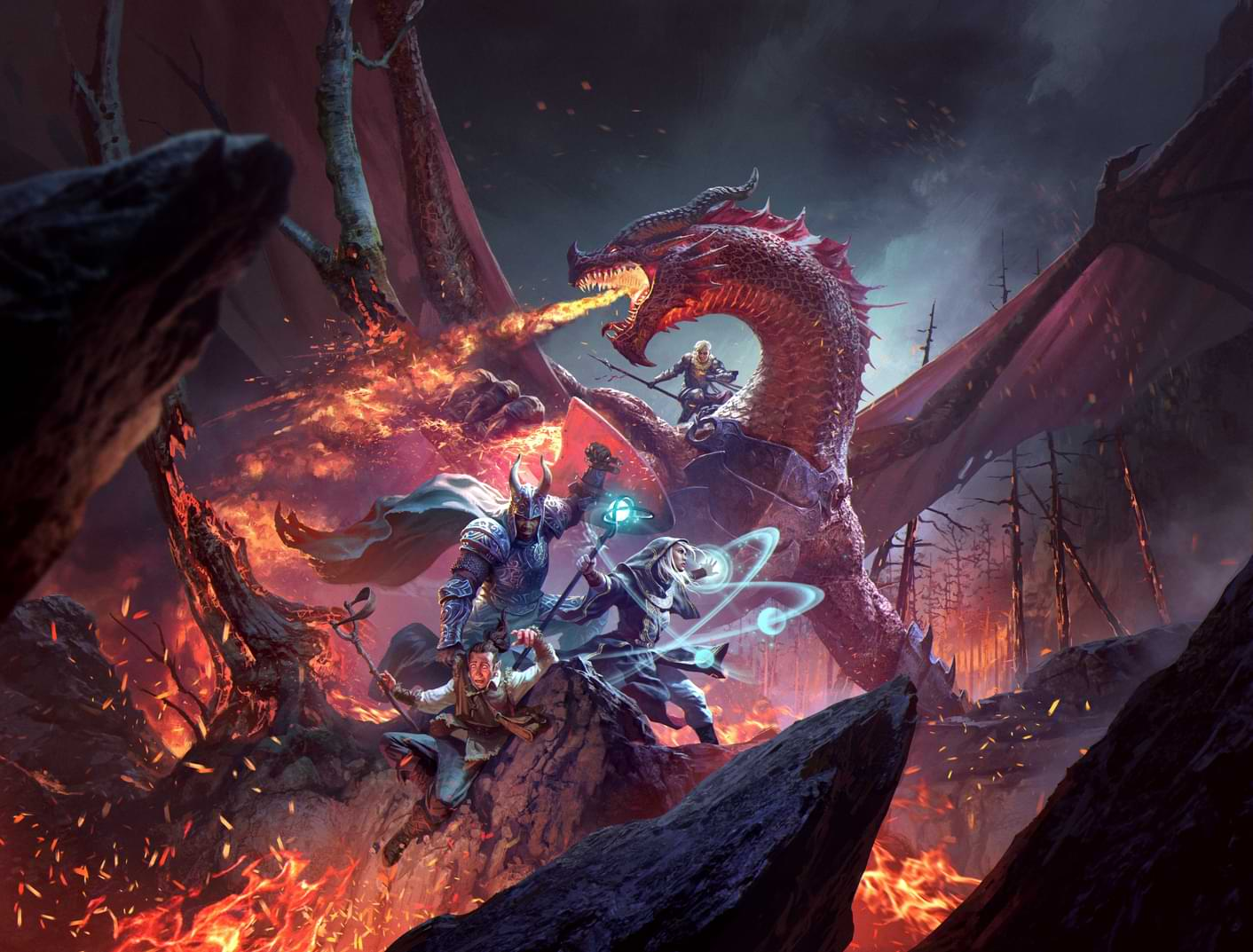
And of course the MM red:

And this one from Fizban's:
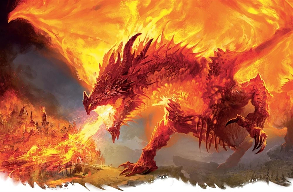
And my personal favorite:
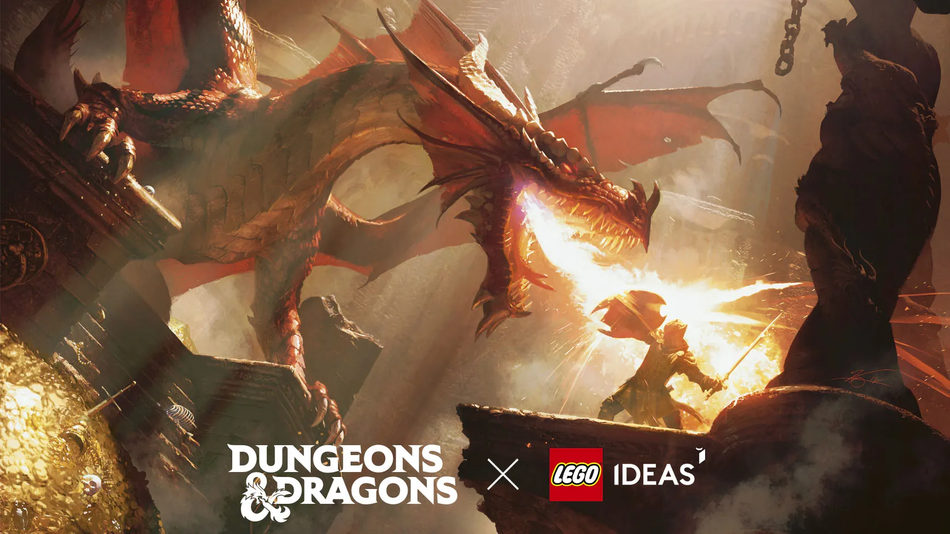
There was also this alternate take:
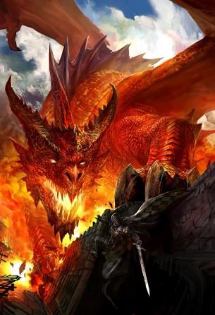
And of course the MM red:
And this one from Fizban's:
And my personal favorite:
There was also this alternate take:
Last edited:
Vaalingrade
Legend
The older dragons tend to look like medieval drawings which... I don't feel are the kind of thing I would be excited to encounter; all floppy and slow-looking like inaccurate depictions of dionsaurs.
The new ones are all lumpy and sinewy like bodybuilders gone wrong and with the really dumb frills for the metallics and the beginning of what would become Warcraft's Leno-dragon chin. Black, Red and Silver are okay.
The new ones are all lumpy and sinewy like bodybuilders gone wrong and with the really dumb frills for the metallics and the beginning of what would become Warcraft's Leno-dragon chin. Black, Red and Silver are okay.
now how many players/dms today can name the color of these...
Well, lets see. The original Monster Manual with that art came out in...1977. The Monstrous Compendium came out in 1989. So, we might start with anyone playing in that span.
Say you pick up D&D at 12 years old. Anyone born after 1977 probably picks up 2e, rather than 1e. So, we are looking for gamers born before 1977 - so gamers 45 and up, for the most part. And, from WotC, gamers 40+ are about 13% of the market today.
So, maybe 13% of D&D gamers today have a shot at it?
Sacrosanct
Legend
And it only took them 22 years after "the change"* to have some diversity in dragon bodies that existed originally
* WoTC change to musclebound dragons
Vaalingrade
Legend
"Approximately two percent of my body weight is fat. Allow me to show you what 350And it only took them 22 years after "the change"* to have some diversity in dragon bodies that existed originally
* WoTC change to musclebound dragons
Ralif Redhammer
Legend
The eyes definitely give me a "medieval manuscript" dragon vibe.
I do love those 1e illustrations. One thing I find fascinating is that, in particularly with the chromatics, their main traits are still recognizable today. The horns of the black dragon, the blue dragon's horn, the crest of the white, etc., they're all here.
But I like the old dragon version better. (Though, 20+ years later, the eyes creep me out...)
Individually, I like the visuals of the 5E dragons, but when combined together, ugh.
I do love those 1e illustrations. One thing I find fascinating is that, in particularly with the chromatics, their main traits are still recognizable today. The horns of the black dragon, the blue dragon's horn, the crest of the white, etc., they're all here.
Well they have had distinctive characteristics beyond color since at least 1e:
View attachment 266260
If your curious:
Top row, left to right: black, blue, green, red, whiteBottom row, left to right: brass, bronze, copper, gold, silver
MonsterEnvy
Legend
Yeah the Modern ones look way better. How some of you can say the ones below look similar compared to the old ones is beyond me.Well they have had distinctive characteristics beyond color since at least 1e:
View attachment 266260
If your curious:

Vaalingrade
Legend
It's the feline-inspired body shape combined with the lumpy rope muscles of 3e design direction. And the Leno-dragon chins, which are actually worse on the metallics.Yeah the Modern ones look way better. How some of you can say the ones below look similar compared to the old ones is beyond me.
I know where the former came from and WotC's love of it goes back to the MTG Anthologies... anthology, but I don't know where the later came from and for me was the only unwelcome part of the dungeonpunk aesthetic.
Similar Threads
- Replies
- 12
- Views
- 3K
- Replies
- 8
- Views
- 817
- Replies
- 14
- Views
- 4K
- Replies
- 47
- Views
- 14K
- Replies
- 540
- Views
- 53K
Recent & Upcoming Releases
-
June 16 2026 -
June 16 2026 -
September 16 2026 
Arcana Unleashed(Dungeons & Dragons)
Rulebook featuring "high magic" options, including a host of new spells.
Replies (250) -
September 16 2026 -
October 1 2026 -
October 6 2026 -
January 1 2027 -
January 1 2027
Related Articles
-
Dragonlance [Dragonlance Homebrew] Alternate Timeline: Magocracy of Ansalon
- Started by Libertad
- Replies: 12
-
D&D 5E (2024) WotC staff guests on Nerd Immersion, State of the Game.
- Started by darjr
- Replies: 8
-
Dragonlance [Dragonlance Homebrew] Alternate Timeline: Hourglass in the Sky
- Started by Libertad
- Replies: 14
-
Dragon Delves Reveals "History Of" Pages for Dragons
- Started by Christian Hoffer
- Replies: 47
-
D&D General What Are Dragonlance's Weis & Hickman, and Actor Manganiello Cooking Up?
- Started by Morrus
- Replies: 540
Recent & Upcoming Releases
-
June 16 2026 -
June 16 2026 -
September 16 2026 
Arcana Unleashed(Dungeons & Dragons)
Rulebook featuring "high magic" options, including a host of new spells.
Replies (250) -
September 16 2026 -
October 1 2026 -
October 6 2026 -
January 1 2027 -
January 1 2027


