I like the new ones a whole lot more than the old ones. Great Job Michael.
I only have 3 that I'm not truely enthralled with ...
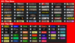
The D&D buttons are a bit full and hard to read - especially, when all that matters (IMO) is the edition number. The last problem I can see now, is how incredebly small the FR logo is. I had to think about it before I realized what it was... maybe you could do the button is a similar fashion as you did the Arcana Unearthed button.
Overall, these buttons you have suggested seem to me much better than the bright, gawdy buttons we have now.
My 2 cents,
Erge

")