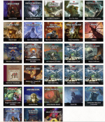
D&D 5E WOTC book covers....

Casimir Liber

Adventurer
Right folks, here are the covers (yes I know there are some duplicates but bear with me) - I know there are also (more expensive?) alternate covers but still. When I'm at home I often have to look twice (and at the title) to recall which damn book I've picked up. To me, the aim of a book or magazine cover is (as well as look amazing) to stand out from the other covers. So WOTC has lots of artists and budget and still we get so many that look like each other. Over-reliance on slate-blue-grey with some big dark entity with glowing eyes. I mean, not all of them, some are really distinctive but I just wish...(this trend pretty much started with the second set of covers of 1e)
 

Attachments

  • sourcebookcovers.PNG
    sourcebookcovers.PNG
    1.8 MB · Views: 183
  • adventurecovers.PNG
    adventurecovers.PNG
    2 MB · Views: 180

log in or register to remove this ad


Mercurius

Legend
D&D has tended to have "themed" covers, going back to TSR. I Mean, the orange spines in AD&D in the early 80s mostly (or only?) had a single artist, Jeff Easley. You see similar patterns from then on - for instance, the 3E hardcovers, the Wayne Reynolds 4E artists, etc.

So I don't see 5E's covers being any different from that overall pattern. The alt covers was a nice gimmick, though - and they've done it in a smart way (i.e. making them different, themed in their own way, rare enough to feel special, not too rare that you can't get ahold of them if you want them - at least early on).


bulletmeat

Adventurer
I can understand your feelings on the covers (to me they look to much like cartoons) but Hasbro needs to exemplify the D&D brand. Just as GW is throwing the warhammer icon on anything in the WH wheel house, WotC has settled on the young adult look of the brand for the kids they want to sell 5e+ to. Old TSR did it w/the logo on their splat books, the grey design border books of later 2e, and so forth.

To me, the font looks like its from a meme more than a book cover, but that's the marketing decision they made.


FitzTheRuke

Legend
Right folks, here are the covers (yes I know there are some duplicates but bear with me) - I know there are also (more expensive?) alternate covers but still. When I'm at home I often have to look twice (and at the title) to recall which damn book I've picked up. To me, the aim of a book or magazine cover is (as well as look amazing) to stand out from the other covers. So WOTC has lots of artists and budget and still we get so many that look like each other. Over-reliance on slate-blue-grey with some big dark entity with glowing eyes. I mean, not all of them, some are really distinctive but I just wish...(this trend pretty much started with the second set of covers of 1e)

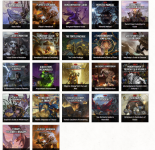
The alternate covers are not actually "more expensive" - they are thought of that way for two reasons:

1) They are only sold at FLGSs, who are stuck with MSRP (or at least close to) as opposed to Amazon, who will often sell the books at close to (or even less than!) cost. But then, Amazon sells hundreds of thousands of them (and presumably get a lower cost as well).

2) They become "collectable" and are then jacked-up on the aftermarket. Here, they will turn up on Amazon marketplace and ebay, among other resellers, at higher-than-MSRP prices.

Personally, as a FLGS retailer, I hate BOTH deep-discounters and jacked-up resellers. I like to sell books at MSRP (which I think should be cheaper than it is - the only reason I think MSRP is as inflated as it is these days, is to please the discounters, which only hurts us small stores, in a vicious cycle.)
 
Last edited:

Branding is very much an important thing, and something that D&D has done for many decades, as you point out. I would also mention that it's no surprise that there are plenty of products on DMsGuild that deliberately emulate that same branding. People associate these specific design elements with 5e. It's the same thing you see with OSR products that deliberately evoke the old TSR style for modules and whatnot.

D&D has tended to have "themed" covers, going back to TSR. I Mean, the orange spines in AD&D in the early 80s mostly (or only?) had a single artist, Jeff Easley. You see similar patterns from then on - for instance, the 3E hardcovers, the Wayne Reynolds 4E artists, etc.

So I don't see 5E's covers being any different from that overall pattern. The alt covers was a nice gimmick, though - and they've done it in a smart way (i.e. making them different, themed in their own way, rare enough to feel special, not too rare that you can't get ahold of them if you want them - at least early on).

That being said, for the most part I go with the more stylish, adventuresome alt-covers. With a few exceptions - I liked the original Candlekeep Mysteries cover more than the alt, for example.
 

To me, the aim of a book or magazine cover is (as well as look amazing) to stand out from the other covers.
Well there's your problem right there. For them the aim is first and foremost to make a sale. "Standing out" from other books of theirs is way down on the list of priorities after "looking the same to establish brand continuity" (and hence help make a sale) and "looking the same to remind people of products they've already bought and liked" (to help make a sale).

And just in case by having all these very similar covers they've alienated some people collecting a large number of books and wanting them to be more distinct from one another they have alternate covers available to fulfill that niche market. Unfortunately the alternate covers are also tied to a "buy it now, limited edition, artificial rarity" niche market, which is where they've let down anyone who wants to build a collection of distinct 5e books but wasn't there for the release of each book.
 

Remove ads

Top