D&D 5E D&D Next weekly art column!

Status
Not open for further replies.
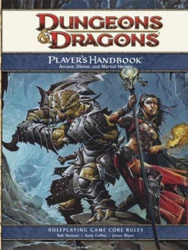
I can see that. I look at the 4e PHB cover:

dnd4e_phb_cover_v2.jpg


and see the similarities to the Basic D&D cover:

dd-box.jpg


And, yeah, nostalgia probably plays a big role here, because that Basic set is where I got my start. :D

Hmmmmm. I don't see that much similarity (style aside, that's a whole other discussion). On the 4e PHB1 cover we basically have 2 adventurers "posing for the camera". I have no idea what they might be up to. I can see a cave behind them, but beyond that I'm not getting much sense of any kind of story. The message seems to be more about their studliness and fancy equipment than what they're doing. Even their "action pose" is more showing off how menacing the DB is and the powers of the (buxom) wizardess.

The basic set cover OTOH shows a whole environment. Stairs lead up to a mysterious door, perhaps the one the PCs entered through, and then there's a whole green sea of some sort (acid maybe?). The situation itself is a little mini-story. Were the adventurers pawing through this loot when the dragon showed up? How are the adventurers going to defeat it? Will they gain the treasure? What else lurks in that dark ocean going off into the distance.

That's my take on it. I can see some basic similarities between the two, they both feature a male fighter and a female wizard and an underground setting. To me the vibe is a good bit different though. 4e PHB says "be a badass!" and the Basic set cover says "Here's a world of adventure, treasure, and danger, come explore!" It is subtle, but they do say different things to me.
 

log in or register to remove this ad

I think the worthy successor of the Basic/1e covers actually ended up being used in the Character Record Sheets. IMHO, it would've hit it out of the park as the cover for the 4e PHB:

51FR1GTxO3L.jpg

I agree, this is a much more 'story telling' cover. I'd like to see the scene a BIT more pulled out even than that, but its going in the right direction.

Notice how the focus on the newer covers is on the fight and on the characters with very little else in frame. Now look at the Erol Otus Basic set cover, or the 1e DMG/PHB covers. In 2 of those there are fights, but in both cases the fight is only a bit of the scene. It is important action and sets the scene to life, but it isn't ALL ABOUT the fight or all about the PCs.

Of course I may be weird, but to me the world that was being explored and created was always way more interesting than the details of the various PCs. I have fun making up interesting PCs and seeing what happens to them, but I want to know about the world (maybe that makes me an 'explorer' as a player, though I definitely like RP and fights too). I don't know how much my tastes are shared but pull back, suggest a story and a world and show the PCs as a part of it, not as the whole focus of things. That gets my juices flowing.
 

Notice how the focus on the newer covers is on the fight and on the characters with very little else in frame. Now look at the Erol Otus Basic set cover, or the 1e DMG/PHB covers. In 2 of those there are fights, but in both cases the fight is only a bit of the scene. It is important action and sets the scene to life, but it isn't ALL ABOUT the fight or all about the PCs.


To be honest, the only real differences in terms of "used space" between the CRS book and the old TSR cover is the addition of a few people by the door. The dragon, the adventurers, the door itsself are all about the same size. I think the main reason it feels more "focused" is all the wasted space from the large title-bar at the top of the page.
 

I agree with AbdulAlhazred (must spread some XP around), there's very little similarity between the Otus cover and the 4E PHB. They both incorporate skimpily clad women holding glowy energy balls, and both suggest a subterranean setting. Beyond that? Nada. The Character Sheets cover is much closer to the Erol Otus piece; not coincidentally, it is one of the very few examples of 4E cover art that I like.

But even when 4E very deliberately imitated older edition art, it often fell short. Look at the 1E Manual of the Planes and compare it to 4E (sorry the images are so small, they were all I could find in a quick search):

AD%26D_Manual_of_the_Planes.jpg
MotP_-_Howard_Lyon.jpg


Now, you can see these are pretty much the same scene. The 4E MotP cover is an obvious homage to its predecessor. And yet. The 1E image is bizarre and fascinating and terrifying. The background is this chaotic mishmash, hinting at half a dozen different planes without portraying any of them clearly. Makes you want to rip open the book to find out what they are. And then you have the beast rising up out of the chaos, and it's not clear what it is, either--all you can see is the cyclopean head and the big pincery arms reaching up at you, which makes it ten times as scary. That dude in front has Big Problems, yo.

The 4E version doesn't have any of that. There's only one plane being portrayed (the Astral Sea), and there isn't anything terribly interesting on display. The astral dreadnought is there, but shorn of the color and mystery that made it so frightening in 1E. You can see the whole body and it's just a silly-looking slug thing, a cross between a giant crab and Jabba the Hutt. And the people on the boat are fighting back, shooting lightning at it--proving that it can in fact be fought. The guy on the 1E cover is just fleeing for his life, because God knows what that thing will do to him if it ever gets hold.

IMO, the lesson for 5E here is to try and capture the spirit of the old covers, the mystery and wonder, rather than trying to imitate the specifics. You can't re-create that 1E cover. But you can create a new cover that holds the same fascination. There was one piece I remember--I think it was from Worlds and Monsters, can't find a link to it now--that depicted the Elemental Chaos. No characters, just an infinite void of fire and ice and mist, with a floating castle and a glowing roadway leading away from it. It would have been absolutely perfect for a MotP cover.
 
Last edited:

On a side note It seems that many of the works on covers are from the dragon's sidekick point of view. I want to see what the PC's see. I do not want to see what the antagonists see. Goes the same for monster movies.
Ah, good point. Either that or the PCs are looking at themselves in a mirror. I would say the player in me would prefer art looking OUT from my PC's perspective -- at a mysterious fantasy world to explore and save or plunder and conquer as I feel like doing this game.

How about a PHB cover taking some cues from Caspar David Friedrich's Wanderer Above the Sea of Fog...
300px-Caspar_David_Friedrich_032.jpg


The DM in me wants art looking at a whole scene with a story, preferably a story that involves the players LOSING sometimes -- perplexed, mystified, afraid, in over their head, running away...getting eaten. Etc.

The 4e MM doesn't have any PCs getting eaten! (At least not that I recall...)

frog.gif

Take that, would be giant frog hunter.

The PHB should display PCs of fantastic daring looking at the world as if it were their oyster.

And then in the MM and DMG I want to see (some of) these outrageously arrogant Icarus's plummet to their melty squishy death.
 

To be honest, the only real differences in terms of "used space" between the CRS book and the old TSR cover is the addition of a few people by the door. The dragon, the adventurers, the door itsself are all about the same size. I think the main reason it feels more "focused" is all the wasted space from the large title-bar at the top of the page.

Eh, I think the old TSR cover does a better job of evoking the mysterious depth of the setting. The CRS cover is not bad though. I like it better than the PHB1 cover for sure and it does start to hint at the whole world to be explored. The old TSR one though has that whole 'acid sea' leading off into the darkness, begging you to see where it leads. There is a bit more story inherent in the scene too. You can imagine what is going on. The adventurers find this treasure chest and then whoosh! the owner (perhaps) pops up out of the water and the fight is on! Or maybe there was some negotiation going on that failed. Who knows? The CRS cover doesn't lead you into the story quite so much.

In a sense the more refined craftsmanship of the newer art actually kind of works against it too. Admittedly EO's stuff is quite stilted (perhaps deliberately) but the very simplicity and abstract style makes it feel like a land of imagination. I'm not saying there isn't a place for the more polished commercial art styles you generally see in later books, it is often pretty effective. I remember that picture of Kostchie fighting the adventurers in the snow in the 2e Monstrous Compendium for instance. Quite polished, but still evoking a sense of story. That kind of piece is find for illustrating a specific monster for instance. I think cover art needs to kind of sum up the whole game in a single scene though. The older stuff IMHO does that a bit better.

Like I say though, it could well be that it is just harking back to my own childhood memories of playing D&D. I'd like to see good quality art, just more story-oriented.
 

Ah, good point. Either that or the PCs are looking at themselves in a mirror. I would say the player in me would prefer art looking OUT from my PC's perspective -- at a mysterious fantasy world to explore and save or plunder and conquer as I feel like doing this game.

How about a PHB cover taking some cues from Caspar David Friedrich's Wanderer Above the Sea of Fog...
300px-Caspar_David_Friedrich_032.jpg


The DM in me wants art looking at a whole scene with a story, preferably a story that involves the players LOSING sometimes -- perplexed, mystified, afraid, in over their head, running away...getting eaten. Etc.

The 4e MM doesn't have any PCs getting eaten! (At least not that I recall...)

frog.gif

Take that, would be giant frog hunter.

The PHB should display PCs of fantastic daring looking at the world as if it were their oyster.

And then in the MM and DMG I want to see (some of) these outrageously arrogant Icarus's plummet to their melty squishy death.

The first pic is solid. The second is nice too. In that particular case I do not want to see what the pc's sees.
 

Is there any treasure in the 3e-4e body of art? Earlier edition, artwork teemed with gold and jewels waiting to be claimed by the bold.(or lucky fools)


Status
Not open for further replies.
Remove ads

Top