D&D 5E New Cover for Eberron: Rising from the Last War

The new cover for the upcoming Eberron: Rising From the Last War has been revealed by WotC.

The new cover for the upcoming Eberron: Rising From the Last War has been revealed by WotC. This cover by Wesley Burt depicts a warforged wizard and their halfing companion in the Demon Wastes.
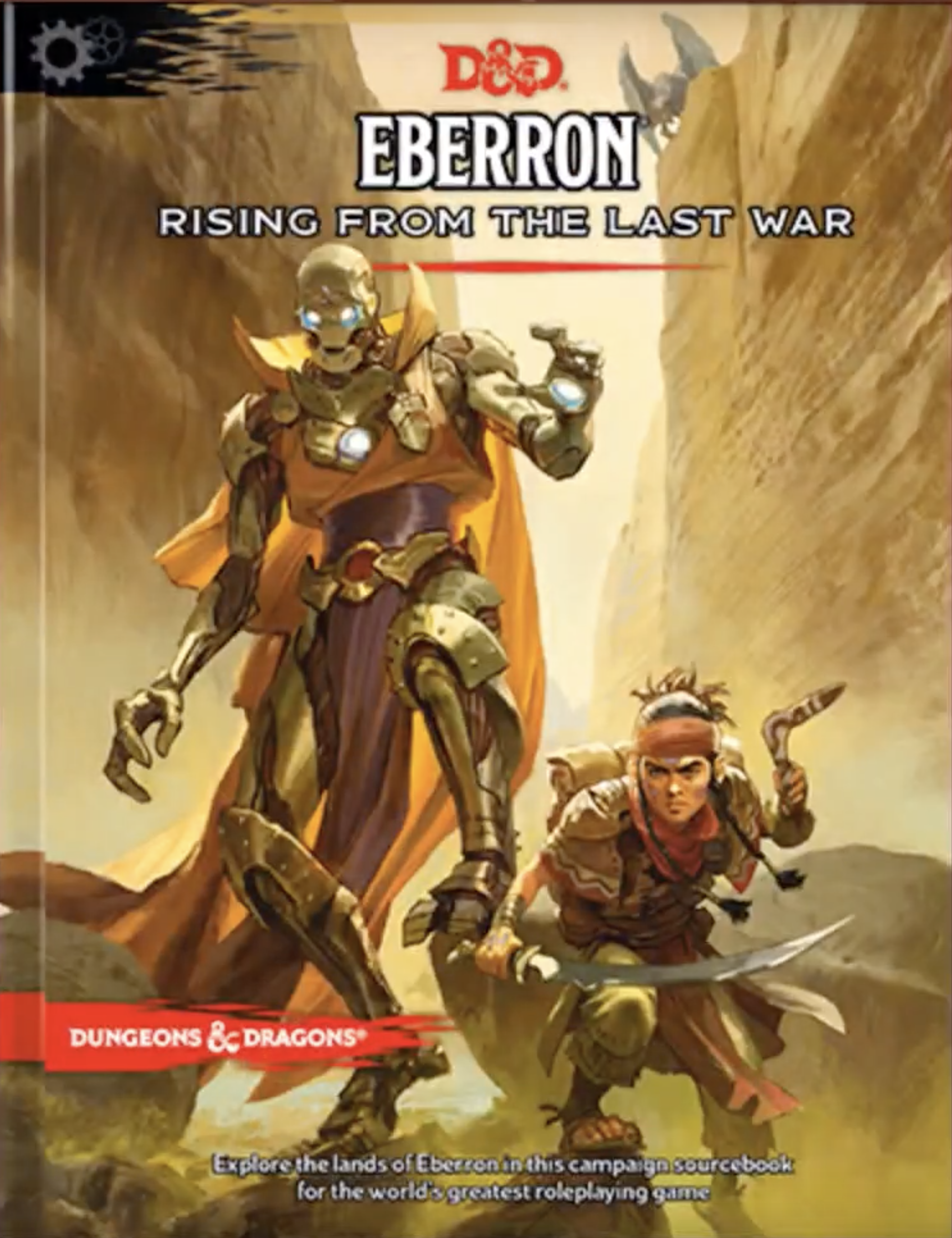
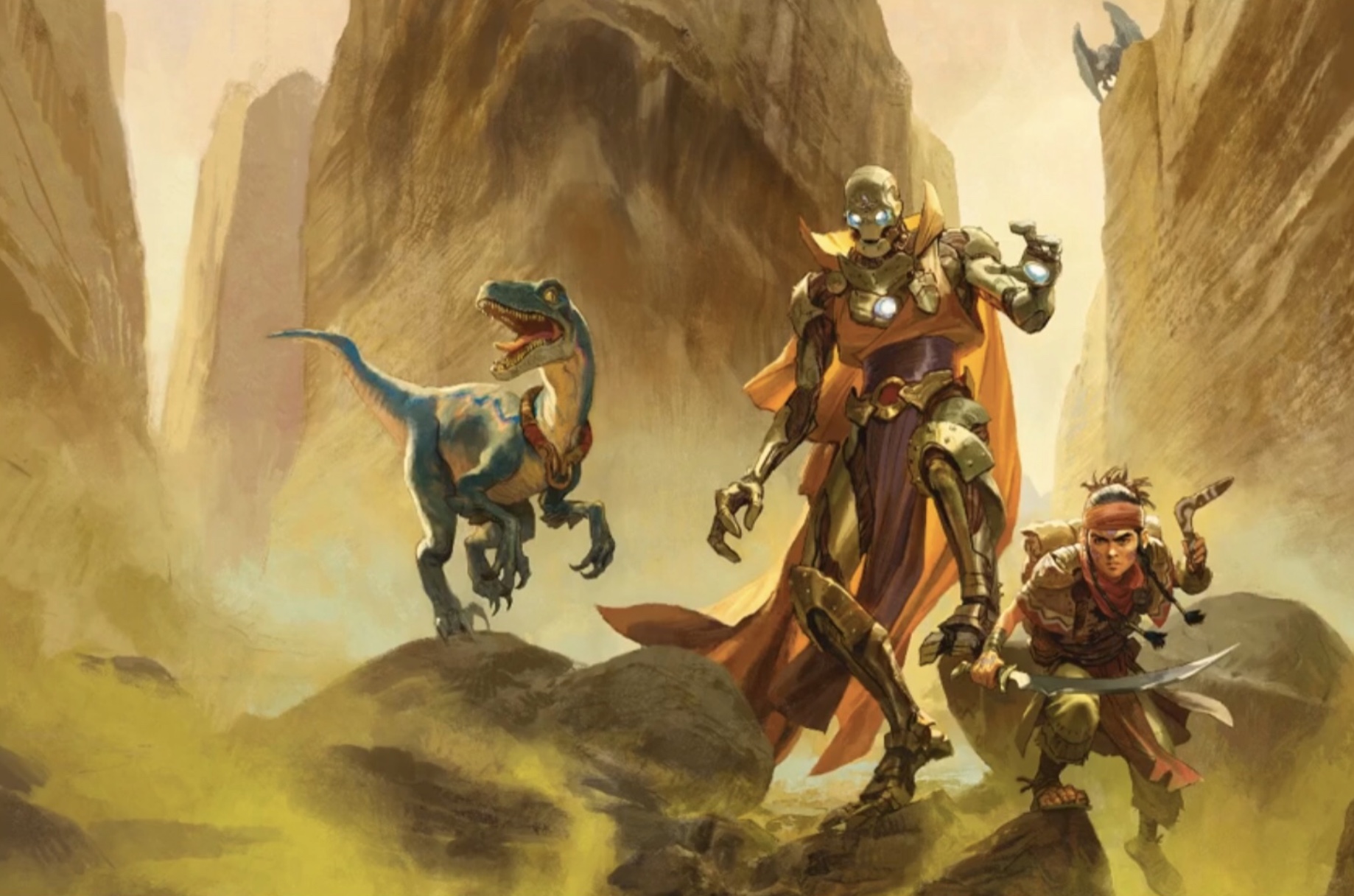
Screenshot 2019-09-14 at 10.15.35.png


08DA5935-137D-47AF-A445-85E7D6089BF6.jpeg

Jeremy Crawford and Greg Tito discuss the new cover in this video. A couple of weeks ago, Jeremy Crawford stated that the previous cover by Ben Oliver was an interior illustration serving as a placeholder cover. They expand on that in this video:

Tito: We have decided to change this cover, though. We are going with a different cover for this book.... we had the rare opportunity to change that because the files had not yet been sent to the printer.

Crawford: That's right. When the book was announced, we were still about a week out from sending the books to the printer... we had a window of time to swap out the cover, which was actually something we had been discussing for some time leading up to the announcement.

Tito: But, once we announced, we also recieved a lot of feedback from fans saying that they wanted a different cover and that feedback really galvanized us... so we are changing it to this cover designed by Wesley Burt.

The painting was already in the book, and was moved to the cover, while Ben Oliver's previous cover was moved to be the chapter opener for the first chapter (character creation).


log in or register to remove this ad


log in or register to remove this ad


Pretty boring and mono-chromatic. Doesn't inspire anything imo.

It's all much ado about nothing anyway. Once you own the book you just start using it and never bother being concerned by the cover ever again. It's all the stuff on the inside that you focus on, not a cover that you would have seen thousands of times over and glossed over just as much.
Disagree. I still remember the 1E PHB cover. THAT inspired me, still does to this day. You;ve go the giant idol, the thief stealing the eye gem. You've got things going on. You got iconic characters and situations.

This one? Two characters and a dinosaur. Except for the dino, the colors are bland. Their is very little happening here. The setting is nondescript, could be any type of desert or wasteland, nothing remarkable about it.

Oh well, wasn't planning on buying it anyway.
 

Parmandur

Book-Friend
Pretty boring and mono-chromatic. Doesn't inspire anything imo.


Disagree. I still remember the 1E PHB cover. THAT inspired me, still does to this day. You;ve go the giant idol, the thief stealing the eye gem. You've got things going on. You got iconic characters and situations.

This one? Two characters and a dinosaur. Except for the dino, the colors are bland. Their is very little happening here. The setting is nondescript, could be any type of desert or wasteland, nothing remarkable about it.

Oh well, wasn't planning on buying it anyway.

A magical robot and a boomerang wielding Halfling Ranger with pet velicoraptor, walking through a canyon with a demon following them for an ambush is boring??


A magical robot and a boomerang wielding Halfling Ranger with pet velicoraptor, walking through a canyon with a demon following them for an ambush is boring??
Yep. Boring.
It's not a bad start, but it is a poor use of space. How about something in the terrain to invoke curiosity? Maybe hints of a cave? Or a relief carving or... anything? I mean look at the background behind the dino. It could have so easily been shaped or shadowed to look like something. Even a face would be more interesting than nothing. And the bottom left in the mist/dust, something could be hidden, but you would have to hint at it. Perhaps something that look like a bone, skull or a .... anything?

In short, lots of space, and all you have are 4 things, all of them creatures/characters.
Inspires you to do what?
Adventure. Heist. Danger.
@Parmandur what does it inspire you? Apparently something since it's your avatar.
 

Parmandur

Book-Friend
Yep. Boring.
It's not a bad start, but it is a poor use of space. How about something in the terrain to invoke curiosity? Maybe hints of a cave? Or a relief carving or... anything? I mean look at the background behind the dino. It could have so easily been shaped or shadowed to look like something. Even a face would be more interesting than nothing. And the bottom left in the mist/dust, something could be hidden, but you would have to hint at it. Perhaps something that look like a bone, skull or a .... anything?

In short, lots of space, and all you have are 4 things, all of them creatures/characters.

Adventure. Heist. Danger.
@Parmandur what does it inspire you? Apparently something since it's your avatar.

To crush my enemies, to see them driven before me, and to loot their dungeons.
 

Henry

Autoexreginated
To me, definitely cooler and more “finished” than the placeholder art. Though honestly, I liked the art from wayfarer’s guidebook better than either of these two pieces. What would have been even better, in my eyes, would have been a cover taking inspiration from some of the 1920s pulps, which Wayfarers guide seemed to - maybe without a half-naked buxom woman being sacrificed by dark-skinned natives on some altar, though, which was a pretty common scene... the one described by @Leatherhead comes pretty close to that pulp inspiration.

Still getting this book, and Keith’s “exploring Eberron” book, though. Too promising not to.
 
Last edited:


Remove ads

Remove ads

Top