D&D 5E Van Richten's Guide to Ravenloft Art Preview

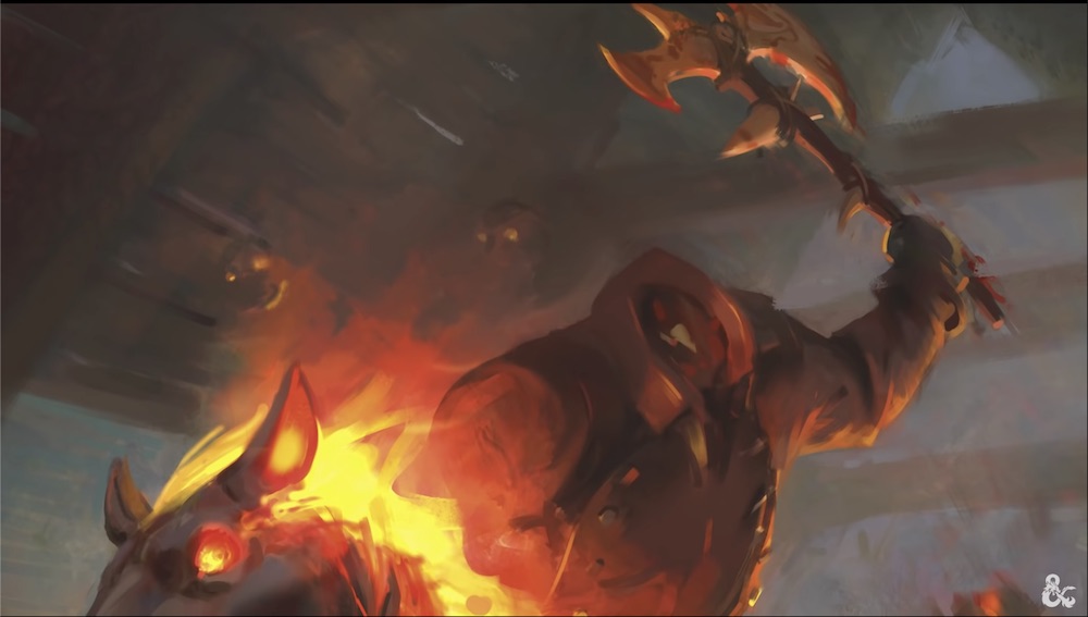
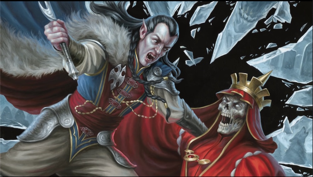
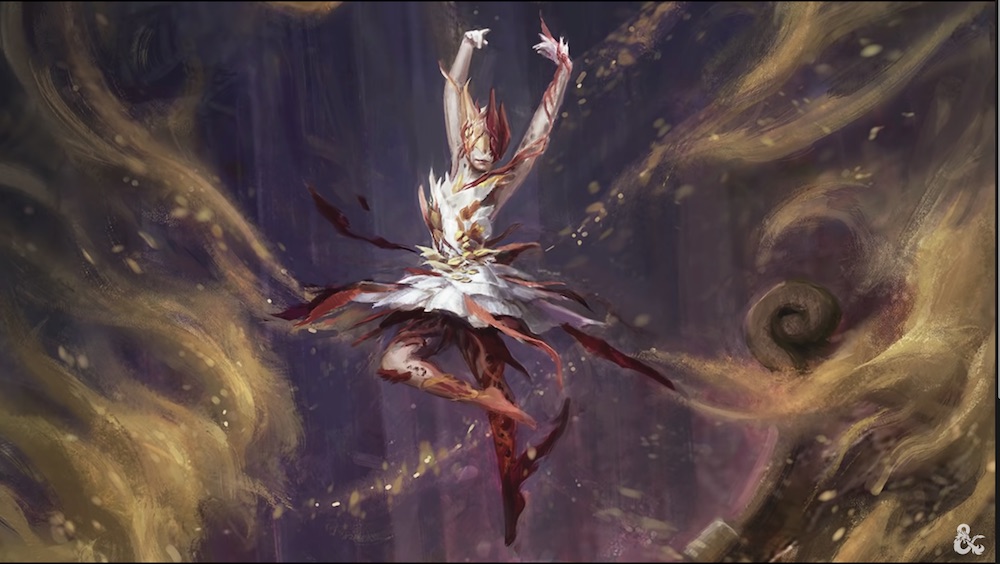
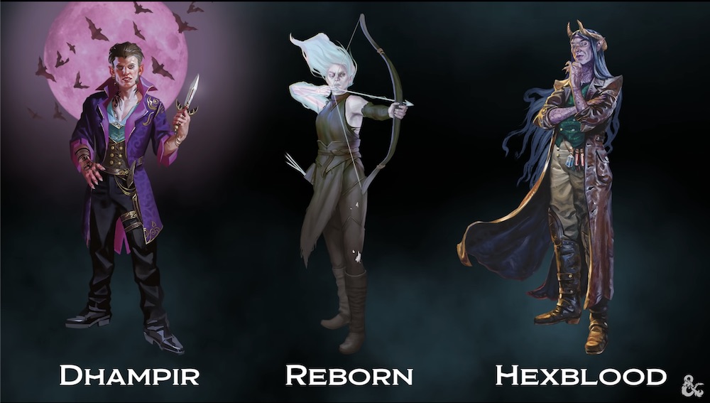
SageAdvice.eu has compiled a bunch of art shots from the upcoming Ravenloft setting book. I've featured a handful below, but click through to the link for the full set of nearly 30 pieces. https://www.sageadvice.eu/2021/04/27/sneaky-peek-at-the-terrific-art-of-van-richtens-guide-to-ravenloft/art-van-richtens-guide-to-ravenloft26/

SageAdvice.eu has compiled a bunch of art shots from the upcoming Ravenloft setting book. I've featured a handful below, but click through to the link for the full set of nearly 30 pieces.
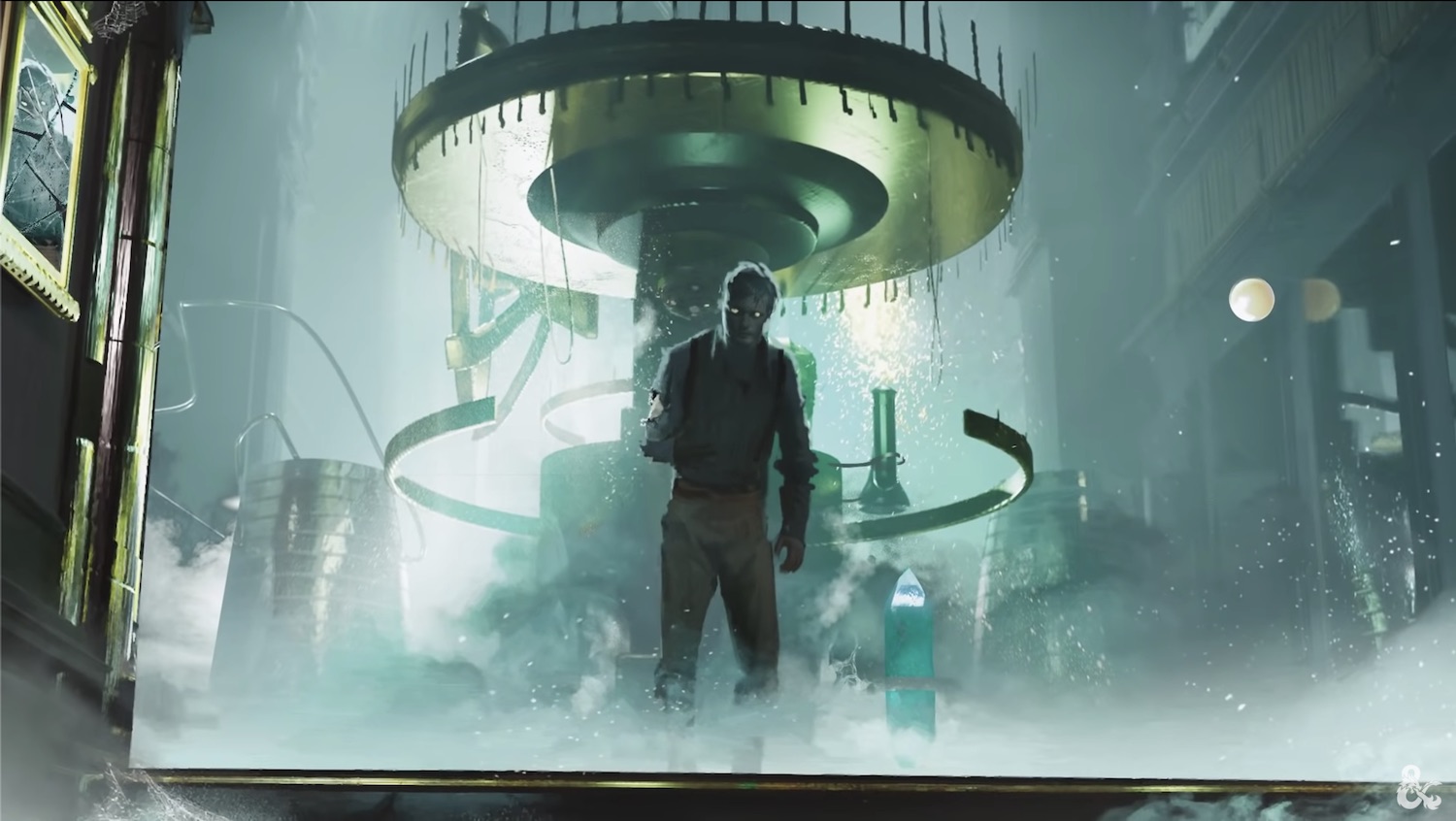
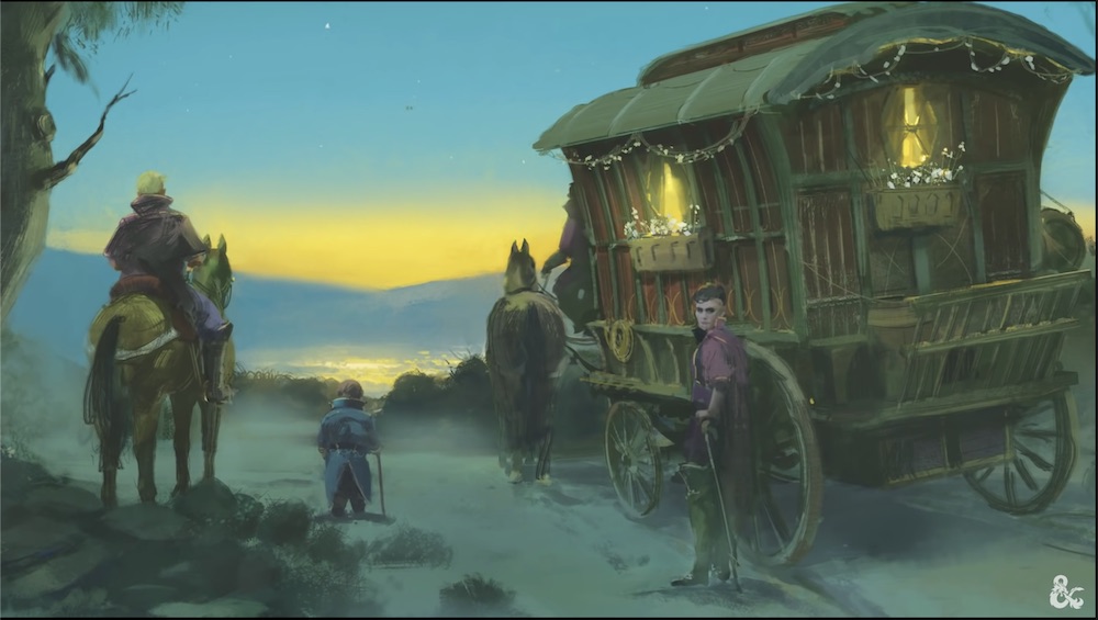
ART-Van-Richtens-Guide-to-Ravenloft0.jpeg

2.jpeg

3.jpeg

4.jpeg

6.jpeg

7.jpeg


log in or register to remove this ad

TheSword

Legend
Kinda gobsmacked by people knocking the art. I think it is amazing.

A lot of D’Terlizzi’s work was monochrome sketches. Bron created the art for Dark Sun but it ironically made the non-Bron stuff look jarring. Not to mention the fact that only really his amazing front covers were full colour.

Yes Darksun had this...

690B8527-9007-40FE-956E-4F24FA329E5F.jpeg


But remember, 90% of the art was this...

009CEE8C-B5A1-4F77-9B7A-B2FE9E2A532D.jpeg


Here in Van Richten’s Guide we have dozens of amazing full colour artworks. Throughout the book. They are dramatically better than the art for Tasha’s. That actually made me cringe...

1E4B20FE-9AE8-4205-83C2-5CB987E3AF1B.png

Compared to...

75D33DB7-CBD7-4C68-A9C5-F460B2366741.jpeg

No contest!
 
Last edited:

log in or register to remove this ad

Marc_C

Solitary Role Playing
As someone who is very tired of classic D&D I'm curious about this book. Never GMed a RL campaign. I only did The Created module, once, in the mid-90s.

The illustration with Strand and the Lich king feel very static despite the supposed action going on in the picture. Also it too clean. Looks like they just bought their clothes and put them on for the first time.
 
Last edited:

Tales and Chronicles

Jewel of the North, formerly know as vincegetorix
Also it too clean. Looks like they just bought their clothes and put them on for the first time.
I mean, both of them are lords of their domain and have had a lifetime to accumulate the appropriate garde-robe. If I was a 1000 y.o dark lord, you can bet that you would not catch me fighting adventurers twice with the same outfits, I'm no peasant!

(maybe they both caught a good promotion chez Simons à Laurier Québec ;))
 

TheSword

Legend
I mean, both of them are lords of their domain and have had a lifetime to accumulate the appropriate garde-robe. If I was a 1000 y.o dark lord, you can bet that you would not catch me fighting adventurers twice with the same outfits, I'm no peasant!

(maybe they both caught a good promotion chez Simons à Laurier Québec ;))
They’re probably robes of the archmagi.

If I’m paying 50,000gp for clothes, I better get dry cleaning included.
 

Not a bad thing. 2e era Ravenloft was nice, but mostly b/w (or r/w) and ranged in quality from great to very hard to see.

I think the stuff with fabian was outstanding (and a lot of the cover art was great as well: Night of the Walking Dead, Feast of Goblyns, a lot of the Van Richten Guides. But it was really the Fabian art that made that setting for me (and the borders and layout). I think where 2E faltered most was in the books that didn't use Fabian where you saw a less consistent level of atmosphere, and a dip in quality (at least IMO, some people may have liked the other artists). I was in love with the Fabian illustrations and found them so inspiring for coming up with adventure ideas. Overall I preferred the black and white approach (it just fit). But there were some instances like you say where the images were hard to see (this seemed to be mostly later on and in reprints (I think especially when there were conflicts over the rights to the Fabian stuff: I am not clear on exactly what happened, but I always had this idea somehow that that was related to some of the quality issues of reprinted Fabian art in some of the books: I could be way off here)
 

Art is a very subjective thing. I think tastes among modern gamers are going to be very different form tastes among gamers my age or older (in fact I often debate people who started in the 70s, because they seemed to have a real dislike of the kind of art I grew up playing the game with: especially the 2E era material). I think it is just one of those things. What looks silly or ridiculous to one pair of eyes, will look amazing to another. I tend to prefer stylized art, and simple art for something like Ravenloft. The setting for me was largely defined by Stephen Fabian.
 

Marc_C

Solitary Role Playing
I mean, both of them are lords of their domain and have had a lifetime to accumulate the appropriate garde-robe. If I was a 1000 y.o dark lord, you can bet that you would not catch me fighting adventurers twice with the same outfits, I'm no peasant!

(maybe they both caught a good promotion chez Simons à Laurier Québec ;))
(I'm sure he bought at Simons in Montréal ! :p )

I mean, it looks like the painting Strahd commissioned for the one time he defeated a Lich lord. It doesn't look like the actual event would. 🙃
 

Tales and Chronicles

Jewel of the North, formerly know as vincegetorix
(I'm sure he bought at Simons in Montréal ! :p )

I mean, it looks like the painting Strahd commissioned for the one time he defeated a Lich lord. It doesn't look like the actual event would. 🙃
Yeah, Its like a propaganda poster commissioned by Strahd:

''The Lord fights for YOU!''
''The Lord fights the red menace Azalin to protect your women and your children''
''Dying for Barovia is NOT the END; give your corpse to the army NOW!''
'' A good Barovian does not serve a Lich, even in DEATH''
 

Necrozius

Explorer
What were you expecting, Geiger?
Obviously not anything as extreme as H.R. Giger, but I agree that some art styles seen here "feel" a little too... clean? Safe? Some are great and atmospheric, but that image of Strahd and Azalin (?) just feels cartoony and lacks any of the moody atmosphere I'd expect from Ravenloft books.
 

Charlaquin

Goblin Queen (She/Her/Hers)
Not a bad thing. 2e era Ravenloft was nice, but mostly b/w (or r/w) and ranged in quality from great to very hard to see. The less said about 3e era art, the better. Innistrad though was some of the best M:TG art in all the sets. I think it's a good match for both settings.
I agree, it’s a very good thing!
 

Remove ads

Remove ads

Top