PHB, MM, DMG covers

Plane Sailing

Astral Admin - Mwahahaha!
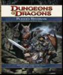
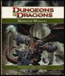
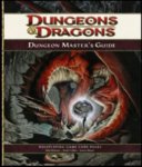
OK, Here are the covers from one of the presentation videos.

me likey!

Does the MM cover look a bit like Orcus? Just looking at the nasty skull-topped sceptre there :)

(added additional, clearer cover-montage from the Wizards Gencon site)
 

Attachments

  • phb40.jpg
    phb40.jpg
    21.8 KB · Views: 13,178
  • mm40.jpg
    mm40.jpg
    20.6 KB · Views: 13,236
  • dmg40.jpg
    dmg40.jpg
    21.3 KB · Views: 12,872
  • 4e_books.jpg
    4e_books.jpg
    117.7 KB · Views: 572
Last edited:

log in or register to remove this ad

Yeah, the covers fit with the "more magazine style" that has been mentioned by David Noonan already...can I say that I find them simply ugly? The layout as well as the pictures? All a matter of taste, I know. But that's what you get when you talk about artwork. To be honest, none of the pictures shouts "Dungeons & Dragons" at me personally. :\

And on a second glance, I have to specify that to the PHB cover. The other two are more tolerable.


At least they're not the bedazzled tombs from hades that increasingly got worse from 3e to 3.5e.

They're clean covers, I think, with maybe a bit too much art, I'd almost like a cover similar to the 2nd Edition Revised ones.

A clean, solid color border with a well done piece of art at the center, and the title across the top and on the binding.

But, I gotta admit, I do like the look of these ones, although anything is an improvement over the last two version styles.


Friadoc said:
At least they're not the bedazzled tombs from hades that increasingly got worse from 3e to 3.5e.

They're clean covers, I think, with maybe a bit too much art, I'd almost like a cover similar to the 2nd Edition Revised ones.

A clean, solid color border with a well done piece of art at the center, and the title across the top and on the binding.
Yup. I would like the cover NOT beeing designed by Wayne Reynold. I'm somewhat tired of his "screaming and attacking" characters, and they should be, given the usualy akward position he draw them. Why not Lockwood or Sam Wood ?


Greetings!

I have to admit--I think the covers *rock*!!!

They look clean, vibrant, and dynamic!

A vast improvement over the lame, or at least boring and dull covers so often used for 3.0 and 3.5E.

I'm glad to see that--Hopefully--WOTC is finally getting their act together, and getting with the effing program!!!!!! :D

Semper Fidelis,

SHARK
 

Ah man, with WoTC actually using illustrations and not some werid design on the cover, how will 3rd party publishers get away without using art on their covers for years aping the style?
 

I never really had a problem with the Tome Style covers Wizards used (a few 3rd party Tome Styles, on the other hand...), but it's nice to see (near) full-art covers again.
 

Remove ads

Top