
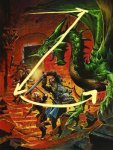
Green Dragon, easily.
Why?
1) I think it shows 'adventure' the best. The second cover has a bit of 'exploration' going for it but the dragon has the best 'adventure and excitement' aspect going for it.
2) Widest Range of characters. The first two options have "A Girl and Weird Critter". While they show off a 'new' race (yes, I know Tiefling has been around, I've played one, but new to the PHB) the dragon has an elf and a dwarf in the image. It has a fighter, a swahbuckler of some sort and a magic user of some sort.
3) Dragon.
4) To me, the PHB isn't "The PC's book". Yes, it's the book every player needs. However, while (in theory though not in practice) the Monster Manual will be the book of monsters and the DMG will only be the DM's book the PHB is NOT only the PC's book. It contains combat rules, equipment lists, spell lists, feats and abilities. It even contains Magic Items now. Everyone will use that book - not just the players of PCs. In my opinion there is absolutely no reason why that cover should only have PCs on it. If anything, there should be more PCs on it. I know that in the new PHB cover there a couple of blobs in the background that are presumably more PCs, but at least you can see the elf and the dwarf in the dragon image - so 4 PCs in the Dragon fight and two PCs in the other covers.
5) Dragon. (It's half of the game's title so it deserves to be counted twice.)
6) The Character Record Sheets are a very PC focused item. So why does that get the dragon cover?
")
")