• The VOIDRUNNER'S CODEX is coming! Explore new worlds, fight oppressive empires, fend off fearsome aliens, and wield deadly psionics with this comprehensive boxed set expansion for 5E and A5E!

Huge Cover Images from CNET article

Henry

Autoexreginated
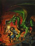
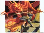
I'm seeing them close up now, and I still don't like 'em. I do like the MM cover -- very evocative. But compare the 4E PHB cover to the 1E version (with the dead lizard men) and the 2E cover (with the knight charging hard into combat, dust trail from his steed flying), and you had a sense of action with those. With this, it doesn't grab me and scream, "roll init!"

Failing that, I also had a soft spot for those faux book covers. They looked pretty neat to me.
 

log in or register to remove this ad

Phoenix8008

First Post
While the art itself is nice, it doens't convey any story. I think I like the DMG cover best and would have prefered something else for the MM cover, although I can't say what at this moment. The PHB cover should be much better/different. Personally, this would have been my pick for the PHB despite the nose-spike...
 

Attachments

  • 4egreendragon.jpg
    4egreendragon.jpg
    1.3 MB · Views: 93

Thornir Alekeg

Albatross!
Put me down with those who think the PHB cover is meh. I want action, not posing.

DMG cover is really good as long as I don't look too closely at the dragon's head. There is something about his head that seems off. Are those teeth or spikes along the side of his head? The way they are in a row near the jawline makes me think teeth, but if they are then he needs an orthodontist since they are pointing straight out instead of down.

I like the MM cover the most. What is that to the right of Orcus? Is it a lich with a big hat?
 

Filcher

First Post
I don't dislike them, but for my money they don't best Elmore ...

THAT one says, "Roll for initiative!"

The composition is rock solid, and the even the shield looks like it has a story to tell.

I'm looking forward to 4E, but I miss the days when a sword looked like something a person could reasonably carry...

~Old Man
 

Attachments

  • Basic D&D Red Dragon.jpg
    Basic D&D Red Dragon.jpg
    189.6 KB · Views: 93

Foundry of Decay

First Post
Phoenix8008 said:
While the art itself is nice, it doens't convey any story. I think I like the DMG cover best and would have prefered something else for the MM cover, although I can't say what at this moment. The PHB cover should be much better/different. Personally, this would have been my pick for the PHB despite the nose-spike...

Wow, yeah. If comparing between the current PHB image and this one, I'd certainly pick the latter. It conveys a good sense of action against an enemy/challenge. I'm sure they'd have to re-model at least one of the party into a dragonborn though, since they'd want to show off the new race in some sort of way.

..Just as long as the fighter wasn't 'painted out' since he looks phenomenal in this image.


Filcher said:
I don't dislike them, but for my money they don't best Elmore ...

THAT one says, "Roll for initiative!"

The composition is rock solid, and the even the shield looks like it has a story to tell.

I'm looking forward to 4E, but I miss the days when a sword looked like something a person could reasonably carry...

~Old Man
Maybe the action is nice, but I still dislike the individual quality. The Dragon looks a bit... goofy to me, and the picture is generally not very well detailed. Combining the general motives and action with the details and richness of the 4E books, and we get closer to perfection...
 

Klaus

First Post
Mouseferatu said:
Oh, was it? I could've sworn it was somewhere across the pond, but I've been wrong before. On occasion. ;)
Oh, it was probably us down in Bananaland. Here, RPG's reputation was pretty much based on Vampire: the Masquerade and its dark themes and crazy LARPers.
 

Taralan

Explorer
These covers are amongts the worst RPG art I have seen in my 25 years of role-playing and certainly not up to par with todays standard, especialy the PHB which is simply atrocious. 90 % of third parties products looks better than that.

I still am hoping that this is all a big joke and that the actual covers will be different, but i am afraid I am deluding myself. Since I can't imagine that the art director can be so bad (especially considering that the art in the two preview books was mostly excellent) I will venture that this is done on purpose to force people to buy the deluxe leather edition, just to get rid of these covers. It will certainly work for me :D
 

Remove ads

Top