• NOW LIVE! Into the Woods--new character species, eerie monsters, and haunting villains to populate the woodlands of your D&D games.

Huge Cover Images from CNET article

Taralan said:
These covers are amongts the worst RPG art I have seen in my 25 years of role-playing and certainly not up to par with todays standard, especialy the PHB which is simply atrocious. 90 % of third parties products looks better than that.
QFT

The DMG cover is passable. The MM cover is bad. The PHB cover is a total embarrassment.
 
Last edited:

log in or register to remove this ad

I will agree as well with everyone. I think the DMG is the best. And is quality work.
The MM isn't as good and I really am just meh about the PHB.

What I really don't like is that both the DMG and MM have a real big red thing with horns on it.
With all the monsters out there, why did they choose 2 that have alot of similar traits?
(I know that WE know the difference, but to newcomers, one could be the were-form of the other.)
Why not throw a blue dragon on there? Or make the MM one of the other demons that isn't iconically red. How about an Ettin or an Elemental?
It doesn't make sense to me to put 2 big red images on 2 out of 3 of the books.
 

hennebeck said:
I will agree as well with everyone. I think the DMG is the best. And is quality work.
The MM isn't as good and I really am just meh about the PHB.

What I really don't like is that both the DMG and MM have a real big red thing with horns on it.
With all the monsters out there, why did they choose 2 that have alot of similar traits?
(I know that WE know the difference, but to newcomers, one could be the were-form of the other.)
Why not throw a blue dragon on there? Or make the MM one of the other demons that isn't iconically red. How about an Ettin or an Elemental?
It doesn't make sense to me to put 2 big red images on 2 out of 3 of the books.
Or maybe make Orcus... I dunno... not red?

While the art is well done, that demon lord looks more like a raging demon of hatred than the demon prince of the undead.
 

Wisdom Penalty said:
el-remmen said:
attachment.php

Man, that just gets me every time. I agree with you completely.

I wonder, however, how much is due to pure nostalgia - which certainly doesn't make it a fair comparison for stuff nowadays.

Still...I miss the simple, B&W, evocative art from Back in the Day.

W.P.

I think its mostly Nostalgia. I don't think its a very good cover (no offense). I would take it in a second over the 4e cover though. I do very much like the logo of the wizard at the bottom right conner though.

Moniker said:
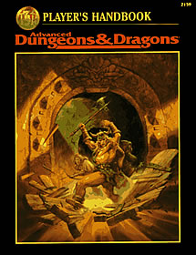
Remember the guy busting through the door with the wrong hand on his arm in the revised 2nd ed. AD&D Handbook? :cool:

phb_addv2_s.jpg

I would give up my first born for a cover this this good. It just reeks of Boris Vallejo and Frank Frazetta.
 
Last edited:


Moon-Lancer said:
I think its mostly Nostalgia. I don't think its a very good cover (no offense). I would take it in a second over the 4e cover though. I do very much like the logo of the wizard at the bottom right conner though.

Not that much nostalgia on my part at least. The art skill level is meh, but the story it portrays is awesome. I'll take a poorly rendered awesome story over a much better rendered crap story any day. Now if it was any of the basic edition boxed set cover art ok nostalgia would be having a large say in the matter. I think it was the masters box set that I loved the most, where the guy in plate is wielding a anime sized sword crackling with lighting while facing a dragon. Yeah its one dude not a party, but I loved it then and love it now.
 

Taralan said:
These covers are amongts the worst RPG art I have seen in my 25 years of role-playing and certainly not up to par with todays standard, especialy the PHB which is simply atrocious. 90 % of third parties products looks better than that.

Of the thousands of covers and thousands of interior illustrations I have seen, I believe most are magnitudes worse than this, in the some thousand books I have in my bookshelf. Compared to e.g. the art in most third party one man show d20 books, this is very, very, very good.

IMO, of course. But I have a hard time seeing that 90% of all art in third party books out there are better than this. I really can't see it.

/M
 

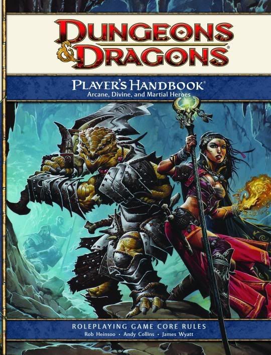
The PHB cover makes sense once you read the photo caption:

4E-PH.jpg


"Redgar and Mialee take first prize in local cosplay contest."

Redgar made the armor and sword out of cardboard, and sewed the dragonborn suit out of dragonborn skin.

Mialee bought her costume from the local "Loviatar's Secret" store, and had Lidda help her with the slutty makeup.

I guess adventurers have geeky hobbies too.


:D


Into the Woods

Remove ads

Top