
cavetroll
Explorer
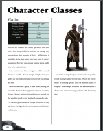
So for the character art, when it is a single character representing a class (as one example), I had the character created with just a little shading under their feet.
The reason being, to have a custom background doubles the price.
Now I'm looking at the page, does it look ok or do you feel like something is "missing". I could have some generic backgrounds created that sit behind each figure, hard to tell if it is needed.
What do you think, does it jump out to you that there is too much whitespace around the figure?
Updated 4-26

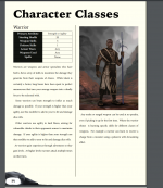
The page is not complete of course.
The reason being, to have a custom background doubles the price.
Now I'm looking at the page, does it look ok or do you feel like something is "missing". I could have some generic backgrounds created that sit behind each figure, hard to tell if it is needed.
What do you think, does it jump out to you that there is too much whitespace around the figure?
Updated 4-26
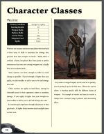
The page is not complete of course.
Attachments
Last edited:
") I'll redo thanks !
I'll redo thanks !