Pigeon
First Post
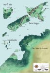
Here's another map I made, still in corel photopaint, but with the lettering done in Corel draw.
I keep forgetting/losing the textures I used for mountains ect, and so never get it looking quite how I would like. Still, I'm pretty pleased with this one. I'm planning on doing some close up maps when I have more time.
Someone suggested that I should make my water a bit more defined, which is something I agree with, just got to work out how to do it!
[edited for spelling]
Attachments
Last edited:


