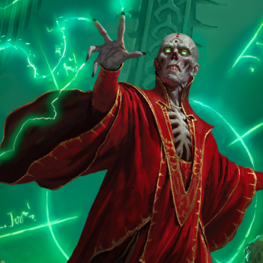
Arcane Power Art Gallery: Welcome back, old friends

Try again. 9 of the first 9 are recycled, or 10 of a total 66 pictures. That's almost 1/6th of all art in the book.

The new art is mostly very good, though.
I stand (actually sit) corrected. Those were only the ones I recognized offhand.

Although, personally, it doesn't bother me all that much, but that's just my opinion. If the artwork is good and fitting, I can handle some re-use. Probably what bothers me the absolute most however, is when they use recycled art and it's not good.* THAT is annoying!

* Art that is "not good" being a totally subjective thing, of course, making my comment rather tongue-in-cheek. :)
 

log in or register to remove this ad

I don't think it's just perception.
As others have pointed it appears that way because they decided to put all the recycled art to the top.

I generally don't mind recycled art, sometimes it even makes sense, e.g. if a 4E paragon path is a reimagining of a 3E prestige class.

I don't know a lot about the process of selecting art for a book, but I think they actually commission more pieces than ever make it into the book. They may get several drafts for a piece and then decide which (if any) should be fully rendered and put into the book.
So at this point (or later after receiving the finished piece) they might decide they'd rather go with an existing piece simply because it's actually better!

E.g. I'm actually overjoyed about seeing the Ultimate Magus art again. It's one of my favorites.

The one I liked best of the new ones is the one with the two blue dragons circling the tower.
 

Actually it's not that much of recycled art. The first rows are recycled and get your attention but most of the art is new. I don't like that there is this much recycled art anyway but it is not as bad as your initial reaction to it may indicate.
 

My very first reaction was to start counting...I only got to 6. But I suspected there was more.

But is it funny? These books aren't cheap exactly.
 

Actually it's not that much of recycled art. The first rows are recycled and get your attention but most of the art is new. I don't like that there is this much recycled art anyway but it is not as bad as your initial reaction to it may indicate.
Much more than the first row. 10 out of 66, actually.


I don't mind the recycled art. That's just not all that bad. But what I do mind is that Morthos the 3.5 warlock still only has four fingers, including the thumb, on his left hand.
Apparently you lose your pinky when you become a warlock:eek:
 

I have no qualms with recycled art, as long as the art is good in the first place.

I would have been happier not seeing Gimpball the gnome or the Dandy dwarf.

I'm pleased to see the CA cover art again.

Wayne England is still very hit and miss in my opinion, the bottom humanoid's are really darn good in this pic thought it's hand looks plain out unfinished and the rest of the pic is meh. His Familiars piece is actually darn good, except he had to go and ruin the pic with a 'Uge 'Ead Imp.

Can't stand this one http://www.wizards.com/dnd/images/APower/12.jpg

This is one of the pics that look painfully shooped..


Remove ads

Top