• The VOIDRUNNER'S CODEX is LIVE! Explore new worlds, fight oppressive empires, fend off fearsome aliens, and wield deadly psionics with this comprehensive boxed set expansion for 5E and A5E!

D&D 5E Art in 5e...?

steeldragons

Steeliest of the dragons
Epic
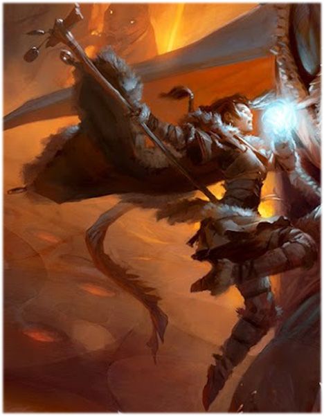
It's interesting that you see it as blue and white; it looked gray and orange to me. It's probably the blue light in his face that makes the colors look weird.

This is true. It could also just be how the color is showing on my screen...which could be different to others.

The cropping has a lot to do with it. In the cropped image, the background is oddly red, and then by contrast the giant looks blue. In the uncropped version, you see that odd redness is really an entire firey landscape, and the frost giant idea goes out the window.

This is certainly true. Having seen the full spread now, there is no question this is a [the?] fire giant. Though I'm still questioning the white beard...Guess fire giants get old too. hahaha. Reassuring.
 

log in or register to remove this ad

Obryn

Hero
Yeah, the sexualization of female heroes in comics and rpg art is a real issue, and one I'm pretty passionate about. But it's a lot more than "is/might be attractive."

It's about poses and context - active vs passive, normal-ish vs t&a, sexy/impractical outfit vs reasonable gear.

RPGs have been terrible about this in the past (and present). Pathfinder art, for example, gets very cheesecake-y and eye-rolling at times. I tend to err on the side of caution and inclusiveness, and agree with feminist criticism of gaming and its fandom. Rpgs have a sketchy history of inclusiveness, so I'm primed to object at the artwork. And I'm certainly not a big Next booster.

But with all that said, I just can't see the cleric on this cover as sexualized. She's reasonably attired, in an active stance, and is attired in protective-looking armor. She's not half naked, her T&A aren't on display, and she's kicking a giant's ass.

It's stylized, sure, but man... If this is the art direction, I expect to have few complaints down the road.
 

SigmaOne

First Post
The cropping has a lot to do with it. In the cropped image, the background is oddly red, and then by contrast the giant looks blue. In the uncropped version, you see that odd redness is really an entire firey landscape, and the frost giant idea goes out the window.


I was showing the cropped image to my fiancee yesterday, and she did not see that it was a fire giant. To which I replied "It's a giant, and there is fire (the red background), and his eyes are glowing red." After that she was completely convinced. I do agree that it's easier to get a feel at a glance with the uncropped image.

Either way, it's a great painting, and a great cover for the PHB.
 

gweinel

Explorer
Am I the only one who thinks that the cropping of PH is just not good? I think the uncropped version is more understanable and tells better the story of the scene that the zoom in of the fire gian the female cleric/wizard. Also in the cropped version you cannot discern clearly the body of the woman as it blends to the body of the giant.
 

Patrick McGill

First Post
Also her outfit has a skirt for no practical reason.


Doesn't have to be a practical reason, does it? Maybe the bad ass elf druid likes fur skirts? That doesn't make it sexual. Just makes her stylish. My wife wears skirts. She loves them. Is she thus sexualized?

While my opinion is that the picture IS progressive, especially for fantasy art, and that the figure presented is heroic and badass and of course fantastical but not a sexual object, I just want to make it a point to point out that I am happy as a hog in mud that this conversation is even taking place, and is being taken seriously.

Whatever you think of the picture, I think that right there is awesome (and another reason why I like this forum). I am glad that the subject of objectification is part of the conversation in some way.

(Also I'll agree to disagree and stop talking about it if thats want is wanted by the mods. I don't think the conversation is an unhealthy one though.)
 
Last edited:

GX.Sigma

Adventurer
Am I the only one who thinks that the cropping of PH is just not good? I think the uncropped version is more understanable and tells better the story of the scene that the zoom in of the fire gian the female cleric/wizard. Also in the cropped version you cannot discern clearly the body of the woman as it blends to the body of the giant.
Yeah, all the covers they've shown seem too cropped. I hope it's the kind of thing where the left half of the image is on the back cover.
 

Dausuul

Legend
Am I the only one who thinks that the cropping of PH is just not good? I think the uncropped version is more understanable and tells better the story of the scene that the zoom in of the fire gian the female cleric/wizard. Also in the cropped version you cannot discern clearly the body of the woman as it blends to the body of the giant.

I agree that the uncropped versions look better. But they're the wrong shape to put on book covers (unless wrapping around to the back), and both have a lot of dead space on the left.
 

Mistwell

Crusty Old Meatwad (he/him)
The "skirt" is a place with pockets for components and such. It's over pants. Skirts only sexualize because they show skin - not because they are skirts. The skirt alone isn't the thing causing the sexualization, and in this case because there are pants on under the "skirt", it's not sexualized. Indeed, it actually serves to cover her butt, rather than reveal anything. It's more de-sexualizing than it would be with no skirt.

PHBwoman_zpsbeecf0f7.jpg


PHB---Tyler-Jacobson.jpg
 
Last edited:

gweinel

Explorer
I agree that the uncropped versions look better. But they're the wrong shape to put on book covers (unless wrapping around to the back), and both have a lot of dead space on the left.

Yes indeed about the shape, and since we howthe spines of the books look like (red/black) then it will a break to the image if the latter wraps around the covers.

As for "dead space" I actually like it, especially for PH. It adds to the atmosphere. I would prefer it than the overcrowded DMscreen of 4the. The lack of horror vacui (fear of the void) is a good feature in a piece of art.
 

gweinel

Explorer
The "skirt" is a place with pockets for components and such. It's over pants. Skirts only sexualize because they show skin - not because they are skirts. The skirt alone isn't the thing causing the sexualization, and in this case because there are pants on under the "skirt", it's not sexualized. Indeed, it actually serves to cover her butt, rather than reveal anything. It's more de-sexualizing than it would be with no skirt.

PHBwoman_zpsbeecf0f7.jpg

I couldn't agree more. Sometimes my gf does the same actually. :)
 

Voidrunner's Codex

Remove ads

Top