Ran across this thread today. Conlan, you do good. Your work shows a level of professionalism and skill others could emulate to their profit.
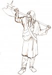
The knight in your first post is well animated. It is clear to anybody with eyes to see that the poor guy is pooped. Show him to a spot near the campfire and he's gone till midmorning.")
I thought you used colored pencils in your first samples. Just had that, grain, to it. Try it with acrylics and high-end markers sometimes, to see how they work. Scan the basic pencil and color the file using your preferred paint program too. Just to see what happens.
I noticed that your style is naturalistic. How are you with nature scenes? Speaking of which, check out Rigor Vitae, a blog on nature, art, and life.
Speaking of blogs. One of your own would help alot. I know a lot of people are happy with Blogger, but I recommend getting a paid host for the extra space and bandwidth. A number of hosts offer blogging and gallery software that is installed through an installation utility like Fantastico.
I use Total Choice Hosting myself. $10.95US for a one year domain registration and about $4.00US a month for the cheapest hosting plan. All plans come with Fantastico, and that provides a lot of stuff you could use. You get any kind of traffic it'll be worth it.
Keep working on your art and I hope to see you at GenCon or ComicCon some day.
The knight in your first post is well animated. It is clear to anybody with eyes to see that the poor guy is pooped. Show him to a spot near the campfire and he's gone till midmorning.
I thought you used colored pencils in your first samples. Just had that, grain, to it. Try it with acrylics and high-end markers sometimes, to see how they work. Scan the basic pencil and color the file using your preferred paint program too. Just to see what happens.
I noticed that your style is naturalistic. How are you with nature scenes? Speaking of which, check out Rigor Vitae, a blog on nature, art, and life.
Speaking of blogs. One of your own would help alot. I know a lot of people are happy with Blogger, but I recommend getting a paid host for the extra space and bandwidth. A number of hosts offer blogging and gallery software that is installed through an installation utility like Fantastico.
I use Total Choice Hosting myself. $10.95US for a one year domain registration and about $4.00US a month for the cheapest hosting plan. All plans come with Fantastico, and that provides a lot of stuff you could use. You get any kind of traffic it'll be worth it.
Keep working on your art and I hope to see you at GenCon or ComicCon some day.