Conlans Art Thread

Bobitron said:
Looks great! I think it might be wise to rotate the blade around so you can see the hilt and give it a little thickness. It looks a bit spindly at that angle. maybe lengthen the hilt a bit as well.

I'm nitpicking, though. I'm really pleased with what you've got!


How do you like this version...
 

Attachments

  • Starhl2.jpg
    Starhl2.jpg
    183.5 KB · Views: 210
Last edited:

log in or register to remove this ad


jgbrowning said:
Nice work.

joe b.

Not trying to hijack the thread but I just wanted to compliment you, Joe. I LOVE the Magical Society books! Extremely useful, especially for someone (me) building his own fantasy setting. Love 'em!

Keep up the great work!
 

Conlan, I am the player of Valurel. Just wanted to say I think your work is excellent! I also think your style would suit the fantasy setting I'm in the process of building nicely. Might have to hit you up for a request or two after you finish what you have in the queue.


I really like the style of these--it has a wonderful earthy, organic feel.

Once you get comfortable with Photoshop, don't let all the slick glossiness of computer art draw you away from this-- the linework is just beautiful, and comes from the use of real ink and pencils.

It gives these early medieval characters an authenticity and context that is very pleasing.

I especially like the ones in the sepia colored line the best for this reason, and all your use of subtle earth tones.
 

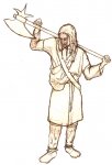
Here is a draft of Herger, I'm still having a couple of anatomy issues with his hands and whatnot, minor stuff. Let me know what you think of it, anything that you want changed, clothing, hair, or axe wise?
 

Attachments

  • Herger Sketch.jpg
    Herger Sketch.jpg
    199.1 KB · Views: 200


Remove ads

Top