You are using an out of date browser. It may not display this or other websites correctly.
You should upgrade or use an alternative browser.
You should upgrade or use an alternative browser.
Disable the blog bar to the Left of the screen?
- Thread starter frankthedm
- Start date
RangerWickett
Legend
I have a tiny (very very small) problem when I try to edit my blog posts. You have the left sidebar, blog sidebar, main column, then right sidebar, which makes it impossible to click the button to toggle between editor modes, since it's located under an ad.
But like I said, it's a tiny problem, surmountable several ways.
But like I said, it's a tiny problem, surmountable several ways.
Attachments
MarkB
Legend
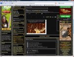
I use Google Chrome on a 19" widescreen monitor. I routinely view forums at +1 zoom for easier text reading. Here's how EN World currently looks:

The problem is, zooming used to just bump the right-hand ad bar further across, but it now squeezes the main pane between the two sidebars. The result, after subtracting the sidebars and the author details to the side of each post, is that I now have less than 50% of my screen width dedicated to the text I am actually reading.

The problem is, zooming used to just bump the right-hand ad bar further across, but it now squeezes the main pane between the two sidebars. The result, after subtracting the sidebars and the author details to the side of each post, is that I now have less than 50% of my screen width dedicated to the text I am actually reading.
IronWolf
blank
Some screenshots might be useful; I have a 22" screen, admittidly, but with both sidebars running I have acres of space. The sidebars between them take up maybe 15% of the screen at most.
This is why you have plenty of usable space since your monitor is a widescreen and likely running a pretty nice wide resolution. The wide resolution gives you more pixels so the sidebars are taking up much less space from the percentage standpoint leaving you with more usable space.
Likely those of us finding the multiple sidebars more of a problem are not running 22" widescreens. I find I am losing a lot of usable, content providing space on my dual 17" setup and on my 19" monitor setup (neither widescreen).
It looks like each sidebar is set to 230 pixels, so 460 pixels (not counting padding) of screen real estate is being used by the sidebars. This has more of an impact on a person running 1024x768 for a display resolution than someone running a 1680x1050 resolution.
I would also like to point out that the left sidebar has screwed with the White/Stealth theme quite a bit. I'm attaching a screenshot to show the effects. As you can see, the ads on the right side now block part of the thread. I actually had to change the theme to be able to post this, since the "upload" button for attachments was covered up.
screenshot deleted
screenshot deleted
Last edited:
pawsplay
Legend
I could see that being a problem - if I needed to click on that obscured RPGNow store button every five minutes!
It's only a little annoying, usually. But I had to change my IE settings to get it to work even that well, and I still get tired of my screen doing a little wiggle when I switch between screens that have the minibar and ones that don't. None of that I would consider a deal-breaker.
What does concern me is the question as to where new site members are going to come from. As pointed out, viewing the site as a free visitor is pretty gross, and brand new visitors to sites don't usually plop down subscription fees on a whim.
To be frank, I'm here for the community, not lots of site extra, and I'm a supporter because I didn't want the site to go away.
Similar Threads
- Replies
- 0
- Views
- 516
- Replies
- 0
- Views
- 660
- Replies
- 16
- Views
- 2K
Recent & Upcoming Releases
-
June 16 2026 -
June 16 2026 -
September 16 2026 
Arcana Unleashed(Dungeons & Dragons)
Rulebook featuring "high magic" options, including a host of new spells.
Replies (250) -
September 16 2026 -
October 1 2026 -
October 6 2026 -
January 1 2027 -
January 1 2027


