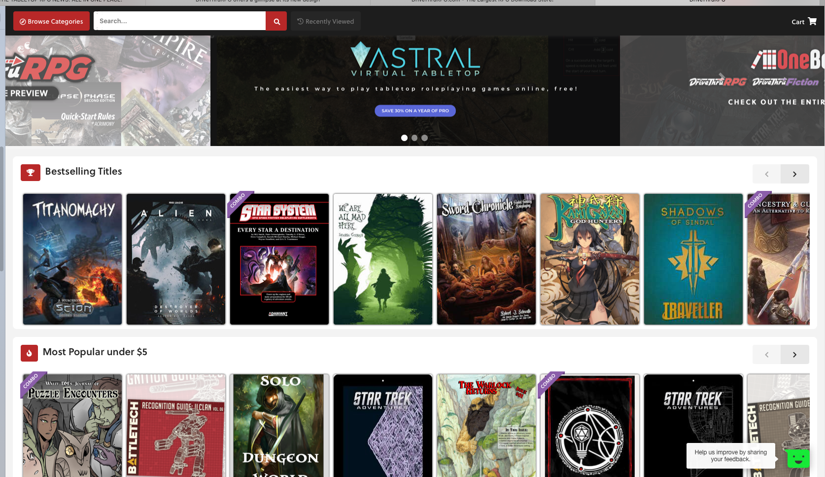
If you head over to DTRPG, you'll see a link at the top to a 'sneak preview' of a new site redesign. For certain values of 'sneak'.


You are using an out of date browser. It may not display this or other websites correctly.
You should upgrade or use an alternative browser.
You should upgrade or use an alternative browser.
DriveThruRPG Is Having A Facelift
- Thread starter Morrus
- Start date
If you head over to DTRPG, you'll see a link at the top to a 'sneak preview' of a new site redesign. For certain values of 'sneak'.

Morrus is the owner of EN World and EN Publishing, creator of the ENnies, creator of the What's OLD is NEW (WOIN), Simply6, and Awfully Cheerful Engine game systems, publisher of Level Up: Advanced 5th Edition, and co-host of the weekly Morrus' Unofficial Tabletop RPG Talk podcast. He has been a game publisher and RPG community administrator for over 20 years, and has been reporting on TTRPG and D&D news for over two decades. He is also on the socials.
Eyes of Nine
Everything's Fine
As a product manager, I'd be really interested in the data around engagement on all the features they decided to keep. Like WHY did they decide to keep the horizontal scroll? Best practice on most ecommerce sites now is a gridded vertical infinite scroll (for example, the Gap); or descending into catetories. Current experience allows you to have gridded, "see all", or even just text links. They removed this functionality in the new experience. Did they A/B test into this new experience? I'm very curious.
Is "Bestselling Titles" really the most important thing to keep that the top? And then to have the very confusing "Most Popular under $5" right under - is that also really the 2nd most important thing?
Does the context change when someone is logged in as opposed to not logged in?
Why don't I see a "deal of the day" when someone comes to the front page?
My final point here - this only seems to be a redesign of their front page.
So many questions, so much opportunity. This actually looks a lot like they just updated the CSS (mostly); without actually altering much of the underlying functionality or conceptualization of the shopping workflow. As @Jd Smith1 noted, unless a lot of the feature logic (including search, for me too) is improved, shade me also as unimpressed.
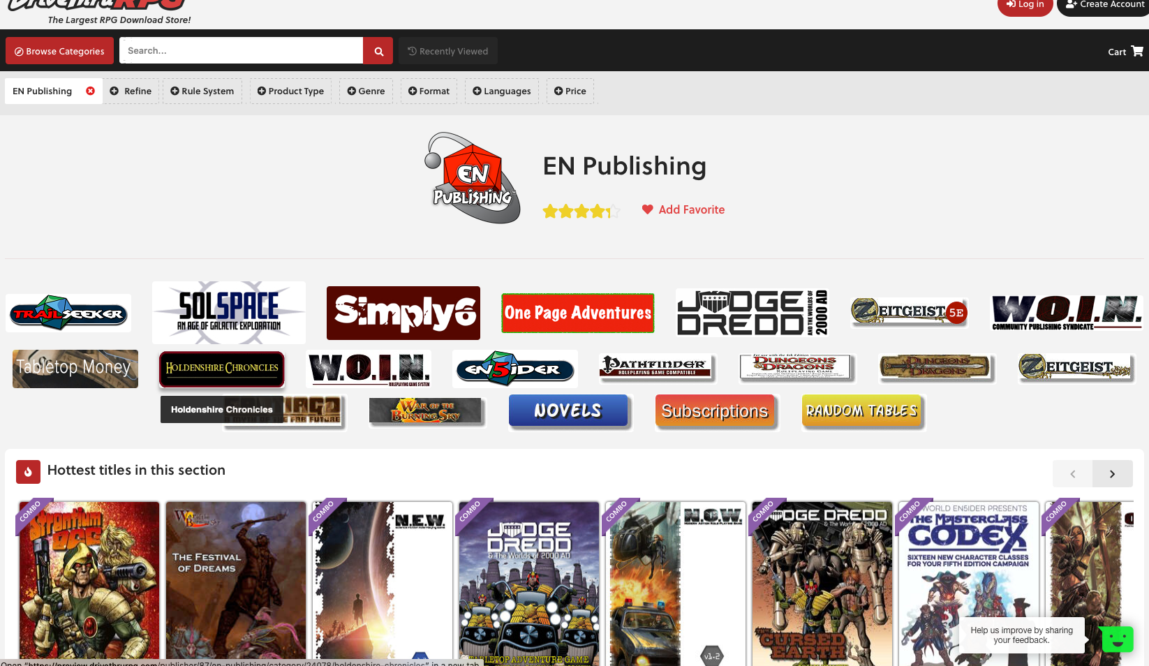
(Ok, I also did a search, using EN Publishing as an example. Not an improvement)
Maggan
Writer for CY_BORG, Forbidden Lands and Dragonbane
My final point here - this only seems to be a redesign of their front page.
They did put up this caveat when I clicked on the preview-link:
Drivethrurpg said:This is just a sneak peek of a few pages and not necessarily our final design.
We would love your feedback using the green icon in the lower-right!
So presumably, they are working on the rest of the site.
/M
imagineGod
Legend
About damn time too. 
The old site was very functional but was so out-dated like a throwback to the 90s.
The old site was very functional but was so out-dated like a throwback to the 90s.
Bolongo
Herr Doktor
To the 90s?About damn time too.
The old site was very functional but was so out-dated like a throwback to the 90s.
Sounds like you weren't actually around for Web 1.0...
imagineGod
Legend
If you want to be pedantic about it, the design of DriveThruRPG is basically RPGNow from nearly two decades back, so 20 years out of date.To the 90s?
Sounds like you weren't actually around for Web 1.0...
Seriously, look at the early days and look at it just before the new upgrade, and within those twenty years, the RPGNow/DriveThruRPG brand basically fossilized its early webdesign for those two decades. Where did all the profits go?
imagineGod
Legend
The logo redesign of DriveThruRPG is really good, a serious upgrade from two decades of excessive 3-D shadows (a throwback to heavy metal covers) and like those old clickable buttons that plagued those days of "Web 1.0" for you old geezers. 


imagineGod
Legend
And in the excitement to show off the new site, we now know it is built with the Angular CMS (Google is the Angular brainchild).
Similar Threads
- Replies
- 10
- Views
- 5K
- Replies
- 499
- Views
- 56K
Related Articles
-
-
-
RPG Spotlight: Realms of the Three Rings/Keepers of the Elven-Rings
- Started by Charles Dunwoody
- Replies: 10
-
-
DriveThruRPG quietly releases "legacy" URL for those who prefer the classic site look
- Started by Alzrius
- Replies: 13
