EN World 10 Year Anniversary Competition & Community Supporter Account Sale!

Morrus

Well, that was fun
Staff member
OK, I've spent over an hour trying to do what should be a 3-second task. I think I need a break before I throw my computer monitor through the window!
 

log in or register to remove this ad


tuxgeo

Adventurer
Some variations on a theme. It's all built in layers so transparency, backgrounds, outlines around the letters, positioning of elements, text, etc. can all be readily changed.

Here's the font that matches the current logo - one with a border and one placed over the current site header bar. I think I prefer this one to Morpheus, but YMMV.

enworld_var1.png

< snip . . . >
Zinovia, please tell the rest of us the name of that font, if you would (for future reference, if nothing more).
 

weem

First Post
Very cool, thank you!

And I agree, all the submissions were really good and I could see any of them working well here. I definitely think this would be a fun contest to do yearly ;)

Thanks Morrus, and thank you to those who offered other prizes as well - this was fun to do and I look forward to seeing the logo up there for the next year!
 

Oryan77

Adventurer
As thanks for your participation, everyone who entered will get a one-year community supporter account.

Cool, thanks!

Congratulations weem, you've now caused Morrus to have to do 3 years of community work to get your logo to work on the website :lol:
 

Mistwell

Crusty Old Meatwad (he/him)
I gotta say I really like the 10 year banner. It's both modern and the style matches the genre well. Well done Weem!
 
Last edited:

Zinovia

Explorer
The font name is...

Zinovia, please tell the rest of us the name of that font, if you would (for future reference, if nothing more).

Evanescence

Congratulations to Weem for the winning design. I wasn't sure I should bother entering because his entry was so strong. I liked it as soon as I saw it.

As for doing stuff like this on spec, we know we're not getting paid for it. 90% of the design work I have done has been for non-profit and volunteer organizations. So my work has no value anyway. ;)
 

tuxgeo

Adventurer
[ the font name is . . . ]
Evanescence

Congratulations to Weem for the winning design. I wasn't sure I should bother entering because his entry was so strong. I liked it as soon as I saw it.
;)
Thanks for the font name, Zinovia! Also congratulations to weem: that was certainly deserved.

Each of the entries had different strengths; I didn't hesitate to attempt one because I thought that a broad variety of design concepts would give Morrus a wider field of alternatives to choose from.

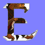
My initial concept would not have worked at all, because it calls for dynamic new art: characters peering out from within the borders of the letters "E" and "N". My own art skills are weak, so I would have had to learn to draw first. An example of the idea should appear below, using "borrowed" art.

Unfortunately, I don't own the art; that's taken from PA! Gabe's drawing of Gnasc the Gnoll, peering out from within the (bolded) lowercase Evanescent e, made transparent. (I hope I did that right.)
Equally unfortunately, any effort to reduce the image to a smaller size more in keeping with a more customary logo would trash the resolution, ruining the effect.
Also unfortunately, I was at a loss for what characters to use in the first place. Initial thought: an Elf and a Nymph, representing E and N. (Or an Eladrin and a Noble might work. Elephant and -- what, Ninesaucerworst? -- would be far too large.)
 

Attachments

  • GnollBigE09T.png
    GnollBigE09T.png
    18.6 KB · Views: 52

Greg K

Legend
Welll, I didn't see a deadline and thought I had more time. This was going to be my entry. I had created illustrator files for non-web based that can be rescaled and converted them to jpegs for a web version.

en_logo%20copy.jpg
 
Last edited:


Remove ads

Top