Okay, my evaluations on this is more along the lines of. Not bad overall. Just missing a certain pinache that could of turned these covers from 2D flat images, to something that really pops off the covers. Depth would of done these works a huge deal. And I think WAR is really, good at what he does. And I enjoy his style immensely.
That said, my opinions on each piece.
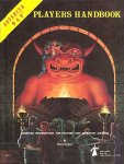
The new players hand book. PHB.
A lot of the complaints on it, being anatomically preposterous, really don't fit with what he's going for. The Wizard and the Fighter back to back, about to face the unknown foe. She's crouching down and if you notice, she's ready to spring back or to the side quite easily based upon her stance. Further having her ally there, to back her up getting ready to whack anything that gets close fits great.
But I concur the problem with the dragonborn is they don't have a tail. And without knowing the reason behind it, I can only say. Tieflings have tails, give the damn Dragonborn some Tail love. We won't think any less of you and will most definitely think much higher of you if you do.
Also the head of the Dragonborn, that's just really painful to look at. The problem is the headridges on either side, should of either been more pronounced, or well, less pronounced to give them some depth, and help seperate the block style head. Also the Dragonborns coloration should of been a bit different, just to offset it some more.
Further the claws that are visibile on the foot, coming at us, look like they were supposed to be gripping the rock, but yeah that didn't happen so much. (Also it looks like it was painted on the last minute as the shading in here is too much of a problem.
Overall, this is not a good image choice to represent your entire D&D line, the one that is going to be seen at every 4E D&D gaming table. "The one that all players will buy." The one thats going to rest itself out for the world to see. This should of probably been a big battle scene with each character fighting an opponent, while doing some crazy stunts to represent action.
Overall.. this cover while good, for me. Only get's a C+ as I know WAR is capable of better.
And the art director didn't create the right feel, as it just feels like a minor progression from previous WAR images.
DMG much better in general, but it does it's purpose well. Conveys the concept of the Dungeon Master watching his prey quite well. The two problems with this image, shadows and coloration of the cavern. Should of been better, more depth, etcetera. My problems with the issues on this again even for the Dragon the shadows just do it justice, and it seems, too flat and 2D. Where as the dragons fore legs are way too long and seems like it was trying to hard to fit.
Better than the PHB but again, to me, just not good enough for the entire line. Overall, this image I would give a B. Solid, and appealing for the dragon, but its still too contorted and seeming forced to squash down to fit the cover.
And then we get to the Monster Manual.
This image feels a bit better overall coming at the player. I don't like Orcus's head very much in this image. That's partially because it doesn't stand out as much as the rest of the body. And the shading and colorations in this still bug me. This one would of been much better served though with some flames and smoke, think the balor from LOTR. In the end, even the pit fiend from previous versions would of been a little bit better in a way for the direction to send this cover. But looking at what it IS, instead of what it should be, is the right way to go.
This in the end is ultimately open for interpretation for the cover, being thats the case, this does an admirable job. But the art director should of been more concious of the direction taken with the art and pushed WAR to come out with something truly epic. And again, depth and a bit of a more photo realistic feel wouldn't of hurt this cover.
Overall, I would give this cover a B+. It's solid, if a bit uninspired, and it still has issues with the shadows and depth for the cover. But I can easily see the action being presented. The monster coming to take our souls, ripping forward crushing all beneath it's hooves.
~~~~~~~
Overall.. its good fantasy for 2008. And I do like it. And I do enjoy WAR's comic book action style pictures. Because it's the best of both worlds D&D and action oriented comic appearances. So I enjoy his art.
They're evocative and interesting, and definitely in the vein of a certain marvel comic how to draw comics feel. (And that's not a knock, it's a solid how to art book. With a big caveat. Marvel draws action, and their heroes don't just stand there. They STAND! There! At least in a pose of some kind implying action!)
At least it isn't the 2E PHB cover, with a dork riding out of the pass. (Though the team picture of the group with the dead dragon was nice for the inside pages.)
So please don't take my opinions as disses of WAR, or D&D. Just have come to expect better from both of them. WAR & WotC.

![:]](http://www.enworld.org/forum/images/smilies/devious.png "Devious :]")