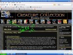
Liking the News on front page today

vic20

Fool
I don't know if it is a temporary thing along the way, but I'm liking the News stuff on the front page right now. Ever since the news was pushed to a link on the front page, I've only clicked through once or twice, so it's nice to see it back in my face where I can glimpse at "what's new" on my way to the forums.
 

log in or register to remove this ad

I second that. I tended to forget to read the news and just headed straight for the forums. But I'll read it if its the first thing I see when I get to the homepage.
 

I like it except for one big issue:

I cannot see any link to the forum.

Now, this could just be because I am dumb (trust me, it could definitely be because I am dumb), but if there is not a link to the forums then how are new people ever meant to discovered them?
 

I like it except for one big issue:

I cannot see any link to the forum.

Now, this could just be because I am dumb (trust me, it could definitely be because I am dumb), but if there is not a link to the forums then how are new people ever meant to discovered them?

The forums are the second icon from the left.

I also like the news, but I don't like that there's no way to get to "My Account" from the front page now. I like jumping straight there to check my subscribed threads on the User CP. Not sure why the "My Account" graphic isn't on the top line.
 

I like it except for one big issue:

I cannot see any link to the forum.

Now, this could just be because I am dumb (trust me, it could definitely be because I am dumb), but if there is not a link to the forums then how are new people ever meant to discovered them?

Sounds like it's time for one of my highly advanced, custom user guides:

attachment.php
 

Attachments

  • forum.JPG
    forum.JPG
    213.6 KB · Views: 306


How odd. That shouldn't happen.

It also looks like the right bar on the front page is very squeezed in your display, too. I might have to take a closer look at the white skin templates over the weekend.
 

How odd. That shouldn't happen.

It also looks like the right bar on the front page is very squeezed in your display, too. I might have to take a closer look at the white skin templates over the weekend.

Ahhh .. well it could be the antiquated browser I am forced to use at work (IE 6). Let me check at home tonight on Safari before you go and redesign a template that may only be getting issues on one browser version. I shall report back tonight.
 

How odd. That shouldn't happen.

It also looks like the right bar on the front page is very squeezed in your display, too. I might have to take a closer look at the white skin templates over the weekend.

The white skin has looked like that for a long time now. I use it occasionally at work, but there's still a lot wrong with it. I really feel like I'm using a crippled version of the site when I do it, but I don't often use EN World at work.

By the way, I also second that there should be a way from the front page to jump to "my account" to see subscribed threads. Especially if the email notifications are still not working.

I do like the news there, though. I like reading it, but not enough to go out of my way to do so, so I only read it if it's on the front page. I knew I could've made the news page my front page before, but I was too lazy to change my links. :)
 

The forums are the second icon from the left.

I also like the news, but I don't like that there's no way to get to "My Account" from the front page now. I like jumping straight there to check my subscribed threads on the User CP. Not sure why the "My Account" graphic isn't on the top line.

There's no room in the top bar, but how's this for a solution?
 

Remove ads

Top