Blog (A5E) Look At Our 'Level Up' Cover Art!

This gorgeous wraparound cover art is by Alba Palacio. It features four of our ‘iconic’ characters engaging in an exploration challenge — a statement which shows the importance we’re giving the exploration pillar of the game, bringing it front and center alongside the combat and social pillars. Maika the human druid, Krarg the orc/human berserker, Gyvwen the dwarf rogue, and Varskyle the...

This gorgeous wraparound cover art is by Alba Palacio. It features four of our ‘iconic’ characters engaging in an exploration challenge — a statement which shows the importance we’re giving the exploration pillar of the game, bringing it front and center alongside the combat and social pillars.
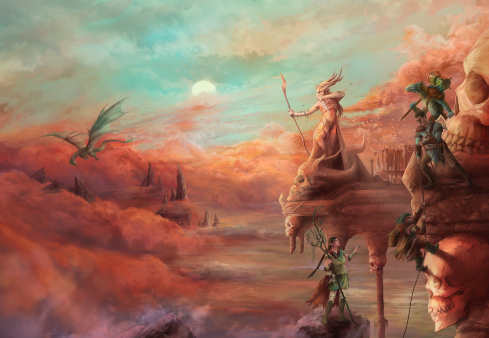
Maika the human druid, Krarg the orc/human berserker, Gyvwen the dwarf rogue, and Varskyle the dragonborn fighter engage in an exploration challenge.

Maika the human druid, Krarg the orc/human berserker, Gyvwen the dwarf rogue, and Varskyle the dragonborn fighter engage in an exploration challenge.

Continue reading...
 

log in or register to remove this ad


log in or register to remove this ad

I would have to agree with tetrasodium. The "statue" doesn't look like a statue. It looks like a 5th character. It actually looks like a Magic User getting ready to cast a spell at the flying dragon on the horizon. But at the same time I can also see it's a statue ONLY because it is the same color and blends in with the rest of the surrounding scenery.

To me it's because of the scale of the statue, which is similar to that of the characters, and its close proximity to them. It makes it seem like one of the characters upon initial glance of the cover.

There's also something odd about the architecture. It almost seems like the stuff below the statue is a reflection in water, rather than more building against clouds.

I also think the character holding the rope and the druid have an odd pose. I get the faint impression (although this may be incorrect), that the statue's legs are obscured, because the artist can't draw legs very well. The entire building also looks weird the more I look at it.

Sorry to be a sour art critic. I do like the colors!
 
Last edited:

tetrasodium

Legend
Supporter
Epic
To me its because of the scale of the statue, which is similar to that of the characters, and its close position to them. It makes it seem like one of the characters upon initial glance of the cover.

There's also something odd about the architecture. It almost seems like the stuff below the statue is a reflection in water, rather than more building against clouds.

I also think the character holding the rope and the druid have an odd pose.
the belly has a fleshtone giving it a bit of a stone/bone bleach Vizard arc inspired outfit look too
1610490772869.png

Chainmail bikini is so common in fantasy that it doesn't even get a second glance a lot of the time.

edit: Not saying it's problematic chainmail bikini or anything, just that there is ample reason to dismiss defensive curiosities like a bare midriff in fantasy armor combined with everything else
 
Last edited:

Statues can be scantily clad. I have no issue with that. I think what bothers me the most is that the architecture looks so far removed from how actual buildings look, that my eyes have trouble 'reading' the image. It throws the entire composition in disarray for me. Also, lots of skulls. Makes it look tacky.

I think the art piece could use a triangle composition to help the eyes understand the picture better. @doctorbadwolf already pointed out how the characters lack outlines to make them stand out. But I also notice that the statue really just draws my eyes away from the characters. There is a strong leftward motion in both the statue's pose and the clouds. Our eyes tend to be drawn to lighter colors, and that statue is central and very bright, so it is the first thing we look at. Its pose however draws our eyes in the wrong direction. Some sharper contrasts or outlines would really have helped.

But I repeat, I really like the colors! I'm not hating on it for the sake of nitpicking. Most people I suspect, will pay little attention to all that stuff I pointed out. I happen to be an artist myself, so I am a critic.
 
Last edited:

Remove ads

Remove ads

Top