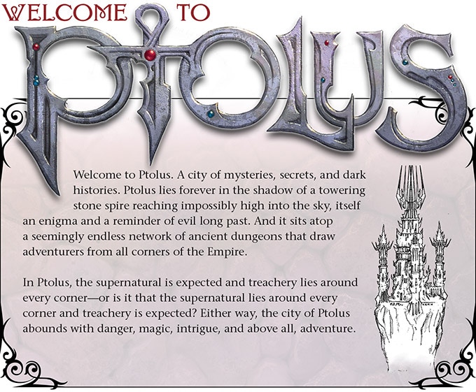
This is one of MCG's luxury products - at nearly 700 pages depicting a massive, detailed fantasy city, we're looking at $150 for the book, or $40 for the PDF, either for D&D 5E or Cypher System.


 www.kickstarter.com
"Monte Cook’s legendary campaign setting, Ptolus, is being updated for both Fifth Edition and the Cypher System.
At 672 beautiful pages, Ptolus: Monte Cook’s City by the Spire isn’t just huge. Top-notch art and abundant cartography grace virtually every page. Innovative features make the premium-quality book uniquely easy to navigate and use. Physical and digital extras include handouts, player maps, and posters, totaling hundreds of pages. Nearly 1,000 pages in all!
And that’s not all: Most backer levels include a massive library of every single existing Ptolus product. Get the original version of Ptolus plus 26 additional PDF titles—2100 pages of content worth over $250—so you can explore the city and plan for your adventures right away."
You can also download a free 32-page introductory Player's Guide.

Ptolus: Monte Cook's City by the Spire
Monte Cook's legendary campaign setting, updated for Fifth Edition and the Cypher System.
"Monte Cook’s legendary campaign setting, Ptolus, is being updated for both Fifth Edition and the Cypher System.
At 672 beautiful pages, Ptolus: Monte Cook’s City by the Spire isn’t just huge. Top-notch art and abundant cartography grace virtually every page. Innovative features make the premium-quality book uniquely easy to navigate and use. Physical and digital extras include handouts, player maps, and posters, totaling hundreds of pages. Nearly 1,000 pages in all!
And that’s not all: Most backer levels include a massive library of every single existing Ptolus product. Get the original version of Ptolus plus 26 additional PDF titles—2100 pages of content worth over $250—so you can explore the city and plan for your adventures right away."
You can also download a free 32-page introductory Player's Guide.


