• NOW LIVE! Into the Woods--new character species, eerie monsters, and haunting villains to populate the woodlands of your D&D games.

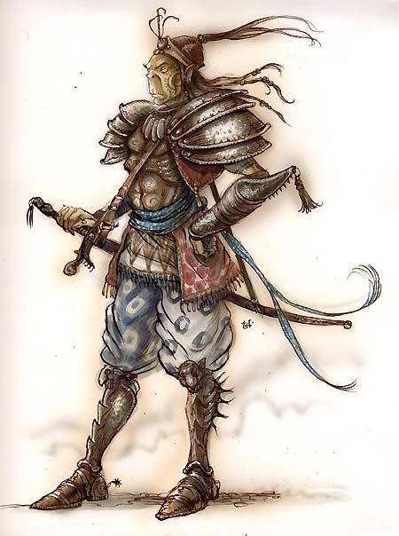
My one criticism of 4th ed: poor artistic style

I think the 4E art direction ably conveys a distinctive aesthetic, which happens not to suit my taste. Conformity seems to me not just over-rated but contrary to the purpose if that is to suggest diversity in the imagined world.
 

log in or register to remove this ad

What Pete Mullens has done for Swords & Wizardry and OSRIC takes me back to the "good old days" of Dragon magazine.

It is most fervently not my hope that everyone should imitate his style, but that each should have a style so much his own. That anti-homogenization is what really revs my nostalgia engine.
 

Most pictures in 4E are not bad in a technical way. Most of them are very well drawn. The problem is that the style the pictures are drawn in is not very good.
The term "Saturday morning cartoon" fits rather well.

Also, WotC seems to have a talent to pick the worst pictures from a batch for book covers. Just think about the spinless Ass&Boobs pose from the PHB1. And the 4E Draconomicon cover is miles behind the 3E one.
 
Last edited:

If you're Tom Wham, then be Tom Wham; if you're Tim Truman, then be Tim Truman.

What has really been counter-productive, I think, is the "one size fits all" standard. Memorable art is as a rule not a product of following fashion.

That's a matter less of artists than of art directors!
 
Last edited:

In 2nd edition, TSR was buying the premier fantasy art of the day. Many peices were good enough to grace the cover of novels.

Noone is going to want 4e art to grace the cover of their novels.

Heck, WoTC would reject most 4e art as illustrations for MtG on the grounds that it shows insufficient artistic design. About the only commonality between MtG art and D&D art is when an artist is asked to paint some wierd monster with no mythic ties - and this is within the same company.
 

I think the art is good, but it doesn't speak to me or inspire me like 2e art did (or even the 3.x art that I liked, of which there was a good percent).

I just don't get the same "I should build an encounter around this piece of art" like I used to. Maybe I'm just old, but that's the way I feel. I don't see this particular art style as one that a 13 year old would randomly pick up the book and become inspired by the art. I suppose I should ask my 13 year old.....
 

Early 4E art would make Granma Enworld cry. Some artists, on purpose or not, seems to never have taken an anatomy lesson. Sometimes when I'm using MM I feel like watching Scooby Doo.

Judging by some Dragon & Dungeon articles it seems that Wotc listened a bit and things are getting better.

From older editions I would bring back, obviously, DiTerlizzi.
 

Art is incredibly subjective -- one person's High Art is another person's utter garbage. Sometimes reaction to game art is matched to reaction to the rules set themselves -- if you like the rules, the art looks better ... and sometimes vice-versa... ;)

Anyway, I really like a couple of artists almost at exact opposites stylistically -- Eric Hotz has done great hyper-realistic drawings (his work appeared in Harn and Ars Magica, amongst other games) of rather ordinary-looking people dressed in medieval costume and armour of extreme historical accuracy; on the other hand Stephani Pui-Mun Law creates fascinating drifting images of faery worlds and magical dreams. Would either of these artists improve the art of 4e? I don't know -- I know I would like the art, but is it "really D&D". Equally many of the more popular D&D artists (...name your edition...and the same could be said of most other games) leave me cold, sometimes due to cartoonishness, sometimes due to uber-sized weapons, sometimes due to poor understanding of anatomy, and sometimes due to just pure strangeness. HOWEVER this is only my opinion -- art discussions are even more personal and volatile than even "edition wars". ;)
 

I'd just like to say how much I've always enjoyed the picture of the triumphant party of valiant adventurers who murdered the gold dragon child for what appears to be a small chest of copepr and silver pieces. Way to go team!

As for 4th edition art, I've been incredibly unimpressed with the interior art. Most of the pieces I'd rate decent are recycled from 3rd edition products (though the PHB 1 dwarf racial and PHB 2 deva and half orc racials are quite good). I'd love it if they started throwing in some full page pieces.
 

ProfessorCirno said:
My big issue with 4e's art is that it seems very cartoony at times. *snip*..If we're talking about art/artists we DO/DID like, then I can only quote from elsewhere:

"Tony DiTerlizzi is a graphic artist who worked on Planescape. He was fired for making better drawings than everybody else and helping make Planescape the best setting in the world."

Early 4E art would make Granma Enworld cry. Some artists, on purpose or not, seems to never have taken an anatomy lesson. Sometimes when I'm using MM I feel like watching Scooby Doo.

From older editions I would bring back, obviously, DiTerlizzi.

Okay, DiTerlizzi was my favorite artist from the 2ed era but there are issues when you say in one breath that 4E is too "cartoony" and then remeniss on the most "cartoony" of the 2ed artists. True, he helped creat Planescape with wonderful images but those images were whimsical and imaginative and VERY cartoony.

[sblock]
githyanki1.jpg

modron_monodrone.jpg

3263342251_a9b5eeafbb.jpg
[/sblock]

As for the OP: Using the image of the group triumphantly standing around the slain baby dragon, it seems like the image would change through different editions:

1st - As is if a cover. If it's in a rule book then its black and white. Looks like a Newspaper 1-panel comic (ala Far Side) The group is fighting the dragon, and someone is melting in its breath weapon. The mage and big bearded fighter would be standing back and watching this happen while the mage makes a funny comment about the situation.

2nd - as is. Everyone posing for the photo.

3rd - More extreme. Everyone is fighting the dragon. No one is dying. Everyone is shouting. The dragon is bigger, as are everyone's weapons. Races and classes are easily identified, and the dragon looks like a D&D green dragon (one of the moves I really liked in the 3E era - have the images match the world they tried to establish). Probably lacks a background. The characters are fighting on the page and text surrounds them.

4th - As late 3rd ed books (Eberron artwork, for example), where the artists started drawing more "cartoony" images and more extreme action, movement, and style. Most likely will have a background.
 
Last edited:

Into the Woods

Remove ads

Top