Perhaps I should emphasize folks, that my real problem is lack of artistic style wihtin the books page LAYOUT and a coherence of a "D&D" feel
")
I don't like Wayne Reynolds as much as I like say, Caldwell, and I don't like 4th ed's, as folk noted, more cartoony look in general.
But that's a matter of taste, each to his own, maybe that's what younger folk like? I don't though.
But what hacks me off is the utter lack of the things that evoke STYLE inside the books:
no fancy borders, paragraph dividers, page number medallions (that look cool rather than functional, current ones are extremely functional but not evocative) or whatever :/
D&D is about fantasy, the layout art of a book massively evokes that, it's vital, IMHO.
Go look at the booklets for Undermountain, 2nd ed. The page backgorund is maybe a tad too much (it should fade to white from the borders liek 3rd ed PHB, IMHO), but the borders, page headings etc are all lovely, it helps evoke a mood.
MOOD is CRUCIAL to D&D! the emphasis cannot be over stated. A good layout helps set that mode, the tone, ya know?
Now, 4th ed has wonderfully easy to read/use page layouts. I'm not, paradoxically , complaining about that.
What I'm saying, is that by not having interesting borders, black and white line art, page numbers in gemstone jewellery effects, neat little paragprah diving art work, etc, they do not evoke the feel of what D&D *is* about.
It's just stats, numbers, details...see what Imean? it's far, far too "dry".
pardon the silliness of this statement, but, D&D has a flavour or a soul, as it were, you have to encourage that, it's not just "lets roll dice and take loot".
It's
fantasy, not "Papers & Paychecks"
")
Whn it comes to specific settings, this is absolutely 100% essential.
Dark Sun, Spelljammer and so on, have a very specific feel, fluff IS vital, fluff IS what the hell settings are all about, the crunch follows the ethos of the fluff, when it doesn't, it doesn't gel.
I suspect 4th ed doesn't have such to save money! Those extra tweaks cost money, and as we all know, the 4th ed books were seemingly poor quality (smudging ink and thin paper)
What I would suggest, is that 4th ed books, have a unified border on the top, right and bottom margins. This margin to have a coherent style for each setting or book and even chapter.
For example, open the 4thed PHB, go to the wizard's first page # 157
it's neatly and very legibly laid out, no problems from htat score. But does it evoke D&D fantasy? not to me it doesn't :/
the details all need legibility, which they do have, so that's ok, but by adding a border, they could add in "feel".
there's lots of small white spaces at end of power's that could take neat little B&W art, or designs to give feeling.
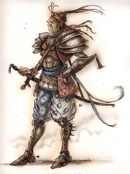
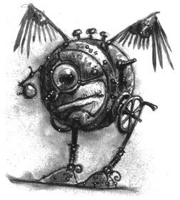
ANother thing I'm not too happy with is 4th ed's extremley strong avoidance of humour :/ D&D is about fun, and if you cannot laugh at yourself now and again...see the 1st ed DMG's cartoons: it wasn't afraid to laugh at itself

Sure they had APril fool's stuff on WOTC's site...but...ther'es nothing wrong with silliness, such as humorous art/critters.