• NOW LIVE! Into the Woods--new character species, eerie monsters, and haunting villains to populate the woodlands of your D&D games.

New web site design!

ToddSchumacher

I like to draw!
I'd like some feedback on this. A few weeks ago I started adding pages detailing my campaign setting, i also decided to change the 'main' pages using what I've learned from tinkering with GoLive a bit.

http://www.toddschumacher.com/

It seems I never get tired of tinkering and re-designing it.
 

log in or register to remove this ad

Very simple and clean but, at the same time, very bland. Just as a suggestion, maybe a color peice on the front page to give it more color.
Also, if you happen to decide to run a Thorn game as a PBP, let me know! :)
 

If you're looking for something that does what a website is supposed to do, you're already there. It's extremely easy to navigate, and easy to tell where stuff is.

As far as aesthetic design I'll agree with mps42 that there's just not much there.

How to remedy this? Well, I won't say anything specific because I'm not entirely sure what you're going for, but I can list some examples of portfolio sites I think have excellent design.

Jeff Matsuda

Elbonie Jackson

Vera Brosgol

Nate and Steve

Mark Crilley

David Mack

Good luck man! I had a tough time trying to figure out what to do with mine too.
 

You certainly like redesigning that thing.

I've liked all the incarnations of the site, though. :)
 

Made some changes.

Take another Look! I Demand it!!

well...suggest it.

No more gallery pop-ups.

http://www.toddschumacher.com/

Be sure to re-fresh your browsers as I've changed the rollover images and title, It would look a bit wonky, I think, if you didn't.

Also, there is more work to be done on the gallery pages descriptions and what not. More to come.
 

Some observations:

1) The site is not standards-compliant and does not validate as valid HTML. This means that the site doesn't necessarily look and behave the same in all browsers. You can see the validation results and generated errors here:
http://validator.w3.org/check?uri=http://www.toddschumacher.com/

Why is it important to create valid HTML (and CSS for that matter)?
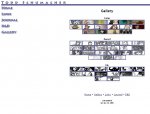
In the attached image "firefox-gallery.jpg" is what I see with Firefox.
In the attached image "opera-gallery.jpg" is what I see with Opera.
I have no Safari here, but by experience I'd say it resembles what I see with Opera (ie. probably not what is intended).

2) Many people (me included) don't use pure white as the color of their choise as active window background color. This means that the image-elements that are designed to show on white background look ugly if the page explicitly doesn't set the background color. This is illustrated in the attached "Image1.jpg" image. The fix is to include background color information in the body tag.

3) You have included no meta-information that would help indexing services (like Google) to assign your site keywords. This has no importance unless you desire your site more visibility in search engines.


Other than those ... looks good.
Keeping the structure simple, easy to navigate and without any annoying effects that draw attention away from the content (like blinking stuff, animated gifs etc) is the way to go in my opinion. Personally I like to avoid complex scripting myself (and boy the scripts do look a bit overwhelming for this kind of site!) unless there is absolutely no way to represent the information otherwise, but I guess that's a matter of taste (and also your site doesn't work in browsers that have disabled JavaScript execution - I don't see why your site NEEDS it because using Cascading Style Sheets would achieve pretty much the same net results anyway).
 

Attachments

  • Image1.jpg
    Image1.jpg
    14.2 KB · Views: 75
  • opera-gallery.jpg
    opera-gallery.jpg
    77.5 KB · Views: 81
  • firefox-gallery.jpg
    firefox-gallery.jpg
    95 KB · Views: 80

Into the Woods

Remove ads

Top