• The VOIDRUNNER'S CODEX is coming! Explore new worlds, fight oppressive empires, fend off fearsome aliens, and wield deadly psionics with this comprehensive boxed set expansion for 5E and A5E!

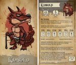
[OC] Would anyone be interested in a deck of these chibi-style DnD 5e monsters w/ stats on the back?

Ben-J-N

Explorer
lAb8fVO.jpg

A friend and I made some chibi-style DnD 5e tarot size monster cards. We're working on some basic card designs now and probably looking to Kickstarter this just a little bit in the future if enough people are interested.

The initial idea is to make decks covering the 4 "tiers of play" outlined in the DMG. Each deck would have 40 cards.
Tier 1: Levels 1-4 - Local Heroes (CR0 - 4)
Tier 2: Levels 5-10 - Heroes of the Realm (CR5 - 10)
Tier 3: Levels 11-16 - Masters of the Realm (CR11 - 16)
Tier 4: Levels 17-20 - Masters of the World (CR17 - 20)

They'd be monsters whose stats are available in the 5e SRD and probably pick the most "iconic" ones. I feel like this mockup card is looking pretty awesome and was hoping others might think so, too.
Anyway, I was wondering what the interest on this sub would be like, plus I wanted to give an update on the card design and really wanted to get some feedback from people about the text readability, location, etc. or some other interesting things that we could do with these cards.
Also, I will probably post updates on Twitter occasionally if anyone wants to follow along there. (https://twitter.com/benjn_jp).
 

log in or register to remove this ad

Tallifer

Hero
A neat idea, reminiscent of 4E Power Cards. I could imagine using these like index cards in a small portable box.

I find text written all in capitals hard to read and distinguish. Leave the titles, subtitles and keywords in capitals, but write the sentences using upper and lower case.
 

Patrick McGill

First Post
A neat idea and the design is good, but my personal preference would be for a cleaner background, like getting rid of the bloodstain and parchment effect and going with white or a color like the one inside the ability score box so the text stands more on it's own. Or even keeping the parchment like color but without so much the texture. I also agree with the earlier reply about capitalizing all of the letters not looking too good.

Though I shouldn't be considered a reliable source of design advice.


Remove ads

Top