You are using an out of date browser. It may not display this or other websites correctly.
You should upgrade or use an alternative browser.
You should upgrade or use an alternative browser.
Question about faces - please comment
- Thread starter Cheiromancer
- Start date
Cheiromancer
Adventurer
Cheiromancer
Adventurer
Cheiromancer
Adventurer
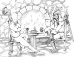
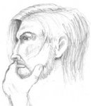
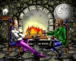
I think the faces did not transfer well into color- I like the sketch versions better. Anyone willing to venture their opinion as to how the sketches transferred to color?
How can the cherubic quality of the original Titivilus be recaptured in color?
How can the subtle shading and lines be restored to the final Eadric?
Anyone have any other comments as to how the final picture can be improved?
(Note: I did not draw these pieces, but I did commission them. The artist is ok with me posting them to solicit comment and critique.)
Some of it is shadowing the cheek is too dark, also you may want to try different shades (plus minus) for effect, this could change the contrast, the dark green shirt draws the eye.
I think it looks good.
I think it looks good.
Last edited:
Chain Lightning
First Post
I actually don't think the shadow on the cheek is too dark. They are in room where the only lighting is the fireplace. I think it more the actual shape of the shadow. Especially toward the brow. The shape chosen makes him have a pronounced brow which gives him sort of a tough guy/brute look. I'd make the transition from his forehead to where his brows are subtle with no curve to indicate his brow is "bumpy".
Also the spots of yellow on his white shirt don't really need to be there. I know the colorist is trying to achieve the effect of the warm yellowish light from the fireplace hitting the shirt, but it isn't really needed. The presence of shadow on the opposite side of the light source accomplishes this already. If you want all the areas that are hit by the firelight to have a warm yellowish glow, then all of the colors on the 'light' side should have a smidge of the yellow mixed into the color. Simply airbrushing some yellow in spots here and there doesn't really do it in the end. It just kind of comes off as yellow stains on the shirt.
Anyways, I like the fact that this piece has two guys sitting at a table and the background is there too! Some people just wanna draw the characters only. Backgrounds may be boring or take extra time to draw....but its cool for setting the scene when it is there.
Does this help any?
Acquana
First Post
I will try to critiqe only the coloring since that's the only thing you want.
Honestly I think what you should try is this: Start over with your coloring. If you really like the shading and linework that's there, don't bother covering it up to make it look more "painterly." Instead, go into Photoshop (I assume that's what you have, am I wrong?), and convert it into CMYK. From there, go into channels and only select C, M, and Y channels. That way when you color with brush or whatever, the blacK channel won't be altered at all. I use this technique for my own stuff.
Other than that, I recommend not using such bright colors on so much of the piece. Decide what your focus is (the figures and their faces), and use the most saturated colors there. Have their shirts or colors be the brightest colors.
Cheiromancer
Adventurer
Anyone else?
I was concerned with the way the faces turned out in the colored version, but comments about other details might also be helpful.
I was concerned with the way the faces turned out in the colored version, but comments about other details might also be helpful.
Similar Threads
- Replies
- 13
- Views
- 3K
- Replies
- 0
- Views
- 168
- Replies
- 49
- Views
- 15K
Spoilers
Fantastic Four (Spoilers)
- Replies
- 108
- Views
- 14K
- Replies
- 75
- Views
- 12K
Recent & Upcoming Releases
-
June 16 2026 -
June 16 2026 -
September 16 2026 
Arcana Unleashed(Dungeons & Dragons)
Rulebook featuring "high magic" options, including a host of new spells.
Replies (250) -
September 16 2026 -
October 1 2026 -
October 6 2026 -
January 1 2027 -
January 1 2027


