Redesigning the D&D website


log in or register to remove this ad

I like that your blog roll is smaller and that it incorporates a show/hide function, but I have a few complaints about yours too.

First, you have both a side and a top nav bar. The redundancy is off-putting and makes me wonder why there are both.

Second, the side nav bar looks almost like a spitting image of the current side nav bar and that's not a good thing.

Third, although your's is smaller (and like you said, better for people who don't want to scroll), it still feels almost exactly as cluttered as does the current site.

Also - if Chibbell dropped the D&D minis product advert off his page, it would shrink the blog roll and come in quite a bit shorter. I've uploaded what that would look like in a side-by-side-by-side comparison.

Your side is like a hybrid between both Chibbell's and the current one. If you dropped the side nav bar and found some way to have a show/hide while simultaneously leaving the art (maybe it shows the title and the first line or two so that the art can stay too), I think you might hit on something.

Better, IMHO, would be to find a way to add a show/hide to the blog roll that Chibbell has now, and then I think you'd have it.
 

Attachments

  • sidebyside.jpg
    sidebyside.jpg
    367 KB · Views: 128

jimmifett said:
Hah. We were doing a web app to replace 2 different apps and merge them. One of the user group's critical requirements was to make sure that pressing cntl+f would still be there to quickly search. I was so tempted to tell them that it was impossible to retain that functionality...
Why would you want to remove a keyboard shortcut that your users obviously find of value?

Or maybe this is some kind of a joke about how the clueless users didn't know that Ctrl-F is built into almost all applications and doesn't have to be added?
 

Tao said:
I'd be interested to hear what you think of it:

http://www.mattylee.com/images/designs/dd_redux.jpg
Gut reaction: It's okay - better than the current page. But: I hate the headers. The combination of a sans serif font with a basically one-coloured rectangle doesn't work well in this context. I'd rather try to imitate the headers in the books, as shown in the articles. Makes it a bit less bland and ties in into the brand recognition.

The left nav bar... is it really necessary? Especially considering you already have a horizontal navigation bar.

And the angled D&D logo behind the log-in box looks corny. :\

Cheers, LT.
 

Tao said:
I'd be interested to hear what you think of it:

http://www.mattylee.com/images/designs/dd_redux.jpg
I do not like the show/hide articles thing. I mean, we're talking about 5 lines of text and a small picture. If I don't care, I skip past them. If I do care, I have to click blindly on a little plus sign next to a title to find out more. I read a lot of blogs, and I'm pretty used to the blogroll style interface. It's successful on a lot of sites, so I would prefer to see it here unaltered instead of adding +/- signs.

I'm not a fan of your color boxes to filter the articles. I think that's too unintuitive. Again, maybe it's me, but there's really no article on the Wizards site that is so far from what I want to read that I can't even skim a summary of it. I think that the "all posts are created" equal method works well, since they're just 30-80 word summaries.

I think a long front page is fine. If I have to click too much to get to the article I want, that's way more of a turn off than having to scroll past stuff on the front page.

I also don't like how you have the navigation present twice on the page. I think it's redundant and not particularly useful. First-time visitors are not going to know where those links go. Repeat visitors will probably be much more interested in what's new on the site.

I do like your header, and the navigation header better than Chibell's.

Basically what it comes down to is that as a repeat visitor to the site, I just want to know what's new on the site. The current design is particularly frustrating, since the new stuff is in a tiny little box, surrounded by fairly useless static information, and worst of all, that box constantly blinks between a bunch of fairly arbitrary categories. I do not really care about those categories.
 
Last edited:

I like the branding you did with the color scheme and the graphics that match the PHB's look. You did that well. :)

However, I don't like the 3 columns. Eliminate the side menu. Its too busy and redundant with the top menu. That text at the top is hard to read, so I would darken the image beneath it to make the text stand out more.

And I don't like the +/- thing to shrink the entries. It seems tacky, just like it does for the menu options on the current site.

Also the notion that users won't scroll so all design has to be "above the fold" is one I don't agree with at all. It was a popular notion from the early days of web design when web design was thought to be similar to print design. At this point the web has proven to be a unique medium unto itself. One of my business courses in college discussed web design and marketing and they debunked the notion that surfers won't scroll.
 

Dragonblade said:
...debunked the notion that surfers won't scroll.
Especially with the prevalence of scroll wheels nowadays. The only thing preventing people from scrolling is: The site doesn't look like a site that is continued below.

Cheers, LT.
 

Thanks for the feedback. Like I said, this was just something I threw together quickly (less than an hour of real work) to show some of Chibbel’s concepts in a more “4e brand” feel. Knowing what I do about large companies and branding, it doesn’t matter how good Chibbel’s design looks… if it doesn’t match the direction marketing and branding are going, it will go straight to the cutting room floor. Its sad. Its even tragic sometimes. Its big business, and its the way things work.

I honestly wasn’t trying to compete or steal Chibbel’s thunder. Just trying to show a bit more the direction branding and marketing would be demanding. I will definitely respond to your comments though.

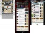
I honestly don’t know why I kept the side nav, to be honest. That particular design is from an attempt I had made a while back to reskin the current site into a bit more open 4e look for myself through a CSS user style sheet (an intellectual exercise that I never ended up finishing). That design was where I started with my own branding of Chibbel’s, but I ended up liking the top nav and used it instead. The side nav should have been removed and the articles widened slightly. Really just an issue of time (my wife got home early and we had a World of Warcraft date).

The collapsing articles may not be useful to some people, but it allows you to show a lot of articles in less space and gives the user control of what they want to see. The default would be to show the newest five articles or so, with another 5-10 shown collapsed below. Allows you to find fairly recent articles without resorting to the archives and without wasting a lot of space on what is essentially old news.

The header probably should be toned down. It originally didn’t have the news, (just image, logo, and login), but I added the news feature at the last second, since it is one of those things that marketing would likely be stuck on. The best bet would be a slightly less busy header with a flash panel that cycles through the most important news and announcements.

Lastly, for the "above the fold" theory, there is a lot more that goes into it. Once you get people started, they are willing to scroll. However, if the only thing on the page is the header and masthead (which would be the case with Chibbel's for anyone with a screen height of 900px or less, not unreasonable even now in the days of widescreen monitors) then it is a problem. Its actually becoming a fairly common issue in the webdesign industry these days. We forget not everyone is working on 36" monitors ;).

I’ve got 12 hour days all this week, but maybe I’ll have a few minutes free to touch it up real quick and give you a more polished looking design.
 

Joshua Randall said:
Why would you want to remove a keyboard shortcut that your users obviously find of value?

Or maybe this is some kind of a joke about how the clueless users didn't know that Ctrl-F is built into almost all applications and doesn't have to be added?

ctrl+F is a function of your computer, not your web app, I believe. So they couldn't take it out even if they wanted to. Hence the joke.
 

I'd have to agree with the other complaints about this new design. I can see that it is more like the look and feel of the new edition, but it is cluttered and reminds me of the new magic site, with too many boxes everywhere. Don't like the menus, or the +/- fiddly clicking.

I loved the OP's idea. If the brand team don't like something that looks that sexy, they need a better brand team. After all, this comes from the same sorts of people who insisted that 10th edition magic really needs the X logo rather than 10 because its way better.

The first site redesign just looks so cool I want to read it. The second one has too many things competing for my attention, but I would hunt through for the things I want.

The current page I don't even visit anymore. I just click on the links provided to the articles from EN World :)
 

Remove ads

Top