Taking Requests

Looks good so far.

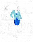
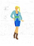
I think the Jacket is still a little too modern, but colors and materials may help with that. The only thing I can think of as a potential fix is to have it close a bit lower in a tie. The blue dress had a top coat over basicly a tube like dress, so the top of the dress should show at some point.

As for the fantasy aspects, I never envisioned her as extremely busty. Maybe a bit more than the pic, but that might show up better once you fill it in.

Again, looks good so far. Far, far better than I could do.
 

log in or register to remove this ad

I've finished the jacket and the dress. Overall, I like how they look, but they still look fairly modern to me...

I first created a layer for each of them, and then filled the relevant portions with the basic color of the item. Then I brightened up or darkened parts of them to emphasize the lightning and the atonomy. Then I painted over them with different patterns that were included in GIMP and used a filter to give the dress a certain glow.

Coming up next: Skin, face, and hair.
 

Attachments

  • SecondDraft.jpg
    SecondDraft.jpg
    56.5 KB · Views: 89


The next draft is finished. As suggested, I removed the buttons - I hope the dress looks a bit less out of place now.

I'm not quite happy with the face, but I realize I can't do it much better with my present level of ability...
 

Attachments

  • ThirdDraft.jpg
    ThirdDraft.jpg
    60.6 KB · Views: 180

The skin was done by first painting the whole area in a uniform color, then brightening or darkening appropriate regions. The band around her waist and the "border" of her jacket was done by copying the jacket, cutting out all other regions, and then play around with the colors and patterns until I got the desired result.

What do you think of the design so far?

I'm thinking of maybe adding a cape...
 

Good, Looks good :)

I've been having internet problems, may not be back for a few days, but I like it so far.

The Green might be a little bright, but it's definately taking form. I like the sash too remove the buttlons, and it looks good.

Bah, keyboard acting odd now too.


BiggusGeekus said:
This may not fit into Urbis, but you can tone down the wilderness nature of the locale.

I want a fallen tower. The top part of the tower should have slid down a hillside

The symbolism, the symbolism!


Remove ads

Top